Categories
How To Guides Microsoft Office

Navigating Interaction: A Comprehensive Guide to Adding and Modifying Hyperlinks and Action Buttons in PowerPoint 2013

Introduction:

In the realm of presentation design, interactivity is a powerful tool to engage and guide your audience through the content. PowerPoint 2013 offers versatile features to enhance interactivity, allowing presenters to seamlessly add hyperlinks and action buttons. This comprehensive guide will explore the intricacies of incorporating hyperlinks and action buttons in PowerPoint 2013, enabling you to create dynamic presentations that captivate your audience.

Understanding Hyperlinks in PowerPoint 2013:

  1. Definition of Hyperlinks:
    • A hyperlink in PowerPoint is a clickable element that, when activated, redirects the viewer to another slide, a different presentation, a website, or even an email address.
  2. Types of Hyperlinks:
    • PowerPoint supports various types of hyperlinks, including:
      • Slide Hyperlinks: Linking to specific slides within the presentation.
      • Web Page Hyperlinks: Redirecting to external websites.
      • Email Hyperlinks: Initiating an email to a specified address.
      • Document Hyperlinks: Linking to external documents.

Adding Hyperlinks:

  1. Creating Slide Hyperlinks:
    • Procedure:
      1. Select the text or object you want to hyperlink.
      2. Right-click and choose “Hyperlink” or use the “Ctrl + K” shortcut.
      3. In the dialog box, select “Place in This Document” and choose the destination slide.
  2. Adding Web Page Hyperlinks:
    • Procedure:
      1. Follow the same steps as creating slide hyperlinks but select “Existing File or Web Page.”
      2. Enter the URL in the Address field.
  3. Incorporating Email Hyperlinks:
    • Procedure:
      1. Choose “Email Address” in the hyperlink dialog.
      2. Enter the email address and optionally set the subject line.
  4. Document Hyperlinks:
    • Procedure:
      1. Select the text or object.
      2. Choose “Existing File or Web Page” and navigate to the document.

Understanding Action Buttons in PowerPoint 2013:

  1. Definition of Action Buttons:
    • Action buttons are predefined shapes in PowerPoint that can be customized to act as interactive elements, triggering specific actions or hyperlinks when clicked.
  2. Types of Action Buttons:
    • PowerPoint provides a set of standard action buttons, including Next, Previous, Home, End, Return, and more.

Adding Action Buttons:

  1. Accessing Action Buttons:
    • Procedure:
      1. Navigate to the “Insert” tab.
      2. Click on “Shapes” and select the desired action button from the Action Buttons category.
  2. Placing Action Buttons:
    • Procedure:
      1. Click and drag to draw the action button on the slide.
      2. A dialog box will appear, allowing you to choose the hyperlink or action for the button.
  3. Customizing Action Buttons:
    • Procedure:
      1. Right-click on the action button.
      2. Select “Hyperlink” to modify the destination or action associated with the button.

Modifying Hyperlinks and Action Buttons:

  1. Editing Hyperlinks:
    • Procedure:
      1. Right-click on the hyperlink text or object.
      2. Choose “Edit Hyperlink” to modify the destination or other settings.
  2. Changing Action Button Actions:
    • Procedure:
      1. Right-click on the action button.
      2. Select “Action” to modify the hyperlink or action associated with the button.
  3. Hyperlink Navigation in Slide Show Mode:
    • Procedure:
      1. Enter Slide Show mode.
      2. Click on hyperlinks or action buttons to navigate through the presentation.

Advanced Hyperlink Techniques:

  1. Navigating to a Specific Slide:
    • To link to a specific slide, choose “Place in This Document” and select the desired slide.
  2. Linking to External Documents:
    • For documents, choose “Existing File or Web Page” and navigate to the document’s location.
  3. Creating Action Settings:
    • In the “Action Settings” dialog, customize the action associated with an object or text, such as running a program or playing a sound.

Best Practices for Hyperlinks and Action Buttons:

  1. Consistent Design:
    • Maintain a consistent design for hyperlinks and action buttons to ensure a cohesive and professional appearance.
  2. Clear Call-to-Action:
    • Use descriptive text or labels for hyperlinks and action buttons to provide clear instructions to the audience.
  3. Test Interactivity:
    • Before presenting, thoroughly test hyperlinks and action buttons to ensure they function as intended.
  4. Limited Use of Hyperlinks:
    • Avoid overwhelming your presentation with too many hyperlinks; use them strategically to enhance, not distract.
  5. Consider Accessibility:
    • Ensure that your hyperlinks and action buttons are accessible to all viewers, including those using assistive technologies.

Conclusion:

Adding hyperlinks and action buttons in PowerPoint 2013 opens up a world of interactive possibilities, allowing you to guide your audience through a dynamic and engaging presentation. By mastering the techniques of hyperlink creation, customization, and action button implementation, you can create a seamless and interactive experience for your viewers. As you embark on the journey of incorporating interactivity, let the principles of clarity, consistency, and thorough testing guide you to presentations that not only inform but also actively involve and captivate your audience. Happy presenting!

Categories
How To Guides Microsoft Office

Crafting Visual Excellence: A Comprehensive Guide to Working with Shapes and Objects in Microsoft Publisher 2010

Introduction

In the realm of desktop publishing, the manipulation of shapes and objects is a cornerstone of visual communication. Microsoft Publisher 2010, a dynamic member of the Microsoft Office suite, offers a rich array of tools and features to empower users in creating visually stunning publications. This comprehensive guide will navigate through the intricacies of working with shapes and objects in Publisher 2010, providing insights into the insertion, customization, and manipulation of graphic elements that enhance the overall design aesthetic.

Section 1: Inserting Shapes and Objects

1.1 The Basics of Inserting Shapes

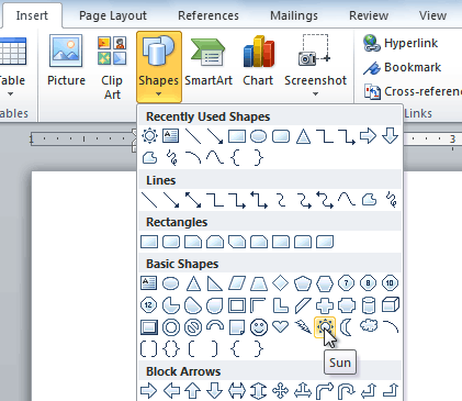
Learn the fundamental steps of inserting shapes in Publisher 2010. Navigate to the “Insert” tab on the Ribbon, where you’ll find a variety of shape options. Click on your desired shape to insert it into your publication.

1.2 Importing External Objects

Discover how to import external objects such as images and clip art into your publication. Utilize the “Insert Picture” option to bring in visual elements that complement your design.

Section 2: Customizing Shapes and Objects

2.1 Resizing and Scaling

Master the art of resizing and scaling shapes to achieve the desired proportions. Publisher 2010 provides handles and guidelines for precise adjustments.

2.2 Rotating and Flipping

Explore the options for rotating and flipping shapes to add dynamic flair to your design. The Ribbon offers intuitive tools for these transformations.

2.3 Grouping and Ungrouping

Efficiently manage multiple shapes by grouping them together. Conversely, ungroup shapes to work on individual elements. This enhances flexibility in your design process.

Section 3: Formatting and Styling

3.1 Fill and Outline Options

Dive into the myriad of fill and outline options available for shapes. Experiment with solid colors, gradients, patterns, and more to customize the appearance of your objects.

3.2 Shadow, Glow, and Reflection Effects

Enhance the visual impact of your shapes by applying shadow, glow, or reflection effects. These features, found in the Ribbon, add depth and dimension to your design.

3.3 Shape Styles

Explore pre-designed Shape Styles in Publisher 2010. These styles offer a quick and stylish way to format your shapes, providing a consistent look throughout your publication.

Section 4: Layering and Arrangement

4.1 Understanding the Layering Concept

Delve into the concept of layers in Publisher 2010. Understanding layering is crucial for controlling the visibility and arrangement of shapes in your publication.

4.2 Sending to Back and Bringing to Front

Learn how to manipulate the stacking order of shapes. Use the “Send to Back” and “Bring to Front” options to control which shapes appear in front of or behind others.

Section 5: Connecting and Combining Shapes

5.1 Connector Lines

Enhance your design with connector lines that link different shapes. Utilize the “Connector” tool in the Ribbon to create dynamic relationships between elements.

5.2 Combining Shapes

Experiment with combining shapes to create custom designs. The “Combine Shapes” tool in Publisher 2010 allows you to merge, subtract, and intersect shapes for unique outcomes.

Section 6: WordArt and Text Boxes

6.1 Creating WordArt

Leverage the WordArt feature to add stylized text to your publication. Customize the appearance of your text with artistic effects, colors, and transformations.

6.2 Text Boxes and Shape Integration

Understand how text boxes integrate with shapes. Combine text boxes with shapes to create visually appealing compositions that seamlessly blend text and graphics.

Section 7: Advanced Design Techniques

7.1 3D Effects

Elevate your design with 3D effects. Publisher 2010 offers options for adding depth to your shapes, allowing you to create visually striking three-dimensional elements.

7.2 Custom Shape Creation

Explore the process of creating custom shapes in Publisher 2010. The “Edit Points” feature enables you to tailor shapes to fit your unique design requirements.

Section 8: SmartArt Graphics

8.1 Utilizing SmartArt

Integrate SmartArt graphics into your publication for a streamlined and professional look. Choose from a variety of SmartArt layouts to convey information effectively.

8.2 Customizing SmartArt

Customize SmartArt graphics to align with your design preferences. Adjust colors, styles, and content to create visually appealing and informative diagrams.

Section 9: Checking and Aligning Objects

9.1 Aligning Objects

Maintain precision in your design by aligning objects. Utilize alignment tools in the Ribbon to ensure that shapes and objects are evenly spaced and aligned.

9.2 Checking Spelling and Grammar

While not directly related to shapes, it’s essential to proofread any text associated with your objects. Use the spell check feature to catch and correct any errors.

Section 10: Saving and Sharing Visual Designs

10.1 Save Options

Before finalizing your design, save your work. Choose appropriate file formats and locations to ensure easy access and collaboration.

10.2 Exporting and Sharing

Consider exporting your visual-rich publication to formats such as PDF for easy sharing and distribution. Explore sharing options, including email and cloud storage.

Section 11: Troubleshooting and FAQs

11.1 Common Design Challenges

Address common design challenges related to shapes, such as alignment issues, color discrepancies, or difficulties with combining shapes.

11.2 Printing Considerations

When preparing for printing, ensure that your shapes and objects follow printing guidelines. Adjust colors, resolution, and shapes as needed for optimal print quality.

Conclusion

Mastering the art of working with shapes and objects in Microsoft Publisher 2010 is key to creating visually captivating publications. By exploring the diverse range of tools and features outlined in this comprehensive guide, you’re not just manipulating shapes – you’re crafting visual masterpieces. Whether you’re designing brochures, flyers, or business cards, Publisher 2010 empowers you to communicate effectively through the language of graphic elements. Happy designing!

Categories
How To Guides Microsoft Office

Mastering Typography: A Comprehensive Guide to Working with Text in Microsoft Publisher 2010

Introduction

Text is a fundamental element in any publication, serving as the primary vehicle for communication and information delivery. Microsoft Publisher 2010 offers a robust set of tools and features for working with text, allowing users to craft visually engaging and professional-quality publications. This comprehensive guide will delve into the intricacies of working with text in Publisher 2010, exploring everything from inserting and formatting text to advanced typography techniques.

Section 1: Inserting Text Boxes

1.1 Understanding Text Boxes

Text boxes serve as containers for text in Publisher 2010. Learn how to insert text boxes by navigating to the “Insert” tab on the Ribbon and selecting “Text Box.”

1.2 Drawing Text Boxes

Explore different methods of drawing text boxes, whether you prefer a simple rectangular box or a more freeform shape. Adjust the size and shape to accommodate your text content.

Section 2: Formatting Text

2.1 Font Selection

Publisher 2010 provides a wide range of fonts to choose from. Experiment with different fonts to find the one that complements your publication’s style and tone.

2.2 Font Size and Color

Adjusting font size and color is crucial for readability and visual appeal. Use the options in the Ribbon to set the appropriate size and color for your text.

2.3 Bold, Italic, and Underline

Emphasize key points in your text by applying formatting options such as bold, italic, and underline. These tools are easily accessible in the Ribbon.

Section 3: Paragraph Formatting

3.1 Alignment and Justification

Explore paragraph formatting options to control the alignment of your text. Choose from left, center, right, or justified alignment to achieve the desired layout.

3.2 Line Spacing and Indentation

Fine-tune the spacing between lines and paragraphs for improved readability. Adjust indentation settings to create a well-structured and organized layout.

Section 4: Bullets and Numbering

4.1 Creating Bulleted Lists

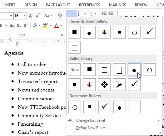
Learn how to create bulleted lists to present information in a clear and concise manner. Customize bullet styles and spacing to enhance the visual impact.

4.2 Numbered Lists

Utilize numbered lists for step-by-step instructions or to sequence information. Publisher 2010 offers flexibility in customizing numbering styles.

Section 5: Text Effects and Styles

5.1 Applying Text Effects

Publisher 2010 includes text effects to add flair to your typography. Experiment with shadow, reflection, and other effects to create a visually striking impact.

5.2 Using WordArt

Explore the WordArt feature for creative and stylized text. Customize the appearance of your text with artistic effects, shapes, and transformations.

Section 6: Advanced Typography Techniques

6.1 Kerning and Tracking

Refine the spacing between individual characters with kerning and tracking adjustments. Achieve a harmonious and visually pleasing text arrangement.

6.2 Drop Caps

Enhance the beginning of paragraphs with drop caps. Publisher 2010 allows you to customize the size and appearance of drop caps for a sophisticated layout.

Section 7: Text Wrap and Shapes

7.1 Text Wrap Options

When working with images or shapes, understand the text wrap options available in Publisher 2010. Control how text flows around objects to create a seamless design.

7.2 Linking Text Boxes

For longer bodies of text, link text boxes to allow for a continuous flow of content. This is particularly useful for newsletters and multi-page publications.

Section 8: Tables and Text

8.1 Inserting Tables

When dealing with structured data, insert tables to organize information. Publisher 2010 provides tools for creating and customizing tables with ease.

8.2 Text in Tables

Learn how to add and format text within table cells. Adjust text alignment, apply formatting, and use tables for a clean and organized presentation of data.

Section 9: Checking Spelling and Grammar

9.1 Spell Check

Ensure the accuracy of your text by using the built-in spell check feature. Navigate to the “Review” tab on the Ribbon and run a spell check to catch and correct errors.

9.2 Grammar Check

Publisher 2010 also offers grammar checking tools. Use these to enhance the professionalism of your text and eliminate grammatical mistakes.

Section 10: Saving and Sharing Text-Rich Publications

10.1 Save Options

Before finalizing your publication, save your work. Choose appropriate file formats and locations to ensure easy access and collaboration.

10.2 Exporting and Sharing

Consider exporting your text-rich publication to formats such as PDF for easy sharing and distribution. Explore sharing options, including email and cloud storage.

Section 11: Troubleshooting and FAQs

11.1 Text Formatting Challenges

Address common text formatting challenges, such as inconsistent font sizes or spacing issues. Troubleshoot and refine your text to achieve a polished result.

11.2 Printing Considerations

When preparing for printing, ensure that your text is legible and follows printing guidelines. Adjust font sizes and spacing as needed for optimal print quality.

Conclusion

Mastering text in Microsoft Publisher 2010 is an essential skill for creating visually appealing and professional publications. By exploring the diverse range of text tools and features outlined in this comprehensive guide, you’re not just working with text – you’re elevating the visual impact of your design. Whether you’re crafting newsletters, brochures, or business cards, Publisher 2010 empowers you to communicate effectively through the art of typography. Happy designing!