In the realm of computer-aided design (CAD), blocks serve as fundamental building blocks for creating, organizing, and reusing geometry and data within drawings. Mastering the techniques for working with blocks in AutoCAD is essential for enhancing productivity, maintaining consistency, and streamlining workflows in various design projects. Whether you’re an architect, engineer, designer, or drafting professional, understanding how to effectively work with blocks empowers you to create complex designs efficiently and with precision. In this comprehensive guide, we’ll explore the tools and techniques for working with blocks in AutoCAD, discuss their applications and functionalities, and provide step-by-step instructions to help you refine your drafting skills and unlock new possibilities in your design projects.
Understanding Blocks in AutoCAD:
Before delving into the specifics of working with blocks in AutoCAD, it’s essential to grasp the concepts and functionalities of blocks:
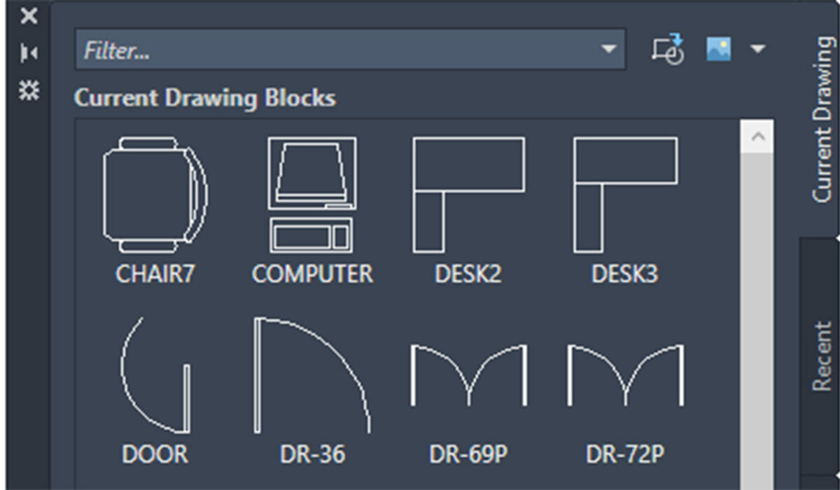
- Block Objects: In AutoCAD, a block is a collection of one or more objects that are combined into a single entity. Blocks can consist of geometric shapes, text, attributes, or even other blocks, and they enable users to efficiently manage and manipulate complex geometry within drawings.
- Block References: Block references, also known as block instances, are instances of a block inserted into a drawing. When you insert a block reference, you create a link to the original block definition, allowing you to reuse and modify the block across multiple instances within the drawing.
Working with Blocks in AutoCAD:
AutoCAD provides a variety of tools and commands for creating, inserting, editing, and managing blocks, allowing users to incorporate reusable elements into their drawings effectively. Here’s how to work with blocks in AutoCAD:
- Creating Blocks:
- To create a block in AutoCAD, select the objects you want to include in the block and type “BLOCK” in the command line or click on the Block Definition tool in the Insert panel on the Home tab of the Ribbon.
- Specify the base point for the block, which defines the insertion point when you insert the block into a drawing.
- Enter a name for the block and specify any additional settings, such as scale, rotation, or visibility.
- Click “OK” to create the block definition.
- Inserting Blocks:
- To insert a block into a drawing, type “INSERT” in the command line or click on the Insert tool in the Blocks panel on the Home tab of the Ribbon.
- Specify the insertion point for the block and any additional insertion options, such as scale, rotation, or mirroring.
- Select the block from the block library or browse for the block file on your computer.
- Click to place the block in the drawing.
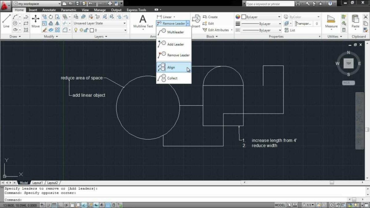
- Editing Blocks:
- To edit a block in AutoCAD, type “BLOCKEDIT” in the command line or double-click on a block reference to enter the block editor.
- Make the desired changes to the block geometry, attributes, or properties using standard editing commands and tools.
- Exit the block editor to save the changes and update all instances of the block within the drawing.
- Managing Blocks:
- To manage blocks in AutoCAD, use the Block Editor and Block Manager tools to view, insert, edit, and purge block definitions within the drawing.
- Use the Block Attribute Manager to edit block attributes and their values, allowing you to update text or data associated with block instances.
Advanced Techniques for Working with Blocks:
In addition to basic block tools and commands, AutoCAD offers advanced techniques for optimizing block usage and enhancing productivity:
- Dynamic Blocks: Create dynamic blocks in AutoCAD to add intelligence and interactivity to block instances. Dynamic blocks allow users to modify block geometry, visibility, and properties using grips and parameters, enabling greater flexibility and customization.
- External References (Xrefs): Use external references (Xrefs) to reference and incorporate blocks from external drawing files into your current drawing. Xrefs facilitate collaboration, version control, and modular design workflows by allowing multiple users to work on different parts of a design simultaneously.
- Block Libraries: Build and maintain block libraries containing commonly used blocks, symbols, and components to streamline design workflows and ensure consistency across projects. Organize block libraries by category, type, or project to facilitate easy access and reuse.
- Nested Blocks: Create nested blocks by inserting one block into another block, allowing you to build complex assemblies and hierarchical structures within drawings. Nested blocks provide a modular approach to design and enable efficient management of intricate geometry.
Best Practices for Working with Blocks:
To maximize efficiency and maintain consistency when working with blocks in AutoCAD, consider implementing the following best practices:
- Standardize Block Naming: Establish and adhere to a consistent naming convention for blocks to ensure clarity and organization within block libraries and drawings.
- Document Block Properties: Document block properties, attributes, and usage guidelines to facilitate collaboration and ensure accurate interpretation of block content by other users.
- Reuse Existing Blocks: Prioritize the reuse of existing blocks whenever possible to minimize redundancy, maintain consistency, and optimize drawing file size.
- Review and Update Blocks: Regularly review and update block definitions to incorporate design changes, corrections, or improvements and ensure that all block instances reflect the latest revisions.
Conclusion:
Mastering the techniques for working with blocks in AutoCAD is essential for enhancing productivity, maintaining consistency, and streamlining workflows in various design projects. By understanding the functionalities of blocks, practicing their use in different design scenarios, and implementing best practices for efficiency and consistency, you can elevate your drafting skills and unlock new possibilities in your design projects. Whether you’re creating architectural plans, mechanical drawings, or electrical schematics, knowing how to work with blocks effectively will enable you to produce high-quality drawings with confidence and precision. With dedication, practice, and a commitment to continuous learning, you’ll become proficient in working with blocks in AutoCAD and excel in your CAD design endeavors.