Introduction:
The Roto Brush tool in Adobe After Effects is a powerful feature that enables users to perform precise and efficient rotoscoping, allowing them to isolate and manipulate elements within video footage with unparalleled accuracy. Whether you’re removing backgrounds, isolating subjects, or applying effects to specific areas, mastering the Roto Brush tool opens up a world of creative possibilities for video editors, visual effects artists, and motion graphic designers. In this extensive guide, we’ll delve into the step-by-step process of using the Roto Brush tool in Adobe After Effects, covering everything from basic rotoscoping techniques to advanced tips and tricks, to help you unlock the full potential of this essential tool.
Understanding the Roto Brush Tool in Adobe After Effects:
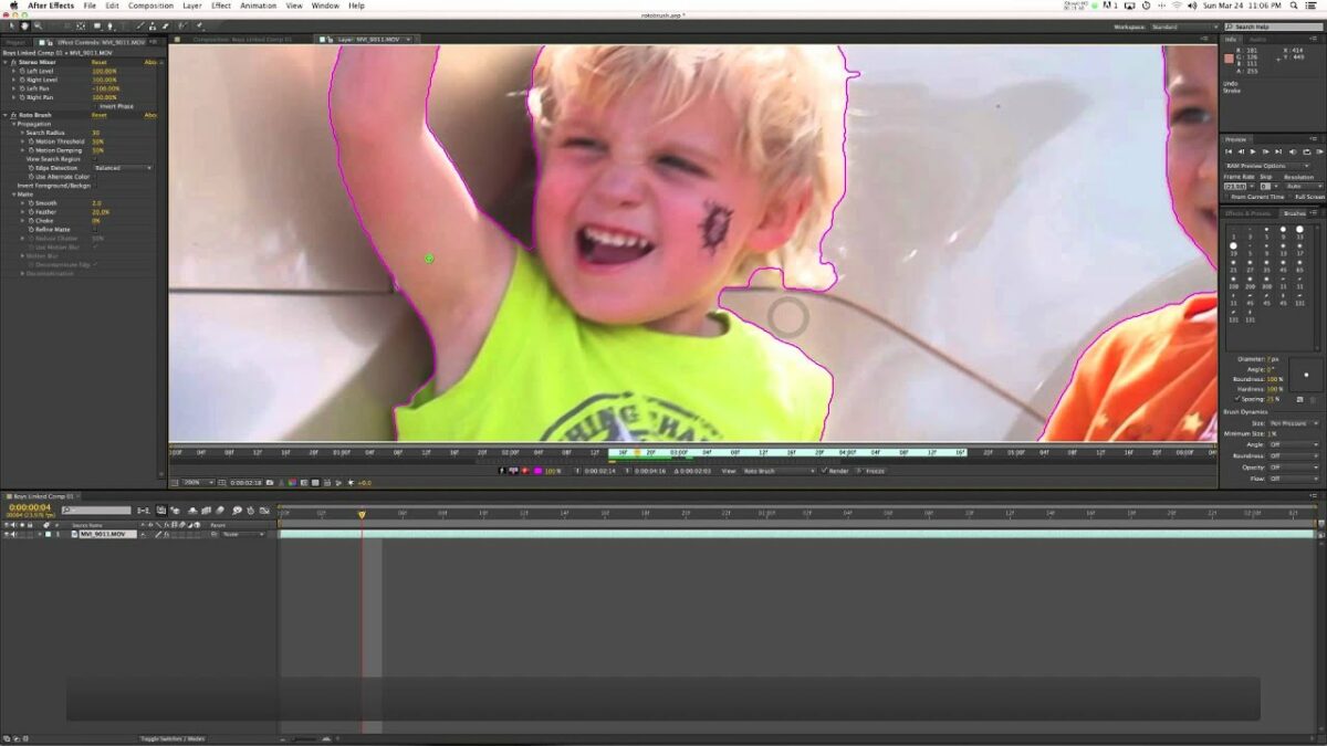
The Roto Brush tool in Adobe After Effects is a rotoscoping tool that allows users to select and isolate foreground elements within video footage with precision and efficiency. Unlike traditional rotoscoping methods, which require manual frame-by-frame masking, the Roto Brush tool utilizes advanced algorithms and machine learning techniques to automatically identify and track the boundaries of objects in motion, making the rotoscoping process faster and more intuitive. The Roto Brush tool works by analyzing the color and contrast differences between foreground and background elements, allowing users to create detailed mattes that can be used to isolate and manipulate elements within the footage.
Key Features of the Roto Brush Tool in Adobe After Effects:
Understanding the key features of the Roto Brush tool in Adobe After Effects is essential for harnessing its full potential. Some key features include:
- Automatic Selection: The Roto Brush tool automatically analyzes the color and contrast differences between foreground and background elements and creates an initial selection based on these differences. Users can refine and adjust the selection using intuitive brush tools and selection controls.
- Refine Edge: The Refine Edge feature allows users to fine-tune the edges of the selection to ensure smooth and accurate mattes. Users can adjust parameters such as Feather, Choke, Contrast, and Shift Edge to achieve precise edge refinement and improve the quality of the selection.
- Motion Tracking: The Roto Brush tool includes built-in motion tracking capabilities that allow users to track the movement of selected objects over time. This enables users to create accurate mattes that adapt to the motion of the object, reducing the need for manual adjustments frame by frame.
- Propagation: The Propagation feature automatically extends the selection boundary based on the motion of the object, allowing users to quickly and easily cover large areas of the footage without the need for manual adjustments.
- Fine Detail Preservation: The Roto Brush tool preserves fine details and textures within the selection, ensuring that intricate elements such as hair, fur, or foliage are accurately captured in the matte.
Step-by-Step Guide to Using the Roto Brush Tool in Adobe After Effects:
Follow these step-by-step instructions to use the Roto Brush tool in Adobe After Effects:
- Import Footage:
- Launch Adobe After Effects and create a new project.
- Import the video footage you want to rotoscope into your project by selecting “File” > “Import” > “File” from the menu.
- Create a Composition:
- Drag the imported footage from the Project panel into the Timeline panel to create a new composition.
- Set the composition settings, including resolution, frame rate, and duration, according to your project requirements.
- Select the Roto Brush Tool:
- In the Tools panel, select the Roto Brush tool (shortcut: Alt+W) or select it from the toolbar.
- Make an Initial Selection:
- Click and drag the Roto Brush tool over the foreground object you want to isolate. The tool will automatically create an initial selection based on the color and contrast differences between the foreground and background elements.
- Refine the Selection:
- Use the Refine Edge tool (shortcut: Alt+Ctrl+R) to refine the edges of the selection. Adjust parameters such as Feather, Choke, Contrast, and Shift Edge to achieve smooth and accurate matte edges.
- Enable Motion Tracking:
- Enable motion tracking by clicking the “Toggle Track Matte” button in the Layer panel. After Effects will automatically track the movement of the selected object over time.
- Review and Adjust:
- Scrub through the timeline to review the selection and make any necessary adjustments. Use the Propagation feature to extend the selection boundary as needed to cover moving elements.
- Fine-Tune the Matte:
- Use the brush tools (shortcut: B) to manually refine the matte by adding or subtracting areas from the selection. Paint over areas where the Roto Brush tool may have missed or incorrectly selected.
- Apply Effects or Adjustments:
- Once you’re satisfied with the matte, apply effects or adjustments to the isolated object as desired. You can apply color correction, visual effects, or transformations to the isolated object without affecting the background.
- Preview and Render:
- Preview the rotoscoped footage in the Composition panel to ensure that the matte is accurate and the effect is applied correctly.
- Once you’re satisfied with the result, render the composition by selecting “Composition” > “Add to Render Queue” from the menu. Configure render settings and click “Render” to export the final composition.
Best Practices for Using the Roto Brush Tool in Adobe After Effects:
To achieve optimal results when using the Roto Brush tool in Adobe After Effects, consider the following best practices:
- Start with High-Quality Footage: The Roto Brush tool works best with high-quality footage that has clear and distinct foreground and background elements. Avoid footage with complex or cluttered backgrounds that may make it difficult for the tool to accurately distinguish between foreground and background elements.
- Work in Small Sections: Break down the rotoscoping process into smaller, manageable sections to maintain focus and accuracy. Rotoscope one section of the footage at a time, refining the selection and matte as you go.
- Use Multiple Layers: If your footage contains multiple foreground objects or elements, consider separating them onto different layers and rotoscoping them individually. This allows you to maintain control and flexibility over each element and apply effects or adjustments independently.
- Save Multiple Versions: Save multiple versions of your project file as you work through the rotoscoping process. This allows you to revert to previous versions if you make a mistake or want to try different approaches.
- Be Patient and Persistent: Rotoscoping can be a time-consuming and labor-intensive process, especially for complex or detailed footage. Be patient and persistent, and don’t rush through the process. Take breaks as needed to avoid eye strain and fatigue.
Conclusion:
In conclusion, the Roto Brush tool in Adobe After Effects is a versatile and powerful tool for performing precise and efficient rotoscoping. By understanding its key features, mastering its techniques, and following best practices, you can unlock the full potential of the Roto Brush tool and achieve stunning results in your video projects. So, dive into the world of rotoscoping, experiment with different techniques, and unleash your creativity with the Roto Brush tool in Adobe After Effects.