Introduction:
In the realm of graphic design, the quest for the perfect font is an integral part of the creative journey. CorelDRAW, a leading graphic design software, empowers designers with a diverse array of fonts to choose from. Navigating this expansive font library is made efficient through the software’s robust search capabilities. This comprehensive guide delves into the nuances of font searching in CorelDRAW, equipping designers with the tools to streamline their workflow, discover hidden gems, and unleash the full potential of typography in their designs.
Understanding Font Searching in CorelDRAW:
Font searching in CorelDRAW involves the systematic exploration and retrieval of fonts from the software’s extensive font library. The search functionality is designed to help designers quickly locate specific fonts, whether by name, style, characteristics, or other attributes. This process enhances the efficiency of font selection, allowing designers to focus on finding the most suitable typefaces for their design projects.
Key Aspects of Font Searching in CorelDRAW:
- Name-Based Searching:
- CorelDRAW allows designers to search for fonts by their names. This is particularly useful when designers have a specific font in mind and want to locate it quickly within the font library.
- Style and Characteristics-Based Searching:
- Search functionality extends to style and characteristics, enabling designers to find fonts based on specific attributes such as serif, sans-serif, bold, italic, or other distinguishing features.
- Keyword-Based Searching:
- CorelDRAW’s advanced search capabilities include keyword-based searching. Designers can input keywords related to the visual style, mood, or theme they are aiming for, allowing the software to suggest relevant fonts.
- Script and Language-Based Searching:
- For multilingual design projects, CorelDRAW offers search options based on script and language support. Designers can search for fonts that cater to specific linguistic requirements or writing systems.
Font Searching in CorelDRAW:
- Accessing the Text Tool:
- Begin by launching CorelDRAW and opening the design project where you want to work with fonts. Activate the Text Tool by selecting it from the toolbox or pressing the shortcut key “T.”
- Selecting a Text Object:
- Click on an existing text object within your design or create a new text object by clicking and dragging to define the text box. Ensure that the text object is selected and ready for editing.
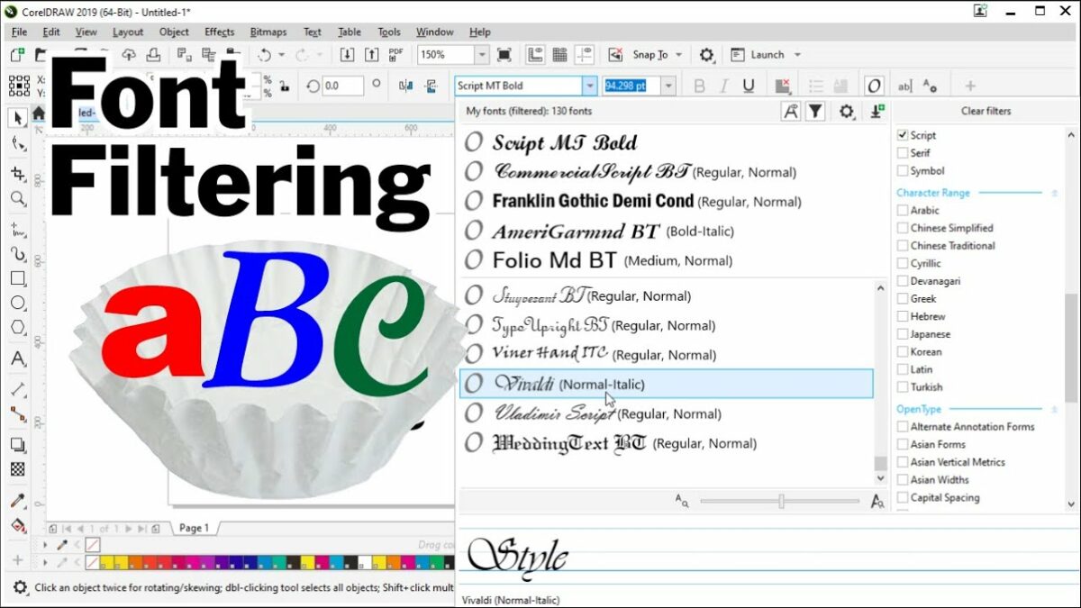
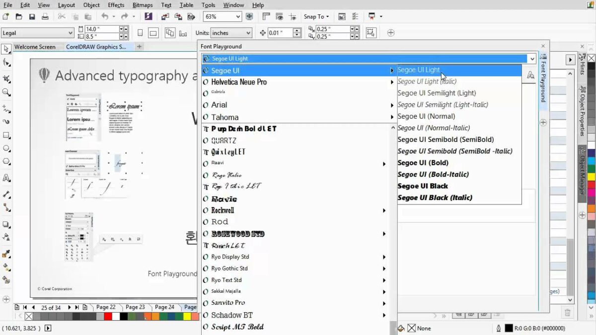
- Accessing the Font Dropdown Menu:
- Locate the font dropdown menu in the Property Bar at the top of the CorelDRAW interface. Click on the dropdown arrow to reveal the list of available fonts installed on your system.
- Using Name-Based Searching:
- If you have a specific font in mind, begin typing its name in the font dropdown menu. CorelDRAW will automatically filter the font list based on the characters you input, making it easier to locate the desired font.
- Exploring Style and Characteristics-Based Searching:
- To search for fonts based on style and characteristics, look for filter options within the font dropdown menu. Depending on your version of CorelDRAW, these options may include categories such as serif, sans-serif, bold, italic, and more.
- Keyword-Based Searching:
- Utilize the search bar or input field within the font dropdown menu to enter keywords related to the visual style or theme you’re aiming for. CorelDRAW will dynamically filter fonts based on the entered keywords, offering suggestions that align with your criteria.
- Script and Language-Based Searching:
- If your design project involves specific scripts or languages, explore the script and language filters within the font dropdown menu. This enables you to search for fonts tailored to the linguistic requirements of your project.
- Previewing Search Results:
- As you perform searches, CorelDRAW provides a live preview of the search results. This real-time feedback allows you to see how different fonts align with your search criteria, facilitating informed decision-making.
Advanced Font Searching Techniques:
- Combining Multiple Search Criteria:
- CorelDRAW allows designers to combine multiple search criteria for a more refined font search. For example, you can search for sans-serif fonts that are also italicized, narrowing down the options to fit specific design requirements.
- Saved Searches and Favorites:
- Save frequently used or favorite searches for quick access in future projects. This feature enhances workflow efficiency, especially for designers who consistently work with specific fonts or styles.
- Utilizing External Font Management Tools:
- For designers with extensive font collections, consider using external font management tools in conjunction with CorelDRAW. These tools often provide advanced search and categorization features, enhancing the overall font management experience.
- Collaborative Searching:
- When working on collaborative projects, communicate search criteria and preferences with team members. This ensures a unified approach to font selection and promotes consistency across design elements.
Practical Applications of Font Searching in CorelDRAW:
- Efficient Font Discovery:
- Font searching is instrumental for efficient font discovery, especially in scenarios where designers need to quickly locate and experiment with specific typefaces. This is valuable for time-sensitive projects or tight deadlines.
- Consistent Branding Across Projects:
- Font searching facilitates consistent branding across various design projects. Designers can search for fonts that align with established brand guidelines, ensuring a unified visual identity in marketing materials, presentations, and more.
- Tailoring Fonts for Design Elements:
- Font searching is beneficial when tailoring fonts for specific design elements. Designers can search for fonts that suit headers, subheadings, body text, and other components, contributing to a cohesive design hierarchy.
- Multilingual Design Projects:
- In multilingual design projects, font searching aids in finding fonts that support specific scripts and languages. Designers can seamlessly integrate fonts that cater to diverse linguistic requirements, ensuring effective communication.
- Web Design and Digital Platforms:
- Font searching is crucial for web design and digital platforms, where typography plays a significant role in user experience. Designers can search for web-safe fonts and styles that enhance readability across various devices and screen sizes.
- Exploring Theme-Based Fonts:
- Theme-based font searching allows designers to discover fonts that align with the thematic elements of a project. This is particularly useful for creating visually cohesive designs for events, promotions, or themed campaigns.
- Personalizing Design Styles:
- Designers can use font searching to personalize their design styles and experiment with different typefaces. This encourages creativity and allows designers to develop a unique typographic signature in their work.
Conclusion:
In conclusion, font searching in CorelDRAW is a dynamic process that empowers designers to explore, discover, and implement diverse typefaces with ease. By understanding the various search options, employing advanced techniques, and applying these insights to practical scenarios, designers can elevate their typographic choices and enhance the overall impact of their designs.
Embrace the artistry of font searching, experiment with different search criteria, and let CorelDRAW be your gateway to a world of typographic possibilities. From efficient font discovery to consistent branding, font searching is a versatile tool that enriches the creative process, allowing designers to sculpt compelling visual narratives through the art of typography.