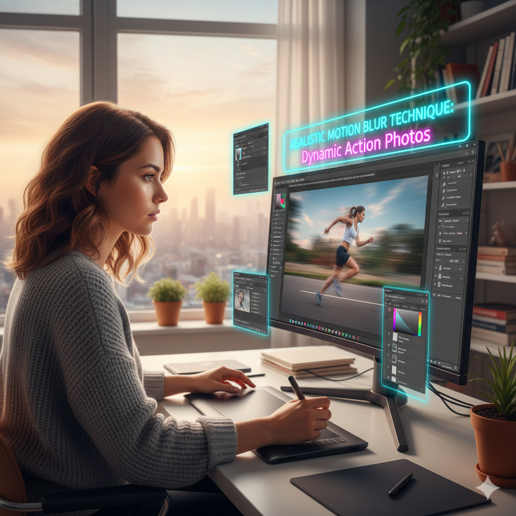
Realistic Motion Blur Techniques for Dynamic Action Photos
Motion blur is an essential technique in photography and digital editing, as it allows for the communication of speed, movement, and energy in situations that include dynamic motion. The proper use of this technique has the potential to convert a static photo into a visually appealing moment that has a sense of life. The creation of realistic motion blur in Photoshop may be accomplished in a number of different ways, ranging from the fundamental directional blurring method to more complex layer-based techniques that maintain subject clarity while putting an emphasis on movement.
Recognizing the Role of Motion Blur in Photography and Digital Design
A natural phenomenon known as motion blur takes place when an object moves rapidly in relation to the shutter speed of the camera, resulting in streaks or trails that give the impression of velocity. It is possible to imitate motion blur in digital editing in order to improve the appearance of a static picture, draw attention to movement, or provide creative effects. When it comes to achieving realism, it is essential to pay attention to the perspective, light direction, and subject motion of the picture. In many cases, photos that are overused or uniformly blurred look to be manufactured.
The process of preparing the image by isolating the subject layers:
Using selection tools like as the Pen Tool, Object Selection, or Layer Masks, you should first isolate the moving subject from the backdrop before applying motion blur to the image. By converting the subject into a Smart Object, you can assure that the editing process is non-destructive. This allows you to make modifications to the blur strength, angle, and masking without affecting the original picture. In order to achieve a realistic blur application that does not disturb the surrounding environment, background separation is a necessary component.
It is possible to apply directional blur to linear motion.
The Motion Blur filter, which can be found by going to Filter > Blur > Motion Blur, is the most basic approach for rendering motion simulations. The subject’s trajectory may be imitated by using this filter, which gives you the ability to select both the angle and the distance of blur. It is important that the angle be in line with the direction of motion when it comes to linear motion, such as while running, cycling, or driving a vehicle. Adjust the distance so that it corresponds to the speed that is felt; movement effects that are quicker are produced by longer distances.
When dealing with complex motion, using path blur
When it comes to curved or irregular movement routes, the Path Blur feature of Photoshop (Filter > Blur Gallery > Path Blur) offers a larger degree of autonomy. You have the ability to build your own bespoke motion routes using Path Blur, allowing you to alter the speed and taper along the trajectory. The exact modulation of blur intensity at various places is made possible by direction arrows and speed lines, making them ideal for spinning objects, dynamic postures, or erratic sports motions.
How to Distinguish Between Background and Foreground Blur
Different blur treatments are often required for the backdrop and the foreground in order to preserve the sense of realism. At the same time as their surrounds are blurred to mimic relative motion, subjects that are moving quickly may maintain their sharpness. The backdrop layer should be duplicated, the copy should have a greater blur applied to it, and regions where the subject is still in focus should be painted over. With this distinction, depth and speed are brought to the forefront, allowing the subject to stand out while maintaining the context of the surroundings.
The use of layer masking for the application of controlled blur
When it comes to carefully adding blur, layer masks are really necessary. When painting on a mask, using a soft brush provides for seamless transitions between sections that are crisp and others that are blurred. As an example, the wheels of a bicycle may be severely blurred, but the torso of the rider may stay clear. Natural trails are created by the use of gradual masking, which helps to eliminate sharp edges that might ruin the sense of motion.
The Development of Speed Trails to Achieve Dynamic Impact
The subject layer should be duplicated, motion blur should be applied to it, and it should be placed underneath the original subject for an additional dramatic impact. The opacity should be decreased, and areas should be masked, in order to produce semi-transparent trails that simulate rapid movement. In order to create the sensation of acceleration and kinetic energy, this approach is particularly useful for sports photography, as well as for cars and action sequence videography.
Enhancing Motion Through the Use of Radial Blur for Circular Movements
For the purpose of mimicking rotating or zoom effects, the Radial Blur effect (Filter > Blur > Radial Blur) is an excellent choice. While the Zoom mode puts more of an emphasis on forward or outward movement, the Spin mode attempts to simulate circular motion. You may add Radial Blur in a non-destructive manner by using a Smart Object, and then change the center point such that it corresponds to the subject’s pivot. With the use of layer masks, the effect may be integrated more organically without influencing the elements of the backdrop.
Making Changes to the Light and Highlights During the Motion
Because motion alters how light is perceived, blurring often necessitates making modest modifications to either the brightness or contrast. In order to keep the layers that are blurred looking realistic, you may use Curves, Levels, or Dodge and Burn. It is possible to accentuate directionality by using highlight streaks, and preventing artificial glow or overexposure by reducing the brightness of trailing sections would be beneficial. By making tweaks to the color and tone, blur may be made to blend in perfectly with the whole picture.
Combining a Number of Different Blur Types to Achieve Additional Realism
The use of Motion Blur, Path Blur, and Radial Blur in conjunction with one another produces layered effects that are capable of capturing intricate movement in extremely dynamic settings. For the purpose of achieving autonomous control, every form of blur should be placed on its own Smart Object layer. The final composition may be improved by adjusting the blending, masks, and opacity settings. Through the use of this layered method, you are able to accentuate speed, direction, and energy while yet preserving visually clear information.
Some last touches to ensure cohesion and a professional appearance
After motion blur has been applied, the picture should be examined for any irregularities, such as ghosting, edge halos, or overlaps that do not seem natural. Maintaining focus on the topic may be accomplished by the use of soft masks, extra layer changes, and selective sharpening. It is possible to further increase the feeling of speed and depth by using subtle gradients or vignette effects, which will complete a composition that is polished and focused on motion.
Finally, Bringing Action to Life in Conclusion
Through the use of realistic motion blur, motionless photographs may be transformed into dynamic and visually interesting scenarios. Using a combination of layer-based processes, directional and path-specific blurring, masking, and lighting tweaks, editors are able to replicate natural movement while yet preserving the clarity of the subject. Once you have mastered these approaches, you will be able to create action photographs of a professional standard that are suited for editorial, commercial, sports, or film projects.