Introduction:
Skin retouching and airbrushing in Photoshop are essential skills for photographers, digital artists, and retouchers aiming to create polished and visually appealing portraits. In this extensive guide, we will explore the intricacies of skin retouching, covering a range of techniques, tools, and best practices. Whether you’re a beginner looking to grasp the basics or an experienced user aiming to refine your skills, this tutorial aims to equip you with the knowledge to achieve flawless skin in your portraits while maintaining a natural and authentic look.
Section 1: Preparing Your Workspace
Before delving into the specifics of skin retouching, it’s crucial to set up your workspace and organize your files for efficient editing.
Subsection 1.1: Importing Images into Photoshop
Open Photoshop and import the portrait you wish to retouch. Ensure that the image is in a suitable resolution for detailed editing.
Subsection 1.2: Duplicating the Background Layer
Create a duplicate layer of the background to work non-destructively. Right-click on the background layer and select “Duplicate Layer.” This duplicate layer will serve as the base for your skin retouching.
Section 2: Basic Cleanup and Blemish Removal
Start the retouching process by addressing basic cleanup and removing any noticeable blemishes or imperfections.
Subsection 2.1: Spot Healing Brush Tool
The Spot Healing Brush tool is an excellent starting point for removing small blemishes, acne, or imperfections. Simply click on the affected areas, and Photoshop will intelligently replace them with surrounding textures.
Subsection 2.2: Healing Brush Tool
For larger or more complex areas, switch to the Healing Brush tool. Alt-click to sample a nearby clean area and then paint over the blemish or imperfection to blend it with the surrounding skin texture.
Subsection 2.3: Clone Stamp Tool
The Clone Stamp tool is useful for replicating texture from one part of the image to another. Use it cautiously, sampling an area and then painting over imperfections to maintain a natural look.
Section 3: Skin Smoothing Techniques
Achieving smooth, flawless skin while retaining natural texture is a key aspect of effective skin retouching.
Subsection 3.1: Utilizing the Gaussian Blur Filter
Create a duplicate layer and apply a subtle Gaussian Blur to the duplicate layer. This helps to smooth out the skin while preserving overall texture. Experiment with the radius to find the right balance.
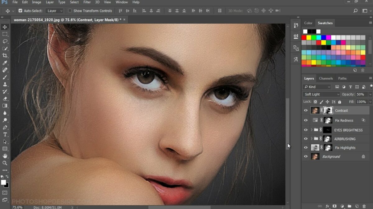
Subsection 3.2: Adding a Layer Mask for Selective Application
Add a layer mask to the blurred layer and use a soft brush to paint over areas where you want to maintain texture, such as eyes, lips, and hair. This selective application ensures that skin smoothing is applied only to desired regions.
Subsection 3.3: High Pass Filter for Texture Enhancement
Create a new layer and apply the High Pass filter (Filter > Other > High Pass). Adjust the radius to enhance skin texture. Change the blending mode of this layer to Soft Light or Overlay to integrate the texture seamlessly.
Section 4: Color Correction and Skin Tone Enhancement
Achieving accurate and pleasing skin tones is crucial in skin retouching.
Subsection 4.1: Adjusting White Balance
Use the Color Balance adjustment layer (Layer > New Adjustment Layer > Color Balance) to correct any color casts or inaccuracies in the image. Tweak sliders for Shadows, Midtones, and Highlights until skin tones appear natural.
Subsection 4.2: Targeted Color Correction with Hue/Saturation
Apply a Hue/Saturation adjustment layer to target specific colors in the image. This is especially useful for adjusting the intensity of reds or yellows in skin tones. Experiment with saturation and lightness sliders for precise control.
Subsection 4.3: Curves Adjustment for Contrast and Color
Fine-tune contrast and color balance with a Curves adjustment layer. Adjust the curve for RGB and individual color channels to achieve optimal tonal balance and color harmony.
Section 5: Eye and Teeth Enhancement
Eyes and teeth are focal points in a portrait, and enhancing them can significantly elevate the overall impact.
Subsection 5.1: Brightening Eyes with Dodge Tool
Select the Dodge Tool from the toolbar and set it to Highlights. Gently brush over the whites of the eyes to brighten them. Adjust the exposure setting for subtle or more pronounced effects.
Subsection 5.2: Enhancing Catchlights
Use the Dodge Tool or add catchlights manually to the eyes. Catchlights add a spark of life to the eyes and contribute to a more engaging and vibrant portrait.
Subsection 5.3: Teeth Whitening with Hue/Saturation
Apply a targeted Hue/Saturation adjustment layer to whiten teeth. Adjust the saturation and lightness sliders for the yellows to achieve a natural yet brighter appearance.
Section 6: Fine-Tuning Facial Features
Refine facial features to achieve a balanced and pleasing look.
Subsection 6.1: Nose and Lip Contouring
Use the Dodge and Burn tools to subtly contour the nose and enhance the natural shadows and highlights. Similarly, refine the contours of the lips for a more defined look.
Subsection 6.2: Softening Wrinkles and Fine Lines
Apply a subtle softening technique to reduce the appearance of wrinkles and fine lines. Use the Healing Brush or Clone Stamp tool with a light touch to maintain a natural look.
Subsection 6.3: Eyebrow Grooming
Groom and enhance eyebrows by using the Clone Stamp or Healing Brush tool to fill in gaps or define the shape. Be mindful of maintaining a realistic and well-balanced appearance.
Section 7: Final Adjustments and Global Enhancements
Fine-tune the overall image with global adjustments for a polished and cohesive result.
Subsection 7.1: Global Contrast with Levels Adjustment
Add a Levels adjustment layer to enhance overall contrast. Adjust the black and white points to fine-tune the tonal range. This step contributes to a visually striking portrait.
Subsection 7.2: Vignette for Emphasis
Create a subtle vignette by adding a new layer, filling it with a dark color, and using a soft brush to paint over the edges. Adjust the layer opacity to control the vignette’s intensity. This technique draws attention to the subject.
Subsection 7.3: Final Sharpening with Unsharp Mask
Apply a light sharpening to the entire image using the Unsharp Mask filter (Filter > Sharpen > Unsharp Mask). Be cautious not to over-sharpen, aiming for a natural and refined look.
Section 8: Exporting the Retouched Portrait
Once satisfied with the retouching, export the final portrait for sharing, printing, or further use.
Subsection 8.1: Save As High-Resolution Image
Save the retouched portrait in a suitable format, such as JPEG or TIFF, ensuring it retains high resolution for optimal quality.
Subsection 8.2: Maintain Layered PSD File
Save a layered PSD file to preserve all the retouching layers. This allows for future edits or adjustments without loss of quality.
Section 9: Showcasing Your Retouched Portraits
Celebrate your mastery of skin retouching by showcasing your final portraits. Share your work on photography platforms, social media, or incorporate it into your portfolio. Engage with the photography community, seek constructive feedback, and let your retouched portraits stand as a testament to your skill in enhancing the beauty of your subjects.
Conclusion:
Skin retouching and airbrushing in Photoshop require a delicate balance between enhancement and authenticity. By following the comprehensive steps outlined in this guide, you can confidently approach portrait retouching with a nuanced understanding of techniques for basic cleanup, skin smoothing, color correction, and overall image enhancement. May your retouched portraits reflect the essence and beauty of your subjects, capturing their unique qualities with grace and finesse.