Using Photoshop Layer Comps to Batch Export Multiple YouTube Thumbnails at Once
When handled manually, the process of creating several thumbnails for YouTube videos, whether for A/B testing, branding variants, or other purposes, can soon become a procedure that is both monotonous and time-consuming. When it comes to saving different layout states inside a single document, Photoshop has a function known as Layer Comps that is both powerful and often misused. When used in conjunction with batch export features, Layer Comps have the potential to significantly simplify the process of creating thumbnails by allowing designers to produce many versions with just a few clicks. By using this strategy, content producers and social media managers that want consistent visual output while keeping design flexibility will find this technique to be extremely advantageous. It is possible to prevent superfluous file duplication and reduction in editing mistakes if you organize distinct thumbnail versions into Layer Comps. The purpose of this article is to provide an explanation of how to make excellent use of Layer Comps and include them into a process that is very efficient for outputting several YouTube thumbnails at the same time.# Acquiring Knowledge of Layer Comps and the Core Functionality They Hold
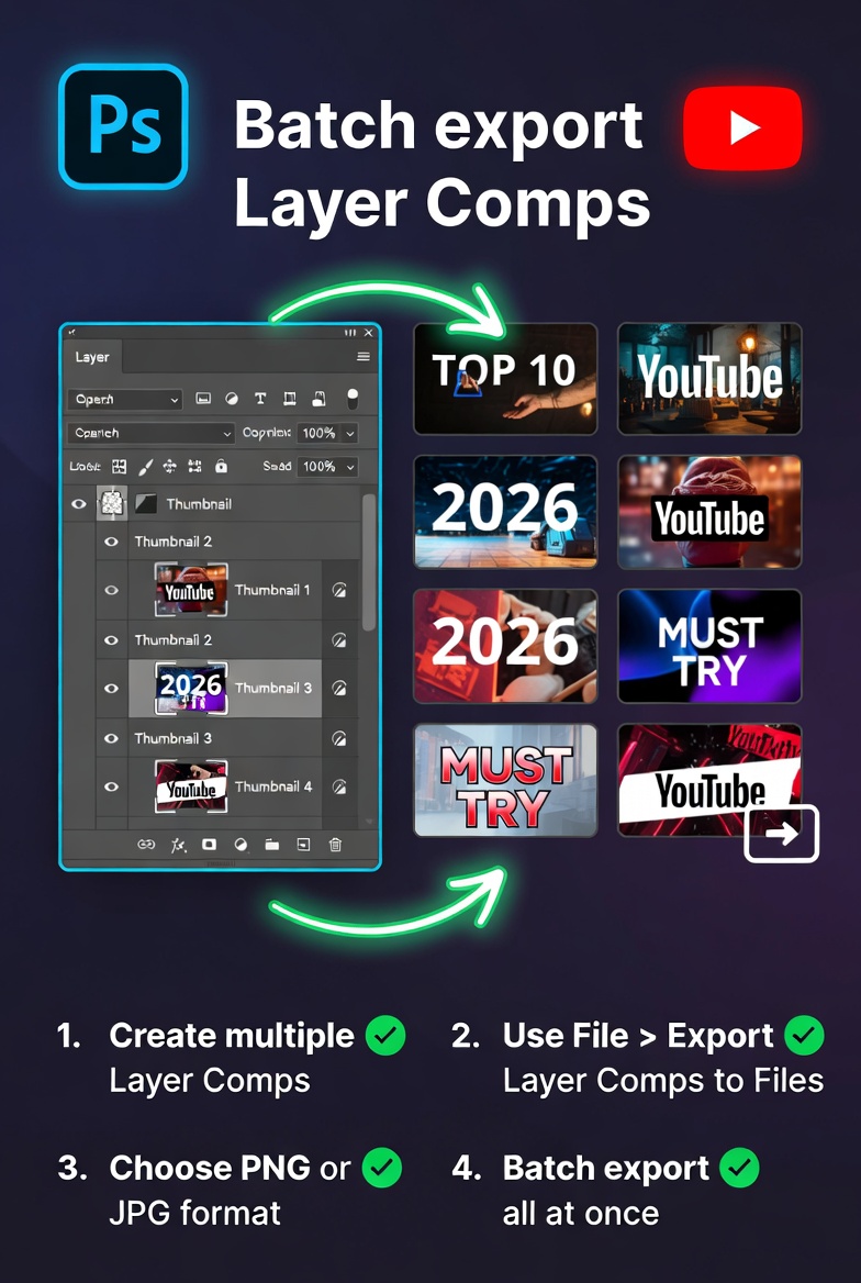
The Layer Comps feature in Photoshop allows users to create snapshots of the visibility, location, and look of a document’s layers at a particular instant in time. Users are able to move between multiple design variants without affecting the file’s original structure since each comp maintains the status of the layers that have been chosen. When working on several thumbnail ideas inside a single project, this function is very helpful since it maintains everything in an orderly and accessible manner. The designers are able to handle all of the different variants inside a single document, rather than having to create separate files for each variation. Because Layer Comps are able to record modifications like as text variants, color alterations, and element locations, they are an excellent tool for experimenting with thumbnails. It is vital to have a thorough understanding of the operation of these comps in order to construct a more effective process for batch exporting that will save time and ensure consistency.
Number One: Configuring Your Thumbnail Template to Support Multiple Variations
Before beginning the process of developing Layer Comps, it is essential to build a thumbnail template that is both versatile and capable of supporting various variants. This entails organizing your Photoshop project in a way that includes layers that are well-organized, elements that are grouped together, and components that are properly identified. There should be distinct layers or groups for each element that may vary between thumbnails. Examples of such elements are titles, photos, and background colors. It is possible to guarantee that all exported thumbnails will satisfy platform requirements by ensuring that the resolution and aspect ratio remain constant. You will establish a strong basis for the efficient generation of various designs if you provide a template that is both clean and scalable. Because it defines how easy you will be able to manage and switch between various thumbnail versions later on in the process, this preparation step is really important.
Creating and Managing Layer Comps in an Effective Manner
When you have finished preparing your template, you may start making Layer Comps for each of the many thumbnail variations. Making adjustments to the visibility and characteristics of layers, followed by saving the current state as a new composition in the Layer Comps panel, is required to do this. Every compilation need to have a name that is unmistakably descriptive of its function, which may include a variety of names, color schemes, or graphic styles. As you produce more comps, it becomes more vital to organize them in a logical manner so that you can navigate and modify them more quickly. Photoshop gives you the ability to update current comps in the event that modifications are made. This ensures that your variants continue to be cohesive with the most recent design improvements you have made. When dealing with various thumbnail versions in a single file, it is helpful to preserve clarity and reduce misunderstanding by managing Layer Comps in an efficient manner.
Creating Different Thumbnail Designs to Achieve the Highest Possible Engagement
Through the use of Layer Comps, it is simple to experiment with various thumbnail designs with the intention of increasing click-through statistics. Without having to duplicate your file, you are able to experiment with different permutations of font, color contrast, face expressions, and visual hierarchy. Because of this flexibility, creative experimentation and design choices that are more data-driven are encouraged. By maintaining all variants inside a single document, you will be able to evaluate various techniques in a short amount of time and adapt your ideas depending on the insights gained from performance. It is important to maintain consistency in the features of your brand, including as typefaces and color palettes, so that all of your thumbnails are in line with your channel identity. When you use Layer Comps for this reason, not only does it speed up production, but it also improves the quality of your visual material and makes it more effective.
Making Use of Export Features in Order to Process Layer Comps in Batch
Photoshop is equipped with features that allow users to export Layer Comps as separate files, which makes the process of batch processing simple and effective. You are able to produce individual picture files for each variant by using the export function, which allows the selection of selected or all of the comps. It is possible to configure file formats, naming conventions, and output parameters during the export process so that they are in accordance with your specifications. This removes the need of manually switching between layers and storing each thumbnail on its own, which results in a considerable time savings in workflows that include a large volume of work. Through the use of this function, you will be able to generate various thumbnails in a way that is both consistent and automatic. When it comes to optimizing the effectiveness of your Layer Comp process, having a solid understanding of these export choices is essential.
Improving Search Engine Optimization by Naming and Organising Files
In terms of both organization and search visibility, one of the most significant roles that proper file name plays is. When exporting several thumbnails, it is helpful to choose file names that are both descriptive and rich in keywords. This helps to ensure that your assets remain easily identifiable and conserved. The use of pertinent phrases that are associated with the content of your video may also contribute to improved indexing and discoverability in SEO. The export options in Photoshop provide you the ability to personalize naming conventions based on the names of Layer Comps, which makes the procedure easier to complete. Keeping your files sorted into structured folders not only improves the productivity of your workflow but also decreases the likelihood of making a mistake and losing assets. Your thumbnails will be ready for rapid uploading and incorporation into your content strategy if you have a system that is clean and well-organized.When exporting thumbnails in batches, it is important to avoid common pitfalls.
In spite of the fact that Layer Comps make the procedure easier, there are several typical blunders that may significantly interrupt your productivity. A common problem is that while building a compilation, it is easy to forget to include all of the essential layer attributes, which might result in exports that are inconsistent. Another issue is the use of layers that are not well ordered, which makes it particularly challenging to successfully handle variances. In addition, it is essential to check the export settings in order to guarantee that the picture quality and dimensions are up to the specifications of the platform. In order to discover possible problems at an earlier stage, it is helpful to test a few comps before performing a complete batch export. By avoiding these potential issues, you will be able to keep your process running smoothly and reliably, which will result in the production of thumbnails of consistently good quality.
Innovative Workflow Strategies for Content Creators and Professionals
When combined with other Photoshop tools, Layer Comps may further boost efficiency for professionals who are responsible for handling vast amounts of material simultaneously. By integrating smart objects, it is possible to make rapid modifications across different compositions, and adjustment layers guarantee that editing will not be in a detrimental manner. Complementing the Layer Comp process with actions that automate repetitive operations might result in the creation of a production pipeline that is more than completely optimized. On top of that, keeping a library of reusable templates and comps might help you save time while working on future projects. In order to attain shorter turnaround times while keeping a high degree of visual quality across all of your YouTube thumbnails, you may do this by continually improving your process and implementing sophisticated approaches.