Introduction
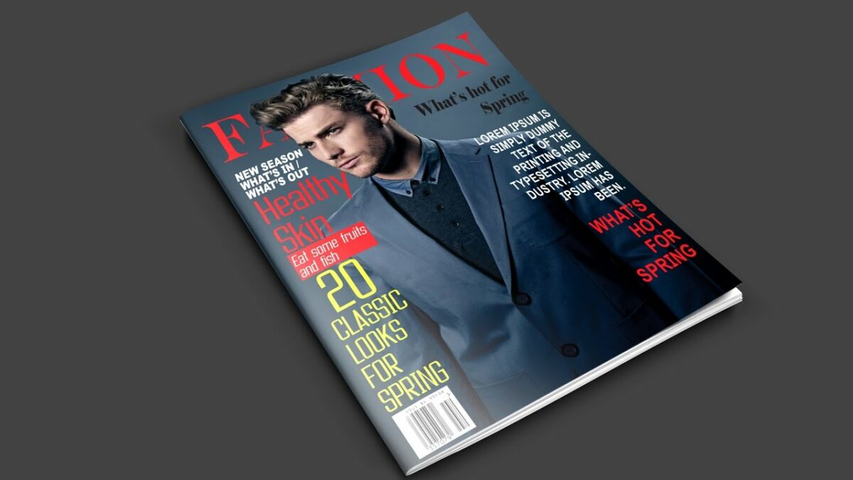
In the ever-evolving landscape of visual communication, a magazine cover serves as a powerful gateway to the content within, capturing the essence of the publication and enticing readers to delve into its pages. Adobe Photoshop, a versatile tool for digital design, offers a myriad of possibilities for creating striking and visually compelling magazine covers. In this extensive guide, we will embark on a step-by-step journey through the process of designing a magazine cover, exploring essential techniques, design principles, and creative strategies that will elevate your cover art to new heights.
Step 1: Define the Concept and Audience
- Understand the Magazine’s Identity: Begin by gaining a clear understanding of the magazine’s identity, target audience, and content theme. Analyze previous covers to identify design trends and elements that resonate with the readership.
- Define the Cover’s Concept: Develop a conceptual framework for the cover. Consider the tone, mood, and message you want to convey. Whether it’s bold and dynamic or subtle and sophisticated, the concept sets the stage for the entire design process.
Step 2: Create a New Document
- Open Adobe Photoshop: Launch Photoshop and create a new document with dimensions tailored to the standard size of a magazine cover. Common dimensions include 8.5 x 11 inches or 8.27 x 11.69 inches, depending on the publication’s specifications.
- Set Resolution and Color Mode: Ensure a high resolution (at least 300 dpi) for print quality. Choose the appropriate color mode based on the publication’s requirements—CMYK for print and RGB for digital.
Step 3: Design the Layout and Composition
- Establish Grids and Margins: Create a balanced layout by establishing grids and margins. Use Photoshop’s guides and rulers to organize the cover elements systematically. This step ensures a cohesive and visually pleasing composition.
- Place Key Elements: Position essential elements such as the masthead, main image, headlines, and additional features according to the established grid. Maintain a hierarchy that guides the viewer’s eye through the cover seamlessly.
Step 4: Select Compelling Imagery
- Choose Striking Images: Select images that align with the magazine’s theme and resonate with the target audience. High-quality, captivating visuals are paramount for a successful cover.
- Consider Image Placement: Experiment with the placement of the main image. Whether it spans the entire cover or is confined to a specific section, the image should be visually arresting and complement the overall design.
Step 5: Typography and Masthead Design
- Select Appropriate Fonts: Choose fonts that reflect the magazine’s personality and appeal to the target demographic. Ensure readability, especially for the masthead, headlines, and cover lines.
- Craft an Impactful Masthead: Design a masthead that stands out while maintaining cohesiveness with the overall theme. Experiment with typography, colors, and effects to create a brand identity that resonates with readers.
Step 6: Enhance with Color and Filters
- Establish a Color Palette: Develop a cohesive color palette that complements the magazine’s theme and enhances the visual impact. Consistency in color choices contributes to a unified and professional appearance.
- Apply Filters and Effects: Experiment with Photoshop filters and effects to add a layer of visual interest to the cover. Subtle effects, such as gradients or texture overlays, can enhance the overall aesthetic without overwhelming the design.
Step 7: Incorporate Additional Design Elements
- Integrate Icons or Brand Elements: Include brand-specific elements, icons, or logos that reinforce the magazine’s identity. These subtle details contribute to brand recognition and a polished design.
- Use Graphic Elements: Enhance the visual appeal by incorporating graphic elements such as lines, shapes, or textures. These additions can guide the viewer’s eye and create a dynamic and engaging composition.
Step 8: Refine and Iterate
- Fine-Tune Details: Zoom in and scrutinize the details of the cover. Adjust font sizes, spacing, and image placement to ensure a polished and professional appearance. Pay attention to alignment and consistency.
- Iterate Based on Feedback: Seek feedback from peers, colleagues, or target audience members. Use constructive criticism to iterate and refine the design. Multiple iterations often lead to a cover that resonates more effectively with the intended audience.
Step 9: Save and Prepare for Print or Web
- Save Your Photoshop Document: Save your project in a layered format to preserve editability. Additionally, save a flattened version in the appropriate format—PDF or high-resolution JPEG—for print or web use.
- Verify Printing Requirements: If designing for print, ensure that your file meets the printing specifications provided by the publication. This includes the correct color mode (CMYK), resolution, and bleed settings.
Step 10: Present and Celebrate Your Creation
- Showcase Your Magazine Cover: Present your meticulously crafted magazine cover in your portfolio, on social media, or within design communities. Create a presentation that highlights the design process and key elements.
- Celebrate Design Achievements: Acknowledge the effort, creativity, and skill invested in your magazine cover design. Celebrate your achievements and use the experience as a stepping stone for future design endeavors.
Conclusion: Elevate Your Design to New Heights
Designing a magazine cover in Photoshop is a dynamic and rewarding process that demands a harmonious blend of creativity, technical skill, and a deep understanding of the publication’s identity. Through thoughtful consideration of layout, imagery, typography, and color, you can create a cover that not only visually entices but also encapsulates the essence of the magazine’s content. As you embark on your design journey, remember that each cover is an opportunity to tell a visual story, captivate audiences, and leave an indelible mark in the realm of graphic design. Elevate your design to new heights, embrace the creative process, and let your magazine covers become compelling gateways to the captivating worlds within.
