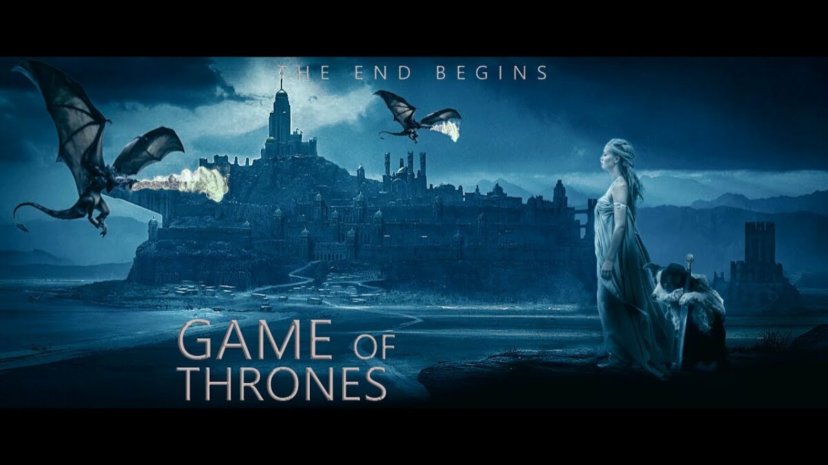
The epic fantasy world of Westeros and Essos, brought to life in the globally acclaimed series “Game of Thrones,” has captivated audiences with its intricate characters, political intrigue, and sweeping landscapes. In this extensive tutorial, we embark on a creative journey to design a Game of Thrones-inspired poster using Photoshop. From composition to intricate details, this tutorial unveils the steps to craft a poster worthy of the Iron Throne.
Section 1: Introduction to the Game of Thrones Aesthetic
1.1 The Essence of Game of Thrones
“Game of Thrones” is renowned for its rich visual tapestry, blending medieval aesthetics with fantastical elements. Before diving into the tutorial, immerse yourself in the world of Westeros and Essos, paying attention to iconic symbols, house sigils, and the atmospheric cinematography that defines the series.
1.2 Poster Design Goals
Define the purpose of your poster – whether it’s a tribute to a favorite character, an homage to a specific season, or a creative blend of various elements from the series. Establishing clear design goals ensures a focused and impactful poster creation process.
Section 2: Setting the Photoshop Stage
2.1 Create a New Canvas
Launch Photoshop and create a new canvas with dimensions that suit your poster requirements. A standard poster size like 24×36 inches offers a versatile starting point, but adjust based on your preferences.
2.2 Gather Resources
Compile resources such as high-resolution images of characters, house sigils, and key symbols from “Game of Thrones.” Access official promotional images, stills from the series, or high-quality fan art to serve as the foundation for your poster.
Section 3: Designing the Composition
3.1 Establish the Hierarchy
Determine the focal points and hierarchy of elements in your poster. Whether it’s a central character, the Iron Throne, or a blend of multiple elements, a clear hierarchy guides viewers through the narrative of your design.
3.2 Rule of Thirds
Apply the rule of thirds to create a visually balanced composition. Divide your canvas into a 3×3 grid and position key elements along the intersecting lines or at the convergence points. This technique adds dynamism and visual interest to your poster.
Section 4: Incorporating Game of Thrones Elements
4.1 Character Placement
Integrate characters strategically into your composition. Consider their relationships, allegiances, and significance in the series. Experiment with blending modes and opacity to seamlessly merge characters with the background.
4.2 House Sigils and Symbols
Incorporate house sigils, iconic symbols (such as dragons or direwolves), and other emblematic elements from “Game of Thrones.” Resize and position these symbols to complement the overall composition and reinforce the thematic elements of your poster.
Section 5: Atmospheric Enhancements
5.1 Background Texture
Add a textured background to evoke the gritty, medieval ambiance of Westeros. Experiment with subtle grunge textures or overlays to infuse depth and character into the backdrop.
5.2 Color Grading
Apply color grading techniques to unify the overall color palette of your poster. Enhance the mood by adjusting highlights, shadows, and midtones to achieve a cinematic and cohesive look reminiscent of the series.
Section 6: Typographic Elements
6.1 Choose Appropriate Fonts
Select fonts that align with the medieval-fantasy aesthetic of “Game of Thrones.” Consider fonts with a regal and archaic feel for titles and subtitles, ensuring readability while maintaining thematic coherence.
6.2 Text Placement and Styling
Strategically place text elements, including titles, character names, and quotes, to complement the visual narrative. Experiment with text styles, shadows, and blending modes to integrate typography seamlessly into the overall design.
Section 7: Fine-Tuning and Refinement
7.1 Detail Enhancement
Zoom in and refine details throughout your poster. Pay attention to facial expressions, house sigils, and other intricate elements to ensure a polished and professional finish.
7.2 Adjustments and Feedback
Review your poster for overall balance and coherence. Seek feedback from peers or fellow fans to gain valuable insights and refine your design further. Address any inconsistencies or areas that may benefit from additional attention.
Section 8: Final Touches and Exporting
8.1 Final Review
Conduct a final review of your Game of Thrones poster. Ensure that all elements align with your design goals and that the poster effectively captures the essence of the series.
8.2 Save and Export
Once satisfied with your creation, save your Photoshop project and export the final poster in the desired format. Whether it’s for print, digital display, or sharing on social media, choose the appropriate resolution and file type for optimal quality.
Conclusion: A Poster Fit for the Iron Throne
In this comprehensive Game of Thrones poster tutorial, you’ve navigated the intricacies of Photoshop to craft a visual masterpiece inspired by the legendary series. From character placement to typographic elements, each step contributes to the creation of a poster that pays homage to the epic tale of power, betrayal, and honor.
As you continue to explore the realm of digital design, let the lessons from Westeros and Essos inspire your creative endeavors. Whether you’re a fan creating tributes or a designer seeking to master thematic compositions, the world of “Game of Thrones” provides a rich tapestry of elements to weave into your artistic creations. So, go forth, wield your creative sword, and craft posters that would make even the noble houses of Westeros proud. Winter may be coming, but your designs will stand the test of time.