Introduction: With the increasing prevalence of mobile devices, creating mobile-responsive designs has become essential for modern web development. Adobe Dreamweaver, a powerful web design and development tool, offers a range of features and tools to streamline the process of creating mobile-responsive designs. In this extensive guide, we’ll explore the principles, techniques, and best practices for creating mobile-responsive designs in Adobe Dreamweaver, empowering you to build websites that adapt seamlessly to various screen sizes and devices.
Understanding Mobile-Responsive Design: Mobile-responsive design is an approach to web design that ensures websites and web applications adapt and respond appropriately to different screen sizes, orientations, and device capabilities. Key principles of mobile-responsive design include:
- Fluid Grid Layouts: Design web layouts using fluid grid systems that adjust dynamically based on the available screen space. Fluid grids use percentages instead of fixed pixel values to create flexible and scalable designs that adapt to different screen widths and resolutions.
- Flexible Images and Media: Use flexible images and media assets that scale proportionally with the viewport size to maintain clarity and readability across devices. Use CSS techniques such as max-width: 100% to prevent images from exceeding their container’s width and causing layout issues.
- Media Queries: Employ CSS media queries to apply different styles and layouts based on screen characteristics such as screen width, device orientation, pixel density, and aspect ratio. Media queries enable conditional styling and layout adjustments to optimize the user experience on different devices.
- Responsive Typography: Implement responsive typography techniques to ensure text content remains legible and readable across devices. Use relative font sizes, em or rem units, and viewport-based sizing to scale typography proportionally with the viewport size and maintain readability on small screens.
- Touch-Friendly Interactions: Design touch-friendly user interfaces with larger tap targets, spacing between elements, and gesture-based interactions to accommodate touch input on mobile devices. Ensure that interactive elements such as buttons, links, and form inputs are accessible and easy to use on touchscreens.
Step 1: Planning Your Mobile-Responsive Design in Dreamweaver Before diving into design and development, it’s crucial to plan your mobile-responsive design strategy effectively. Follow these steps to plan your mobile-responsive design in Adobe Dreamweaver:
- Define Breakpoints: Identify key breakpoints or screen sizes at which your design will adapt and reflow to accommodate different device widths. Consider common device sizes such as smartphones, tablets, and desktops, as well as landscape and portrait orientations.
- Content Prioritization: Prioritize content based on its importance and relevance to mobile users. Determine which content elements are essential for mobile users and should be prioritized for display on smaller screens. Consider hiding or consolidating non-essential content to optimize screen space.
- Wireframing: Create wireframes or mockups of your mobile-responsive design layout to visualize the content hierarchy, navigation structure, and user interactions. Use wireframing tools or design software to sketch out the mobile layout and iterate on design concepts before implementation.
- User Experience Considerations: Consider the user experience (UX) implications of your mobile-responsive design, including navigation patterns, touch interactions, page load times, and performance optimization. Design intuitive and user-friendly interfaces that streamline navigation and enhance usability on mobile devices.
- Accessibility: Ensure that your mobile-responsive design adheres to web accessibility standards and guidelines to accommodate users with disabilities. Design with accessibility in mind, including proper color contrast, semantic HTML markup, and keyboard navigation support for screen reader users.
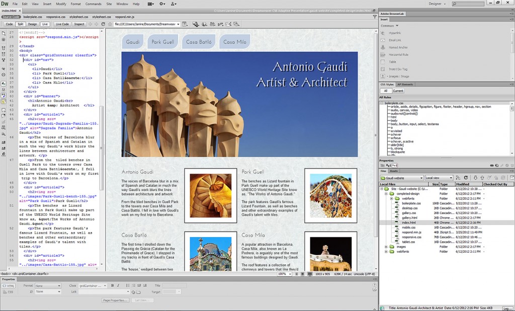
Step 2: Creating Mobile-Responsive Layouts in Dreamweaver Adobe Dreamweaver offers several tools and features to create mobile-responsive layouts efficiently. Follow these steps to create mobile-responsive layouts in Dreamweaver:
- Fluid Grid Layouts: Use Dreamweaver’s Fluid Grid Layout feature to create responsive grid-based layouts that adapt to different screen sizes. Define grid columns, gutters, and breakpoints to organize content and adjust layout behavior for various devices.
- CSS Media Queries: Implement CSS media queries in Dreamweaver’s CSS stylesheets to apply responsive styles based on screen characteristics. Write media queries to target specific screen widths and orientations and define styling rules for different breakpoints.
- Device Preview: Utilize Dreamweaver’s Device Preview feature to preview your mobile-responsive design in real-time across multiple devices and screen sizes. Access Device Preview mode to simulate how your design will appear and function on smartphones, tablets, and desktops.
- Responsive Design View: Use Dreamweaver’s Responsive Design View to visually inspect and test your mobile-responsive design across different breakpoints. Toggle between device presets, adjust viewport dimensions, and preview layout adjustments in real-time within Dreamweaver’s interface.
- Flexbox and CSS Grid: Explore advanced layout techniques such as Flexbox and CSS Grid to create complex and adaptive layouts in Dreamweaver. Leverage Flexbox properties and CSS Grid layouts to achieve precise control over element positioning, alignment, and spacing in responsive designs.
Step 3: Optimizing Content for Mobile Devices in Dreamweaver Optimizing content for mobile devices is essential to ensure a seamless user experience across different screens. Follow these tips to optimize content for mobile devices in Dreamweaver:
- Responsive Images: Use Dreamweaver’s image resizing and optimization tools to create responsive images that adapt to different screen sizes. Resize images proportionally and compress image files to reduce file size and improve loading times on mobile devices.
- Mobile-Friendly Navigation: Design mobile-friendly navigation menus and controls that are easy to access and navigate on small screens. Implement collapsible menus, hamburger icons, and touch-friendly navigation patterns to enhance usability and accessibility on mobile devices.
- Touch Gestures: Incorporate touch gestures and interactions into your mobile-responsive design using Dreamweaver’s interactive elements and behaviors. Create swipeable carousels, touch-sensitive sliders, and interactive galleries that respond to touch gestures and enhance user engagement.
- Form Optimization: Optimize web forms for mobile devices by simplifying input fields, reducing form length, and optimizing form layouts for touchscreen keyboards. Use Dreamweaver’s form validation features to ensure data input accuracy and usability on mobile devices.
- Performance Optimization: Improve page load times and performance on mobile devices by optimizing CSS, JavaScript, and media assets. Minify CSS and JavaScript files, leverage browser caching, and optimize media files for faster loading on mobile networks.
Step 4: Testing and Debugging Mobile-Responsive Designs in Dreamweaver Testing and debugging mobile-responsive designs is essential to ensure compatibility and usability across different devices. Follow these steps to test and debug mobile-responsive designs in Dreamweaver:
- Browser Testing: Test your mobile-responsive design in various web browsers and browser versions to ensure cross-browser compatibility. Use Dreamweaver’s browser preview features to test layout rendering and functionality in popular browsers such as Chrome, Firefox, Safari, and Edge.
- Device Testing: Test your mobile-responsive design on actual mobile devices to evaluate performance, responsiveness, and user experience. Use Dreamweaver’s Device Preview mode or export your design to a mobile device for real-world testing and feedback.
- Responsive Design Tools: Utilize responsive design testing tools and frameworks to assess your mobile-responsive design’s performance and behavior. Use browser developer tools, responsive design testing websites, and mobile emulators to identify layout issues and optimize responsiveness.
- Debugging Tools: Use Dreamweaver’s built-in debugging tools and features to identify and fix layout bugs, CSS conflicts, and JavaScript errors in your mobile-responsive design. Inspect HTML, CSS, and JavaScript code, and use browser developer tools for advanced debugging and troubleshooting.
- User Testing: Conduct user testing sessions with real users to gather feedback and insights on your mobile-responsive design’s usability and effectiveness. Observe how users interact with your design on different devices and incorporate user feedback to improve the overall user experience.
Step 5: Best Practices for Mobile-Responsive Design in Dreamweaver Follow these best practices to create effective and efficient mobile-responsive designs in Adobe Dreamweaver:
- Design for Mobile-First: Adopt a mobile-first design approach by prioritizing mobile users and designing for smaller screens and touch interactions initially. Start with a mobile-friendly layout and progressively enhance the design for larger screens and desktops.
- Maintain Consistency: Maintain visual and functional consistency across different breakpoints and devices to provide a cohesive and seamless user experience. Use consistent branding, typography, colors, and navigation patterns throughout your mobile-responsive design.
- Performance Optimization: Optimize performance by minimizing HTTP requests, reducing file sizes, and optimizing code and assets for faster loading on mobile devices. Prioritize content delivery and minimize unnecessary animations and effects that may impact performance on mobile networks.
- Accessibility Compliance: Ensure accessibility compliance by following web accessibility standards and guidelines such as WCAG (Web Content Accessibility Guidelines). Design with accessibility in mind, including proper HTML semantics, keyboard navigation, and screen reader support for users with disabilities.
- Continuous Improvement: Continuously iterate and improve your mobile-responsive design based on user feedback, analytics data, and emerging technologies. Monitor user behavior, track performance metrics, and adapt your design strategy to meet evolving user needs and expectations.
Conclusion: Creating mobile-responsive designs in Adobe Dreamweaver enables web developers to deliver seamless and engaging user experiences across various devices and screen sizes. By following the principles, techniques, and best practices outlined in this comprehensive guide, you can design and develop mobile-responsive websites and web applications that adapt fluidly to the ever-changing landscape of the digital world. Whether you’re a beginner or experienced developer, mastering the art of mobile-responsive design in Dreamweaver empowers you to create impactful and user-centric web experiences that resonate with audiences and drive success in today’s mobile-first world.