Introduction: Color is the language of design, and mastering it is a crucial skill for graphic artists. CorelDRAW, a powerhouse in the design software realm, equips designers with a robust set of color management tools. This comprehensive guide aims to demystify color management in CorelDRAW, offering a step-by-step exploration for beginners. From understanding color spaces to utilizing CorelDRAW’s sophisticated features, designers will embark on a journey to harness the full potential of color in their creative endeavors.
I. The Fundamentals of Color Management:
A. Understanding Color Spaces:
- RGB Color Space: CorelDRAW primarily operates in the RGB (Red, Green, Blue) color space, ideal for digital design. RGB represents colors using light, making it suitable for computer monitors and electronic displays.
- CMYK Color Space: For print projects, the CMYK (Cyan, Magenta, Yellow, Black) color space is essential. CMYK is the standard for the four-color printing process, representing colors using ink.
B. Color Profiles:
- Definition: A color profile defines the color characteristics of a device or color space, ensuring consistent color reproduction. CorelDRAW relies on color profiles to interpret and display colors accurately.
- Importance of Profiles: Using the appropriate color profile is crucial for maintaining color consistency across different devices and output mediums. Profiles guide the translation of colors from the design software to the final output, be it a digital display or a printed material.
C. Rendering Intents:
- Perceptual Intent: This rendering intent adjusts all colors to maintain overall visual harmony, preserving the relationship between colors. It is often used when the original colors are more critical than exact color matches.
- Relative Colorimetric Intent: Relative colorimetric intent preserves color relationships as much as possible while mapping colors that fall outside the destination gamut to the nearest in-gamut color.
- Absolute Colorimetric Intent: This intent maintains the exact color values, even if they fall outside the destination gamut. It’s suitable for situations where color accuracy is paramount.
- Saturation Intent: Saturation intent emphasizes preserving vivid colors, sacrificing some accuracy to maintain color richness. It is useful when vibrant colors are essential.
II. CorelDRAW Color Management Tools:
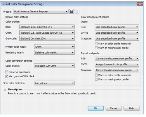
A. Color Management Settings:
- Accessing Color Settings: The Color Settings dialog in CorelDRAW is the gateway to color management preferences. Designers can navigate to “Tools” > “Color Management” > “Default Settings” to configure their preferred color settings.
- Configuring Default Settings: Within the Color Settings dialog, designers can set default color profiles for RGB and CMYK, choose rendering intents, and configure soft proofing options.
B. Soft Proofing:
- Definition: Soft proofing is a vital feature that allows designers to simulate how colors will appear on different output devices. This simulation aids in making informed decisions before finalizing designs.
- Activating Soft Proofing: Designers can activate soft proofing by selecting “View” > “Proof Setup” and choosing a profile that matches the intended output device or medium. Soft proofing allows for adjustments to ensure the final result aligns with the designer’s vision.
C. Device Link Profiles:
- Advanced Color Management: Device link profiles are advanced color management tools that facilitate precise color transformations between different devices and color spaces. They preserve color relationships and consistency during conversions.
- Applying Device Link Profiles: Designers can apply device link profiles within the Color Management dialog by selecting “Advanced Options.” This feature is particularly useful for projects that demand stringent color control and accuracy.
III. Practical Steps for Beginners:
A. Setting Up Default Color Profiles:
- Open CorelDRAW and access the Color Management dialog through “Tools” > “Color Management” > “Default Settings.”
- Choose the appropriate RGB and CMYK color profiles based on your project requirements. Ensure these profiles align with your intended output, whether for digital display or print.
B. Configuring Rendering Intents:
- Within the Color Management dialog, choose the desired rendering intents for both RGB and CMYK profiles.
- Consider the nature of your project when selecting rendering intents. For perceptual or relative colorimetric intents, the choice depends on whether maintaining overall visual harmony or precise color matching is more critical.
C. Activating Soft Proofing:
- To enable soft proofing, navigate to “View” > “Proof Setup” and select a profile that corresponds to your output device or medium.
- Soft proofing provides a visual representation of how colors will appear in the final output. Make adjustments as needed to align the simulated output with your design intent.
D. Exploring Device Link Profiles:
- For advanced color management needs, access the Color Management dialog’s “Advanced Options” and explore device link profiles.
- Apply device link profiles when stringent color control and consistency are paramount, especially when working on projects with specific color requirements or brand guidelines.
IV. Best Practices and Tips:
A. Regular Monitor Calibration:
- Calibrate your monitor regularly to ensure accurate color representation. Calibration tools and software help adjust monitor settings to match industry-standard color profiles.
- Monitor calibration is crucial for digital design, as it ensures that colors displayed on the screen are faithful to their real-world counterparts.
B. Consistent Use of Color Profiles:
- Maintain consistency in color profiles across projects to ensure uniform color reproduction.
- Create a standardized set of color profiles that align with your preferred color spaces and rendering intents, making it easy to apply them consistently.
C. Soft Proofing for Print Projects:
- When working on print projects, activate soft proofing with the appropriate CMYK profile to simulate how colors will appear in the final printed output.
- Soft proofing allows for adjustments to ensure that the printed result aligns with your design vision, considering the characteristics of the chosen printing process and materials.
D. Experimenting with Rendering Intents:
- Experiment with different rendering intents to understand their impact on color reproduction.
- For projects where maintaining overall visual harmony is crucial, consider using the perceptual intent. For projects requiring precise color matching, the relative colorimetric intent may be more suitable.
V. Conclusion:
Embarking on the journey of color management in CorelDRAW is a fundamental step towards achieving precise and consistent color representation in design projects. Understanding the basics of color spaces, profiles, rendering intents, and leveraging CorelDRAW’s color management tools empowers designers to navigate the spectrum of colors with confidence. As designers delve into the software’s features, from soft proofing to device link profiles, they unlock the potential to create visually stunning designs that resonate with their intended audience. With a foundation in color management, designers can confidently wield the palette of possibilities offered by CorelDRAW, ensuring that their creative visions are brought to life with unparalleled accuracy and vibrancy.