Introduction: Revit is a powerful Building Information Modeling (BIM) software developed by Autodesk, widely used by architects, engineers, and designers for creating detailed architectural designs, documenting building projects, and collaborating with stakeholders. With its robust modeling tools, parametric components, and intelligent workflows, Revit enables users to design, visualize, and analyze complex building projects more efficiently than ever before. In this comprehensive guide, we’ll explore the intricacies of creating architectural designs in Revit, covering everything from project setup to final documentation and presentation.
Section 1: Introduction to Revit and Building Information Modeling (BIM) 1.1 Overview of Revit: Revit is a BIM software platform that allows users to create, manage, and collaborate on building projects in a 3D virtual environment. It offers a range of tools for architectural design, structural engineering, MEP (mechanical, electrical, plumbing) design, and construction documentation. Revit’s parametric modeling approach enables users to create intelligent building components that maintain relationships and constraints throughout the design process.
1.2 Understanding Building Information Modeling (BIM): BIM is a collaborative process that involves creating and managing digital representations of physical and functional characteristics of buildings. BIM software such as Revit enables users to generate and exchange information throughout the lifecycle of a building project, from conceptual design to construction and facility management. BIM facilitates better coordination, communication, and decision-making among project stakeholders, leading to improved project outcomes and reduced costs.
Section 2: Setting Up Architectural Projects in Revit 2.1 Project Setup: The first step in creating architectural designs in Revit is to set up a new project file. Users can choose from a variety of templates provided by Revit, including architectural, structural, and MEP templates. The template defines the project settings, units, levels, and views, providing a starting point for the design process. Users can also customize project settings according to project requirements.
2.2 Creating Building Elements: Once the project is set up, users can begin creating building elements such as walls, floors, roofs, doors, and windows using Revit’s modeling tools. Revit offers a range of parametric building components that can be customized in terms of size, shape, materials, and properties. Users can draw elements directly in 3D views or use 2D sketches to create parametric shapes that can be extruded or swept to form building elements.
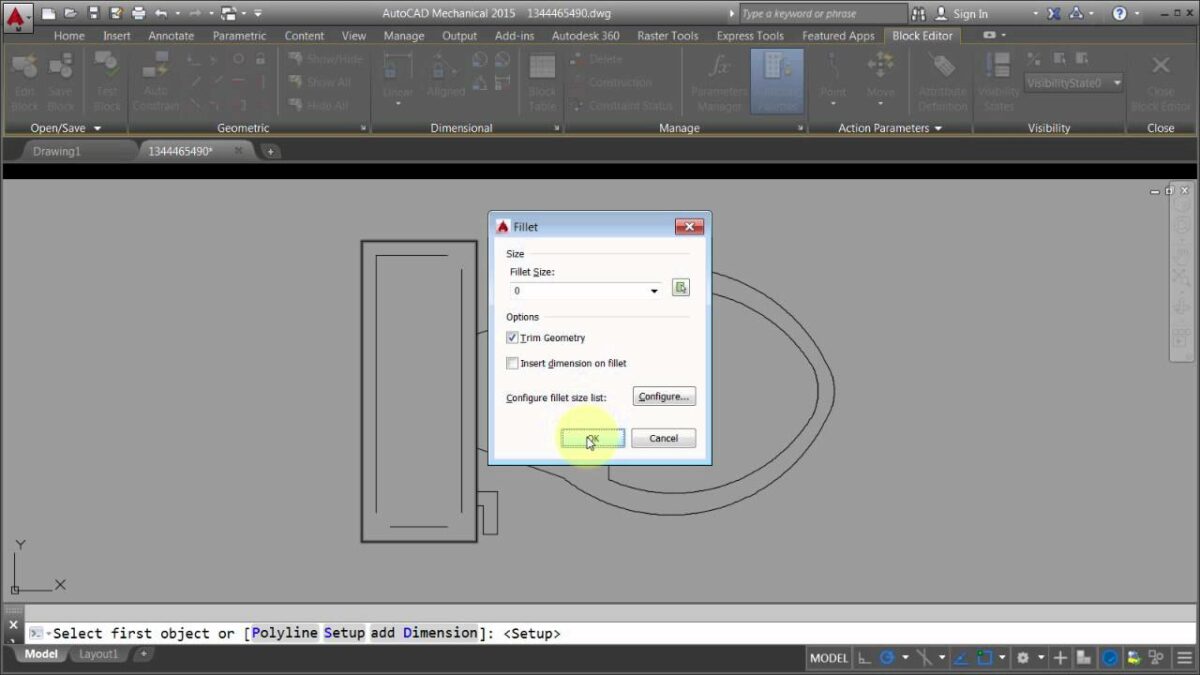
Section 3: Developing Architectural Designs in Revit 3.1 Modeling Architectural Elements: Revit’s modeling tools enable users to create detailed architectural elements with precision and accuracy. Users can draw walls, floors, and roofs using sketch-based tools, define structural grids and columns, and add architectural details such as doors, windows, stairs, and railings. Revit’s parametric capabilities allow users to modify building elements dynamically and maintain design consistency throughout the project.
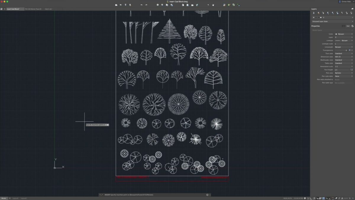
3.2 Working with Families and Components: Revit’s family editor allows users to create custom building components and parametric families that can be reused across multiple projects. Users can create families for doors, windows, furniture, fixtures, and other building elements, defining parameters and constraints to control their behavior and appearance. Revit’s family library provides a wealth of pre-built components that can be customized and adapted to specific project requirements.
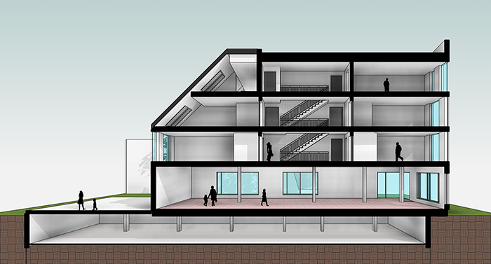
Section 4: Visualizing and Presenting Architectural Designs 4.1 Rendering and Visualization: Revit’s visualization tools enable users to create photorealistic renderings and walkthroughs of architectural designs, helping to communicate design intent and visualize the project in context. Users can apply materials, textures, and lighting effects to building elements, adjust camera settings, and render high-quality images and animations directly within Revit.
4.2 Creating Presentation Drawings: Revit’s documentation tools allow users to generate presentation drawings, plans, sections, elevations, and details directly from the 3D model. Users can customize drawing views, annotate elements with dimensions and labels, and generate schedules and legends automatically. Revit’s intelligent linking and updating capabilities ensure that drawings remain coordinated and up to date throughout the design process.
Section 5: Collaborating and Documenting Architectural Projects 5.1 Collaboration and Coordination: Revit’s collaboration features enable multiple users to work on the same project simultaneously, making it easy to coordinate changes and updates across disciplines. Users can work in a centralized model environment, share project data and models with stakeholders, and track revisions and comments using Revit’s versioning and markup tools. Revit’s cloud collaboration platform allows users to collaborate in real-time, regardless of location or time zone.
5.2 Documentation and Construction Drawings: Revit’s documentation tools streamline the process of creating construction drawings, specifications, and schedules for architectural projects. Users can generate floor plans, sections, and elevations directly from the 3D model, annotate drawings with dimensions and notes, and generate detailed schedules and material takeoffs automatically. Revit’s parametric capabilities ensure that drawings remain coordinated and consistent throughout the design and documentation process.
Conclusion: Revit is a powerful tool for creating detailed architectural designs, visualizing building projects, and collaborating with stakeholders throughout the design process. By mastering the techniques outlined in this guide and leveraging the capabilities of Revit’s BIM platform, architects, designers, and building professionals can create innovative, sustainable, and cost-effective architectural solutions that meet the needs of clients and communities. With its intuitive interface, parametric modeling tools, and robust collaboration features, Revit empowers users to design, document, and deliver high-quality architectural projects with confidence and efficiency.