Introduction:
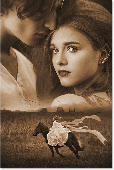
Creating a captivating movie poster involves a delicate blend of artistic vision and technical skills, and Adobe Photoshop stands as the ultimate canvas for bringing these elements together. In this extensive guide, we will explore the step-by-step process of blending photos to craft a visually stunning movie poster. From selecting the right images to mastering Photoshop tools, this tutorial aims to empower both beginners and seasoned designers in transforming their ideas into compelling movie poster art.
Section 1: Preparing Your Concept
1.1 Conceptualization:
- Before diving into Photoshop, envision the theme and narrative of your movie poster. Consider the genre, mood, and key elements you want to highlight. Sketching out a rough idea can be beneficial.
1.2 Image Selection:
- Gather high-resolution images that align with your concept. Choose photos that convey the atmosphere of your movie and feature essential characters or scenes.
Section 2: Setting Up Your Canvas
2.1 Photoshop Workspace:
- Open Photoshop and create a new document. Set dimensions based on standard poster sizes or custom dimensions. Ensure a high resolution (300dpi) for print quality.
2.2 Layers and Organization:
- Familiarize yourself with Photoshop’s layers panel. Organize your layers logically, separating background, characters, and other elements. This helps maintain a structured workflow.
Section 3: Basic Photo Blending Techniques
3.1 Placing the Background:
- Open your chosen background image and drag it onto your canvas. Resize and position it accordingly. Use the “Transform” tool (Ctrl+T) for adjustments.
3.2 Layer Masks:
- Utilize layer masks to seamlessly blend elements. Refine edges using a soft brush and mask out unwanted parts. This allows for smooth transitions between images.
3.3 Adjustment Layers:
- Experiment with adjustment layers (e.g., brightness/contrast, color balance) to harmonize the color palette. Match the tones of your images for a cohesive look.
Section 4: Advanced Blending Techniques
4.1 Blending Modes:
- Experiment with blending modes for layers. Overlay, Multiply, and Screen are commonly used for blending images. Adjust layer opacities to fine-tune the effect.
4.2 Smart Objects:
- Convert layers to Smart Objects before scaling to maintain image quality. This is crucial for preventing pixelation when enlarging elements.
4.3 Depth and Perspective:
- Create a sense of depth by adjusting the size and positioning of elements. Use the “Blur” tool to add depth of field, emphasizing focal points.
Section 5: Typography and Text Effects
5.1 Font Selection:
- Choose fonts that complement your movie’s theme. Experiment with various styles, ensuring readability while enhancing the poster’s overall aesthetic.
5.2 Text Effects:
- Apply layer styles to text for added flair. Consider drop shadows, outer glows, or bevel and emboss effects. Ensure that text integrates seamlessly with the overall design.
Section 6: Special Effects and Enhancements
6.1 Filters and Effects:
- Apply filters or artistic effects to enhance visual appeal. Experiment with Gaussian blur, motion blur, or filters like “Oil Paint” for artistic touches.
6.2 Lighting Effects:
- Add realistic lighting effects to elements by incorporating gradients or applying soft brushes with varying opacities. This enhances the cinematic feel of the poster.
Section 7: Fine-Tuning and Final Touches
7.1 Color Grading:
- Implement color grading techniques to unify the overall color scheme. Use adjustment layers or presets for a consistent and cinematic look.
7.2 Final Checks:
- Zoom out and assess the poster as a whole. Check for balance, coherence, and focal points. Make any necessary adjustments to refine the composition.
Section 8: Exporting for Various Platforms
8.1 Print vs. Digital:
- Adjust the color profile and resolution based on your intended platform. Use CMYK for print and RGB for digital. Ensure proper sizing for online sharing.
8.2 Export Options:
- Save your work in a high-quality format (e.g., JPEG, PNG) for digital use. For print, consider saving as a PDF or TIFF to preserve image quality.
Section 9: Showcasing Your Work
9.1 Portfolio Presentation:
- Showcase your movie poster in your portfolio or on online platforms. Provide context about the movie concept and your design process.
9.2 Seeking Feedback:
- Share your creation with peers or online design communities to receive constructive feedback. Use insights to enhance your skills for future projects.
Conclusion:
Creating a movie poster in Photoshop is a dynamic blend of artistic expression and technical prowess. By mastering the techniques outlined in this comprehensive guide, designers can unlock their creative potential, bringing captivating stories to life through visually stunning posters. Remember, each step is an opportunity to experiment, refine, and elevate your design skills, making your movie poster a true work of art in the digital realm.
