Utilizing Photoshop Techniques to Create Viral Thumbnails for YouTube
The thumbnail that you use on YouTube is more than simply an image; it is the initial impression that people get of your video, your silent salesperson, and it is often the single most important element that determines whether someone clicks on your video or scrolls past it.
In the event that the thumbnail fails to capture attention within a fraction of a second, even the most excellent video may have difficulty gaining momentum. To your good fortune, Photoshop provides you with everything you want to create thumbnails that not only stand out but also convert views into subscribers who remain loyal to your channel.
If you are able to grasp a few fundamental Photoshop principles, such as composition and color psychology, you will be able to design thumbnails that pique the viewer’s interest, convey what they are feeling, and blend in perfectly with the visual identity of your channel.
A Look at the Thought Process Behind Clickable Thumbnails
It is essential to have a solid understanding of what makes a thumbnail clickable before delving into the more advanced Photoshop capabilities.
Contrast, passion, and clarity are all things that the human eye is attracted to. Not only does a good thumbnail look attractive, but it also conveys instantaneous information about the content. Consider it to be the movie poster for your video; it ought to elicit an emotional response from viewers even before they start playing the video.
Each of the most successful thumbnails have three characteristics in common:
- In terms of clarity, the topic is immediately recognized, even when it is reduced in size.
- Emotion: Curiosity may be triggered by facial emotions or visually striking images.
- When there is a clear distinction between the foreground and the backdrop, contrast stands out and draws attention.
- A deliberate design of these characteristics may be accomplished using Photoshop by making use of certain tools and effects.
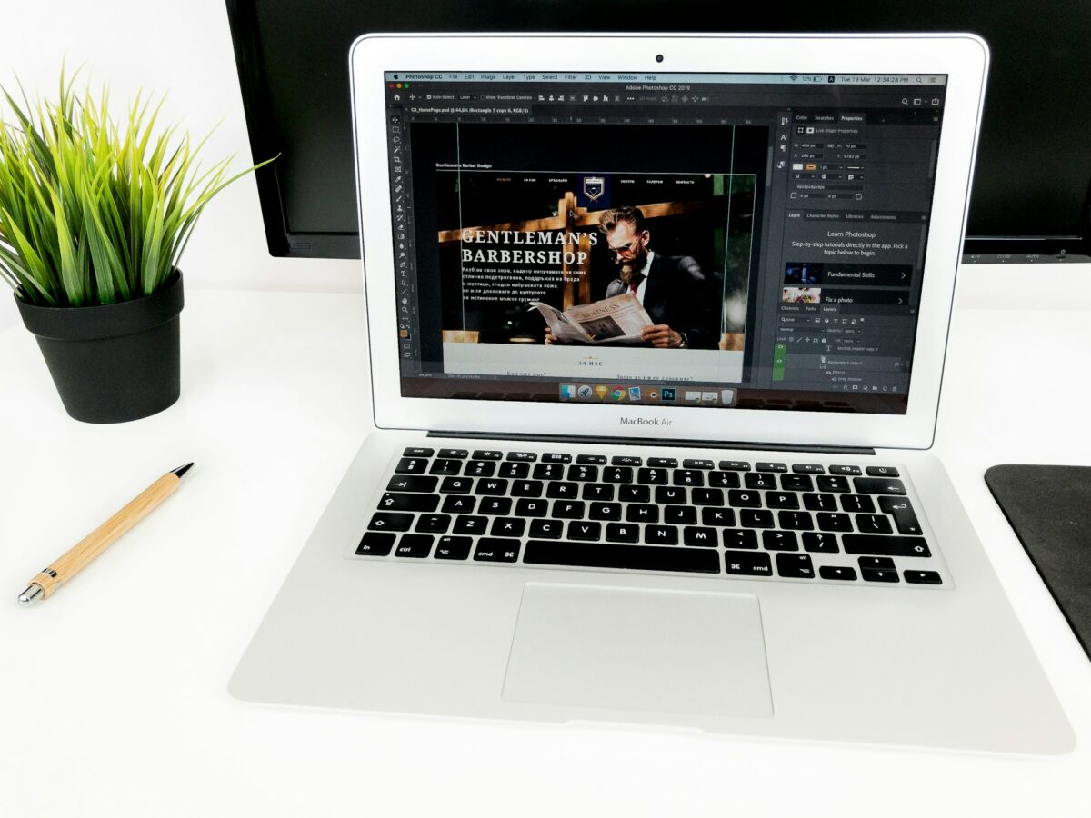
Beginning with the Appropriate Canvas Size is the First Step
Start with the right proportions for the YouTube thumbnail, which are 1280 pixels wide by 720 pixels tall and 72 dots per inch.
To input these values, open Photoshop, choose File > New, and then enter them. It is important to maintain exact dimensions in order to guarantee that your design appears clear on all platforms, including smart TVs and smartphones.
When YouTube presents your video on multiple screens, it is beneficial to establish a safe zone, which is around five percent of the total width on both sides. This ensures that nothing of significance, such as text or objects, is cut.
Second Step: Select an Eye-Catching Picture
A powerful picture serves as the main component of each and every thumbnail. There must be a clear representation of the subject matter of the video, regardless of whether it is a still frame from your film or a prepared snapshot.
In order to improve the brightness, contrast, and color of an image, you may use the Camera Raw Filter or the Levels/Curves adjustments in Photoshop.
If the backdrop seems to be overly congested, you may get rid of it by utilizing the tools that are called Select Subject and Remove backdrop. The impact of a thumbnail is immediately increased by having a clean composition, particularly for thumbnails that include people or items.
The Third step is to include facial expressions to provide emotional focus.
Faces of people are the focus of attention. In the event that your film include a host or speaker, you should choose a frame that depicts a powerful emotion, such as surprise, enthusiasm, astonishment, or interest.
Using the Liquify > Face-Aware Liquify command in Photoshop, you may gently improve the emotions of your images. Because of this, it is possible to make subtle alterations to the contours of the lips, eyebrows, or eyes without making them seem fake.
Utilize the Dodge Tool to brighten eyes and the Burn Tool to provide depth to shadows in order to get a higher level of clarity. Despite the fact that they are just thumbnail size, these subtleties make expressions stand out.
The fourth step is to make elements stand out by using contrast.
The visibility is driven by contrast. Using Brightness/Contrast, Levels, or Curves, you may create a divide between your subject and the backdrop of your illustration.
When you duplicate the subject layer, apply a Drop Shadow, or use the Outer Glow effect with a hue that is complimentary to the subject layer, you may also give depth to the image.
The use of this slight halo effect results in visual lift, which makes the topic seem to be separated from the backdrop and makes it more noticeable on YouTube feeds that are already rather crowded.
Text that is bold and easy to read is the fifth step.
It is important that the text be brief yet effective. Simply a few words, preferably less than five, is sufficient.
Employ powerful sans-serif typefaces such as Montserrat, Bebas Neue, or Impact instead of serif fonts. It is important to keep the message brief (for example, “Before & After,” “Big Mistake,” “Secret Trick,” etc.) and to position it in a strategic manner.
Applying effects such as Stroke, Drop Shadow, or Gradient Overlay will provide the text with the ability to be read against any backdrop. Never depend just on color; contrast is your ultimate ally in this endeavor.
Utilize writing that is white or brightly colored over dark backgrounds, or text that is black over bright backgrounds, for the highest possible level of clarity.
Making Use of Color Psychology to Drive Emotion is the Sixth Step
Emotion is evoked more quickly by color than by words. Color contrast and emotive tones are two factors that have a significant impact in viral thumbnails:
- Urgency, enthusiasm, and energy are all conveyed via the color red and yellow.
- Indicating trust and authority, blue is shown.
- Green is associated with expansion or happiness.
- Both pink and purple are associated with originality and innovation.
It is possible to fine-tune tones in Photoshop by using either Gradient Maps or Selective Color changes. It is important to avoid oversaturation; a modest increase in brightness is often sufficient to stand out without seeming to be cheap.
Step Seven: Include Dramatic Lighting and Effects
Adding lighting to your thumbnail gives it life. Applying the Dodge and Burn method in Photoshop will allow you to sculpt light and shadow around the subject’s face or item inside the image.
Make a new layer with the Soft Light setting, fill it with gray that is fifty percent complete, and then paint it with white (for highlights) and black (for shadows) in a gentle manner.
Additionally, in order to emulate cinematic lighting, you may apply a minor Lens Flare or Radial Gradient from the corners of the image. It is possible to immediately attract attention to the center of your thumbnail by strategically placing a light behind the topic subject image.
Applying color grading to ensure consistency is the eighth step.
Establishing a brand identity requires consistent color grading. Make use of Color Lookup Tables (LUTs) or Gradient Maps in order to keep the feel of all of your thumbnails consistent with one another.
When seen via YouTube’s bright interface, warm, high-contrast appearances often perform better than other formats because they seem more animated. Content in the fields of technology, science, or analysis might benefit from cool tones.
Your audience will be able to easily identify your films if you build a trademark color grade, which will ultimately lead to an increase in click-through rates over time.
The ninth step is to use the blur technique to create depth.
Background blur is a technique that is often used by the most talented authors.
Convert your backdrop layer into a duplicate, add Gaussian Blur, and make sure the subject remains crisp. This simulates the depth-of-field of the camera, directing the attention of the viewer to the most important element.
If you want to add some energy or imitate movement, you can even generate a tiny motion blur effect on the items that are in the backdrop. You want the effect to have a cinematic sense, rather than an artificial one, therefore subtlety is essential.
Add Branding Without Creating Clutter is the Tenth Step
Your brand should be promoted without there being any distractions in your thumbnail. Include smaller, more consistent characteristics of your brand, such as:
- One of the corner logos or channel icons.
- A color that appears repeatedly in the backdrop.
- An unchanging typeface or border throughout.
Make sure to keep it understated; the logo should not dominate the thumbnail but rather assist identification. Instead of clicking on the logo, viewers are interested in the content, therefore make sure the message is the focal point.
The eleventh step is to test variations.
Alterations to the design, even little ones, may have a significant impact on performance. You may save numerous thumbnail versions by using the Layer Comps function in Photoshop. For instance, you might save one version with strong lettering and another version with muted tones.
After that, you may do an A/B test on YouTube by swapping thumbnails after a few hours and determining which one has a greater click-through rate (CTR). This, over time, helps improve what visually connects with your audience and what they find appealing.
Avoiding the Most Frequent Errors
The amount of text is excessive; viewers should read it immediately.
- Those thumbnails that blend in with the white backdrop of YouTube are overlooked because of their low contrast.
- Cluttered layouts: Maintain a single, distinct focus, whether it is a person, a product, or a scenario.
- When emotion is ignored, facial emotions or expressions always perform better than neutral pictures.
- As a result of excessive manipulation, photographs that are oversaturated or oversharpened seem untrustworthy.
- Bear in mind that the purpose of a thumbnail is not to explain, but rather to captivate.
Creating Content for the Scroll
A viral thumbnail is a combination of art and psychology in equal measure. In a fraction of a second, it is about capturing the attention of the audience, implying that there is a narrative, and providing value.
You have access to all of the tools that Photoshop provides, including contrast, composition, lighting, and color, which allow you to mold feelings and visual rhythm. On the other hand, success is not only dependent on consequences. Understanding how your audience reacts when they view your picture is the key to unlocking this potential.
Your thumbnail becomes into a visual invitation when it is produced with careful consideration; it is an invitation that does not only request a click but rather deserves it.