Adapting the Pomodoro Technique: Time-Blocking Strategies for Deep-Work Coding vs. Shallow Admin Tasks
One of the most popular methods for increasing productivity is the classic Pomodoro Technique, which is based on using predetermined times of concentrated work followed by brief breaks. On the other hand, its conventional structure does not necessarily correspond with the particular cognitive requirements of the many kinds of labor. When compared to shallow administrative jobs, deep-work coding tasks need continuous focus, problem-solving, and mental continuity. On the other hand, shallow administrative tasks include reduced cognitive load and many context switches. The use of a timing model that is universally applicable might actually decrease efficiency rather than increase it. Users may improve their ability to concentrate, lessen the effects of weariness, and keep their productivity at a higher level throughout the day by modifying time-blocking tactics based on the Pomodoro technique to correspond with the characteristics of each kind of activity. In order to use this strategy, it is necessary to have a grasp of how mental energy is distributed and how interruptions impact productivity. By making the necessary adjustments, time-blocking transforms from a rigid timer into a flexible system. The users are able to adjust their schedules so that they are in sync with the natural rhythm of their cognitive function.
A Comprehensive Understanding of the Distinction Between Deep Work and Shallow Tasks
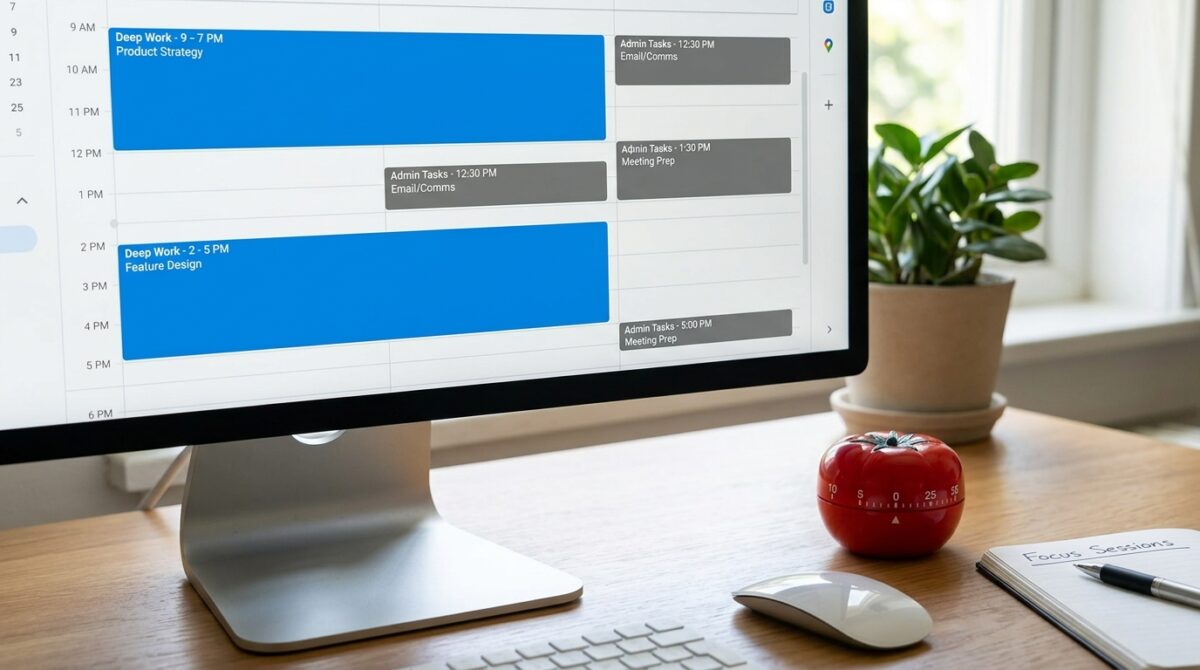
To engage in deep work, one must engage in tasks that are mentally taxing and need undivided attention. Some examples of deep work include writing difficult logic, troubleshooting, or developing systems. These activities need the ability to keep one’s mental context intact for lengthy periods of time. On the other hand, superficial jobs consist of communications such as emails, scheduling, updating documents, and doing normal administrative activities. The cognitive effort required for these pursuits is lower, and they are able to make do with interruptions. Understanding the difference between the two is necessary for conducting efficient time blocking. The application of the same time limitations to both kinds of labor may be disruptive to the efficiency of the process. For deep work, longer, unbroken periods are beneficial, but for superficial work, shorter intervals are sufficient for completing tasks. By gaining an understanding of these distinctions, one may more effectively allocate their time. Consequently, it guarantees that the right method is used for each and every form of activity.
Some Restrictions Inherent in the Traditional Pomodoro Structure
In most cases, the traditional Pomodoro model schedules work periods of 25 minutes, followed by brief breaks. It is possible that this structure is too limiting for deep work, despite the fact that it is excellent for general productivity. To achieve a productive state, it is frequently necessary to immerse oneself for a lengthy period of time in complex coding activities. By interrupting this flow every quarter of an hour, you might disrupt focus and lower the quality of the output. On the other hand, jobs that are not very intricate may not need for such organized intervals. The basic model’s inflexibility severely restricts its ability to effectively handle a wide variety of tasks. Understanding these constraints is the first step in adapting to new circumstances. Users are able to customize intervals to the needs of the work when using a method that is more flexible. This results in an increase in both productivity and contentment.
Extending the Time Blocks for the Sessions of Strenuous Work
When it comes to deep-work coding, larger time blocks rather than the more usual short intervals are more successful. A session lasting sixty to ninety minutes gives the brain the opportunity to fully engage with difficult topics. This length is beneficial to the establishment of flow state, which is a condition in which productivity and attention are at their highest. If you want to avoid disturbing the flow, you should still include breaks, but you should spread them out widely apart. Increasing the length of blocks helps lessen the mental burden of having to resume activities. They also make it possible to study the topic in more depth. Adjusting the intervals of the Pomodoro technique in this manner is in line with the requirements of coding job. The speed as well as the quality of the output are both improved. When it comes to maintaining focus, longer sessions are indeed necessary.
Utilizing Brief Intervals for the Purpose of Performing Insignificant Administrative Tasks
Shorter, more regimented periods, comparable to the old Pomodoro model, are beneficial for jobs that are not very complex. It is possible to do these jobs in short bursts since they often include actions that are redundant. The use of blocks ranging from fifteen to twenty-five minutes helps to maintain productivity without overcommitting time. Moreover, short intervals promote the batching of jobs that are comparable, which reduces the amount of context switching. Taking this strategy avoids the expansion of administrative labor that is not considered necessary. This ensures that these jobs are completed within the allotted amount of time. It is possible to guarantee that shallow work does not conflict with deep work periods by applying shorter Pomodoro cycles to shallow forms of work. Having this distinction helps to enhance the overall balance of the process.
In lieu of fixed cycles, the implementation of task-based time blocking
The task-based strategy may prove to be more successful than the traditional method of carefully adhering to predetermined intervals. Assigning time blocks to each work depending on its level of difficulty and the criteria it must fulfill is a part of this process. As opposed to shallow jobs, which are put together into shorter periods, deep work is given greater blocks of time. This approach places an emphasis on results rather than strict adherence to time. This enables a higher degree of flexibility in the management of workload. The task-based blocking method is more successful at adapting to the demands of the actual world. It lowers the number of interruptions that are not essential and enhances attention. Taking this strategy will turn Pomodoro into a dynamic system. It synchronizes the management of time with the real work patterns.
Dealing with Cognitive Exhaustion Through the Use of Strategic Breaks
It is vital to take breaks in order to sustain productivity; however, the scheduling of these breaks and the length of time they last should correspond to the level of difficulty of the activity. In order to avoid mental tiredness, it is necessary to have extended rest times after heavy work sessions. After prolonged concentration, it is possible that little pauses will not be enough. On the other hand, shallow jobs take a limited amount of time for recuperation. Positioning breaks in such a way as to enable continuous performance throughout the day is essential. Getting enough rest helps avoid burnout and keeps one’s mind clear. By gaining an understanding of how weariness builds up, one may better optimize break plans. This equilibrium is essential for overall production over the long run. Efficient management of breaks contributes to both productivity and well-being respectively.
How to Avoid Switching Contexts Between Different Types of Tasks
It is possible to disturb one’s ability to concentrate and diminish one’s efficiency by regularly switching between deep and superficial jobs. The mental adjustment that is required for each change is a time-consuming and energy-consuming process. It is possible to reduce the number of transitions by grouping together jobs that are comparable. When it comes to maintaining continuity, dedicated blocks for serious work and separate blocks for administrative activities are both beneficial. Because of this distinction, the brain is able to continue operating in the mode that is most suitable for each kind of job. It is more productive to avoid moving between tasks that are not essential. Moreover, it lessens the burden on the mind. For successful time management, it is vital to keep clear boundaries between the different sorts of tasks. Utilizing this strategy helps maintain attention over time.
Maintaining a Workflow That Is Both Flexible and Adaptable
The ability to adjust to shifting workloads and priorities is essential for the success of any time-blocking system. Having a strict commitment to a predetermined timetable might make it more difficult to respond. Consistent analysis of patterns of production contributes to the system’s gradual improvement over time. It is possible to enhance efficacy by adjusting block lengths depending on previous experience. By providing users with flexibility, they are able to adapt to unforeseen jobs without disturbing the entire operation. An method that is dynamic guarantees that the system will continue to be relevant. Efficiency and enjoyment are both improved via the process of continuous improvement. The Modification of the Pomodoro Technique in this manner results in the creation of a customized productivity framework that develops in accordance with the requirements of the user.