Using Blend-If for Invisible Background Removal
The Blend-If tool in Photoshop is one of the most effective but underused tools in the program. It allows users to create smooth selections and remove backgrounds without resorting to disruptive masking. Blend-If gives you the ability to isolate areas of a layer based on luminance or color channels, in contrast to standard selection techniques, which involve manual cutting or exact erasing. The ability to separate items from complicated backgrounds while preserving small features like as hair, reflections, or rough borders is a feature that makes this tool very useful.
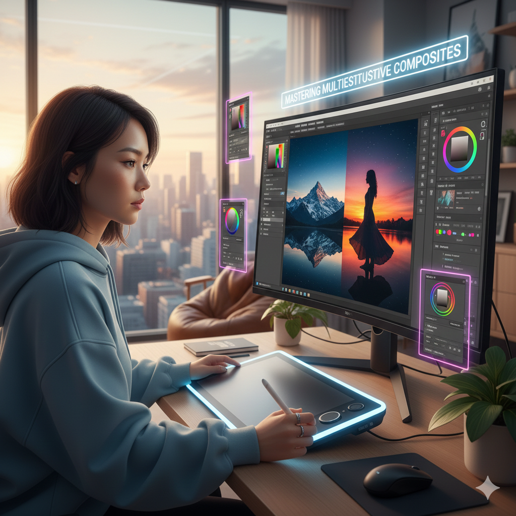
Understanding the Blend-If Concept Blend-If is a feature that functions inside the Blending Options of a layer, which can be accessed by going to Layer > Layer Style > Blending Options via the Layer menu. Controlling which pixels of a layer are visible is the fundamental concept. This may be accomplished by determining the luminance of the pixels or the values of the distinct color channels (Red, Green, Blue). Through the use of thresholds, Photoshop is able to automatically conceal or disclose portions of the layer, so producing a distinction between the subject and the backdrop that is not harmful. In comparison to the more conventional cutouts, this method enables transitions to be more seamless.
Making Preparations for the Background Removal of Your Layer
Make sure that your target layer has not been flattened before performing the Blend-If command. If you want to experiment with several modifications or combine them at a later time, you should convert it to a Smart Object. While working with Smart Objects, the original pixel data is preserved, and you are able to make adjustments to the Blend-If parameters without having an effect on the picture that is forever.
Locating the “Blend If” option under the Blending Options menu is the first step in accessing and adjusting the Blend-If sliders. “This Layer” and “Underlying Layer” are the two key sliders that you will notice under this heading.
The pixel brightness or color is used to determine whether sections of the active layer are transparent. This layer is responsible for making that determination.
The underlying layer is responsible for determining whether components of the layer below interact with the active layer. This aspect of the layer enables complicated blending with gradients or background textures.
Make adjustments to the sliders by dragging the triangles that are black and white. Holding down the Alt or Option key while dragging the triangle will create a progressive fade rather than a sudden cutoff, which will have the effect of making transitions more seamless. When it comes to natural borders, such as hair, smoke, or transparent things, this is very necessary.
Using the Blend-If technique to remove backgrounds based on their luminance is especially useful in situations when the subject’s backdrop is brighter than the subject itself. For example, if you slide the white triangle of “This Layer” toward the left, you may isolate a dark topic that is set against a bright backdrop. Make sure that any highlights or edge features are preserved when you fine-tune the split so that it creates a seamless transition. Further refinement of the mask may be achieved by using a gentle brush or by adding additional adjustment layers.
Use of Color Channels for Separations That Are Complicated
There are situations when luminosity alone is not enough, particularly when sections of the topic and the backdrop have brightness levels that are comparable to one another. When this occurs, change the Blend-If channel from “Gray” to one of the following colors: red, green, or blue. Through the use of certain color channels, it is possible to isolate specific regions, such as green-screen backgrounds, colored reflections, or objects that exhibit partial transparency. In many cases, clearer separations are produced by combining channel-based modifications rather than global brightness settings.
Mixing and matching the Blend-If and Layer Masks
It is possible for little flaws to persist around edges, despite the fact that Blend-If automatically eliminates the majority of the undesired backdrop. It is possible to do manual refining once the result has been converted into a layer mask. Black paint may be used to conceal any lingering background pixels, whereas white paint can be used to expose parts that were accidentally covered up. In this hybrid technique, brightness and color separation are automatically separated, and fine human control is also included.
Maintaining the Exceptional Details and Elements That Are Semi-Transparent
The capacity of Blend-If to keep delicate textures like as hair strands, smoke, or fabric edges is one of the most significant benefits of this cleaning product. The use of progressive slider splits does away with the need to apply thick masks or manually erase sections, allowing subtle areas to retain their semi-transparent appearance. Consequently, this guarantees that the topic will blend in smoothly with the new surroundings, without any harsh or fake cut lines.
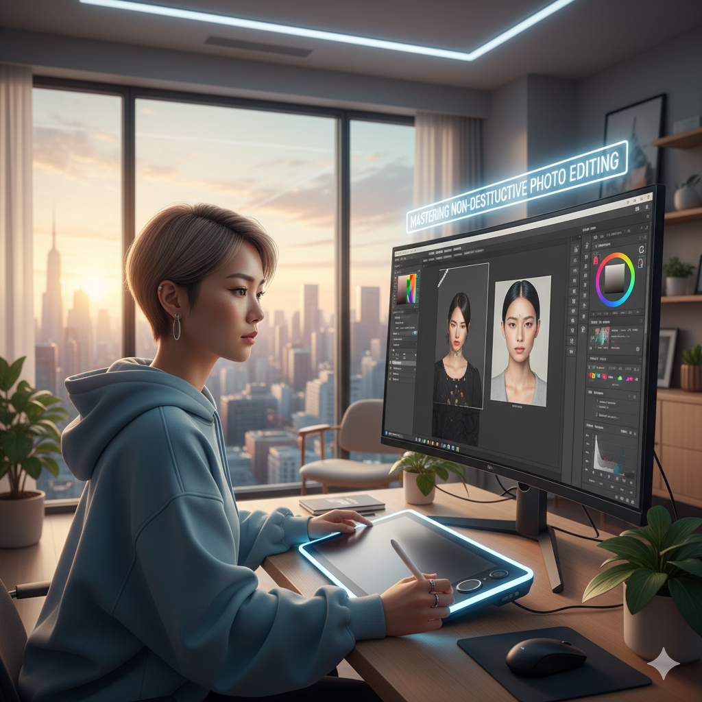
Workflow that is non-destructive and uses intelligent objects
When utilizing Blend-If for professional applications, it is imperative that the layer be maintained as a Smart Object at all times. This gives you the ability to make adjustments to the sliders at a later time, mix them with other effects, or modify the backdrop that is below without having to start again. Utilization that is non-destructive is of utmost significance in the fields of compositing, product photography, and editorial design, all of which may need several modifications of the backdrop.
Blend-If Integration Into Workflows that are Used for Compositing
In situations when exact subject isolation is essential, Blend-If performs very well in multi-layer composites. As an illustration, putting a person into a new scene, displaying a product on a textured background, or combining numerous picture layers are all examples of different techniques. Because the automated separation helps to save time while maintaining realism, it is an essential tool for professional pipelines that are used for compositing.
Completed Details for a Background Removal That Is Effortless
In order to improve the margins of the subject once it has been isolated, you may use a combination of layer masks, the Select and Mask tools, or a modest Gaussian blur on the mask. Adapt the hue and contrast to the new backdrop in order to improve the cohesiveness of the design. Blend-If, when combined with these finishing processes, allows you to create undetectable background removal of professional quality in a way that is both quick and non-destructive.