Photoshop Tutorial: How to Transform Photos Taken During the Day into Night Scenes
Creating a transformation in Photoshop that takes a brilliant daytime photograph and transforms it into a dark nighttime landscape is one of the most rewarding techniques available. A combination of technical expertise and creative vision is required for the procedure, which involves adjusting the brightness, tone, and ambiance of the photograph until it seems as if it was taken under the moonlight.
Learning how to handle the daylight-to-night conversion teaches you how to influence mood via color, contrast, and lighting balance. This is true whether you are building a cinematic composite, improving a landscape, or adding mystique to a portrait. In order to get this effect, let’s go through the process step by step.
Recognizing the Characteristics That Define a Night Scene
It is helpful to have an understanding of what causes a picture to seem to be nighttime before digging into the tools. Authentic nighttime photography is characterized by three characteristics:
- As the temperature drops, the yellows that are present in daylight transform into blue or indigo.
- The contrast is reduced, and the highlights are softened; the brilliant spots lose their brilliance.
- Moonlight, street lighting, and reflections are examples of localized light sources that may generate pockets of brightness that are sandwiched between areas of darkness.
- You want to be able to duplicate these features in a natural way when you are altering a photograph taken during the daytime without over-darkening it or losing its texture.
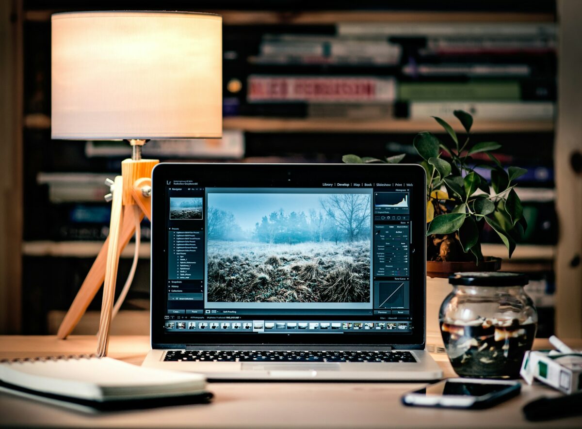
First Step: Make sure your base layer is ready and duplicate it.
Immediately after opening your picture of the daytime in Photoshop, duplicate the Background layer by using the Ctrl and J or the Cmd and J keys.
It is possible to make adjustments to your alterations at a later time if you work in a non-destructive manner. To ensure that there is no confusion, give the duplicate layer a name such as Night Base.
The next step is to make sure the lighting of your workstation is comfortable. The ability to effectively detect contrast is enhanced by using a screen that is somewhat muted. This is because subtle color changes might be difficult to assess on displays that are too bright.
The second step is to adjust the white balance to a cooler intensity.
Cooling down the picture is the first phase, and it is also the most noticeable one.
You may adjust the density to about 30–40% by going to Image > Adjustments > Photo Filter, selecting the Cooling Filter (82), and then increasing the density.
Another option is to make use of a Color Balance Adjustment Layer, which provides further control:
- Adding +20 blue and +10 cyan to the midtones
- Adding +15 Blue and +10 Cyan to the shadows
- Notes: add ten points to the blue
The warmth of sunshine is immediately removed, and the blue color of dusk is substituted for it. This modification takes effect immediately.
The next step is to gradually intensify the darkness.
In order to create a genuine night impression, it is not enough to just reduce the brightness; rather, it is necessary to recirculate the light.
It is recommended to make use of a Curves Adjustment Layer in order to softly bring down the midtones while maintaining a bit of brightness in the highlights. Because of this, depth is created rather than a flat blackness.
Make sure that the sky is included in your scene by selecting it using the Quick Selection Tool or the Select Sky command for example. Next, add another layer of Curves to make it darker in a more aggressive manner. Having a sky that is little deeper than usual immediately improves the appearance of evening.
Add some subtle desaturation as the fourth step.
At night, when there is less light in the environment, colors look more subdued. Adding a Hue/Saturation Adjustment Layer and lowering the saturation by around 20–30% will allow you to get this effect.
It is important to keep an eye on skin tones or places with warm light since they should preserve a hint of color in order to have a natural feeling. Use the layer mask to selectively restore saturation where it is required, such as in close proximity to streetlights, windows, or things that are illuminated by the moon.
Moonlight or street lighting should be simulated in the fifth step.
Light lends a sense of reality and drama to your nighttime setting.
Create a new layer, set it to Overlay or Soft Light, and use a soft white brush to paint places that may be illuminated by the moon or artificial light. These areas include the borders of roofs, faces, and road surfaces.
Make use of the Gradient Tool (white to transparent) and drag from the light source outward in order to improve the directionality of the animation. Set the opacity to regulate the level of subtlety.
If you want the light layer to have a cooler appearance, you can also use the Color Overlay blending option to give it a very little blue tinge.
Paint Shadows to Create Depth is the Sixth Step
Shadows that are convincing are quite important for night situations. In locations where the amount of daylight was the greatest, use a soft black brush to paint shadows on a new layer that has been set to the Multiply mode.
Adjust the opacity of the layer to somewhere between 30 and 40 percent, and then use the Gaussian Blur effect to gently blur it.
Consider in a rational manner the locations where shadows are cast, such as under vehicles, trees, or people. In order to get a more theatrical effect, your lighting should have a more directed texture.
Step Seven: Modify the Sky and Add Stars (This Step Is Optional)
The sky in your photograph may be replaced or edited to create a more convincing illusion if it is included in the photograph.
By selecting Sky from the menu, you may erase the one that is now selected and then add a deeper gradient or a different night sky picture by mixing it with the Soft Light setting.
Create a new black layer, fill it up entirely, and then go to the Filter menu, then choose Noise, and finally select Add Noise. Change the blending mode to Screen and decrease the opacity of the image. By using Levels, you may make the stars seem more natural and finer.
This seemingly little aspect has the potential to shift the metamorphosis from “edited” to “believable.”
To complete the eighth step, add a dash of atmospheric haze.
A distinct way of scattering light is shown by night air, particularly near lighting or moonlight. In order to get this environment, you will first need to create a new layer, then apply Gaussian Blur, and last, lightly brush white around the light sources.
You should lower the opacity of the layer to around 20–30% and set it to Screen or Soft Light.
In addition to adding realism, this faint haze gives the impression that there is mist, moisture, or light diffusion in the air.
Utilize Gradient Maps to Achieve Tonal Harmony as the Ninth Step
Make use of a Gradient Map Adjustment Layer in order to bring the overall tone together. After selecting a gradient that ranges from a dark blue to a light gray, change the blending mode to Color and reduce the opacity to around thirty percent.
Your picture will have the seamless impression of a genuine nighttime setting as a result of this, which pulls together all of your lighting differences and color variations. There is no trace of daylight hue left behind thanks to this finishing touch, which is of professional quality.
The tenth step is to selectively sharpen and add the finishing touches.
Perform a final pass in which you carefully sharpen areas that you want the viewer to concentrate on, such as the face of a person, the headlights of a vehicle, or a significant structure.
Apply the High Pass Filter to a duplicated layer that is set to the Overlay blending mode, and then mask off regions that should not be sharp, such as the sky or shadows inside the layer.
By doing so, you are able to improve the depth and clarity of your night composition without simultaneously adding noise or unnatural edges.
Avoiding the Most Frequent Errors
Excessively darkening the whole picture: Night does not imply complete darkness; the goal is to strike a balance.
- Forgetting the direction of the light: Shadows have to be aligned with the light source that was selected.
- Without taking into account the difference between warm and cold light, streetlights are often warm, while moonlight is chilly. The mixture has a natural tone.
- Night scapes still feature neutrals and minor color variation, despite the fact that blue tones are often used.
- The addition of stars in an unnatural manner: the scale and brightness should be compatible with the viewpoint.
A Few Closing Thoughts: The Art of Storytelling Is What Transforms Day into Night
The art of storytelling is where the actual beauty of this transition may be found. You are not only adjusting the exposure; rather, you are altering the emotional tone of the photograph when you do so.
Daylight has a cozy, secure, and reassuring atmosphere. Night brings with it a sense of mystery, tranquility, and perhaps a touch of danger. When you use Photoshop, you are not just duplicating nature; rather, you are rethinking it.
You have the ability to transform any brilliant landscape into the peaceful poetry of the night if you have time and the correct combination of tonal changes, painting, and gradient mapping.