Categories
How To Guides Photoshop

Dancing in the Rain: A Comprehensive Guide to Adding Realistic Rain to a Photo with Photoshop

Introduction:

Rain, with its gentle droplets or torrential downpours, can evoke a range of emotions and add a dynamic and cinematic quality to photographs. While capturing rain in-camera may be challenging, Adobe Photoshop provides a powerful toolkit for digital artists to simulate the captivating effect of rain in post-processing. This comprehensive guide will walk you through the step-by-step process of adding realistic rain to a photo using Photoshop, exploring various techniques, tools, and adjustments to achieve a convincing and visually striking rain effect.

I. Choosing the Right Photo:

1.1 Photo Selection:

  • Begin by selecting a photo that suits the mood and theme you envision with the addition of rain.
  • Consider the existing lighting, atmosphere, and the overall ambiance of the image.

1.2 High-Quality Image:

  • Opt for a high-resolution image to ensure the rain effect integrates seamlessly with the photograph.
  • High-quality images provide a more realistic canvas for the addition of rain droplets and streaks.

II. Launching Adobe Photoshop and Opening the Image:

2.1 Opening Photoshop:

  • Launch Adobe Photoshop on your computer to initiate the creative process.
  • Create a new document or open an existing one where you want to add the realistic rain effect.

2.2 Importing the Image:

  • Import the chosen image into Photoshop as the base layer.
  • Ensure the image layer is positioned at the bottom of the layer stack to serve as the backdrop for the simulated rain.

III. Creating a New Layer for Rain:

3.1 Adding a New Layer:

  • Create a new layer above the image layer to paint and simulate the rain.
  • Use the Brush Tool (B) with a soft, round brush and set the foreground color to white.

3.2 Adjusting Brush Settings:

  • Experiment with brush settings such as size, opacity, and flow to achieve a varied and natural raindrop effect.
  • Utilize pressure sensitivity if using a graphics tablet for more control.

IV. Painting Raindrops:

4.1 Randomized Placement:

  • Paint random white dots across the new layer to simulate raindrops.
  • Vary the size and spacing of the dots for a natural and organic appearance.

4.2 Angle and Direction:

  • Consider the direction of rain in the scene and paint raindrops at angles that align with the existing elements in the photo.
  • This step enhances the realism of the rain effect.

V. Adding Motion Blur:

5.1 Selecting Rain Layer:

  • With the rain layer selected, go to Filter > Blur > Motion Blur.
  • Adjust the angle and distance settings to simulate the motion of raindrops falling.

5.2 Duplicating and Varying Blur:

  • Duplicate the rain layer and experiment with different motion blur settings on each duplicate.
  • Varying the blur adds depth and dynamism to the rain effect.

VI. Adjusting Opacity and Blend Modes:

6.1 Opacity Control:

  • Fine-tune the intensity of the rain effect by adjusting the opacity of the rain layers.
  • Experiment with different opacities to find the right balance between subtlety and visibility.

6.2 Blending Modes:

  • Explore blending modes such as Screen or Overlay to seamlessly integrate the rain with the underlying image.
  • Each blending mode imparts a unique character to the rain effect.

VII. Creating Rain Streaks:

7.1 Adding Vertical Lines:

  • Create a new layer for rain streaks and use the Line Tool to draw vertical white lines.
  • Vary the lengths and thickness of the lines to emulate rain streaks at different distances.

7.2 Motion Blur for Streaks:

  • Apply motion blur to the streaks layer to simulate the dynamic movement of rain streaks.
  • Adjust the angle and distance settings for a realistic appearance.

VIII. Atmospheric Adjustments:

8.1 Adjusting Hue/Saturation:

  • Fine-tune the color of the rain layers to match the overall tone of the image.
  • Use adjustment layers like Hue/Saturation to blend the rain seamlessly with the existing colors.

8.2 Adding Atmospheric Elements:

  • Introduce fog or mist to the image to enhance the overall atmosphere and complement the rain effect.
  • Create a new layer for fog and experiment with brushes or filters to achieve a subtle misty ambiance.

IX. Realistic Reflections:

9.1 Adding Reflective Surfaces:

  • Enhance realism by adding reflections of rain on surfaces such as roads or windows.
  • Duplicate the rain layers and position them where reflections would naturally occur.

9.2 Adjusting Opacity for Reflections:

  • Lower the opacity of the reflection layers to simulate the transparency of reflections on wet surfaces.
  • This step adds a touch of authenticity to the rain effect.

X. Fine-Tuning and Refining:

10.1 Iterative Review: – Step back and review the entire composition, considering the placement, motion, and overall visual impact of the rain effect. – Make iterative adjustments to opacity, blend modes, and additional elements for a refined and cohesive result.

10.2 Saving Iterative Versions: – Save iterative versions of your project to preserve different stages of the creative process. – This practice allows for experimentation and easy backtracking if desired.

XI. Exporting the Image with Realistic Rain:

11.1 Saving in Appropriate Formats: – Save the final image with the realistic rain effect in the desired format, resolution, and color space. – Consider the intended use, whether for digital display, print, or further digital manipulation.

11.2 Sharing and Showcasing: – Share your image with the added rain effect on social media platforms or within digital art communities. – Engage with fellow photographers and digital artists, gather feedback, and celebrate the atmospheric beauty of your rain-infused creation.

XII. Conclusion:

Adding realistic rain to a photo in Adobe Photoshop is a journey into the realm of atmospheric storytelling, where digital artistry brings nature’s elements to life. By skillfully painting raindrops, applying motion blur, and integrating reflections, artists can create a captivating and immersive rain effect that transforms ordinary scenes into cinematic masterpieces. As you embark on your rainy day adventure, let your creativity guide you, experiment with different techniques, and witness the transformative power of Photoshop in crafting images that dance with the magic of falling rain.

Categories
How To Guides Photoshop

The Art of Transparency: A Comprehensive Guide to Adding Transparent Text to an Image with Photoshop Layer Effects

Introduction:

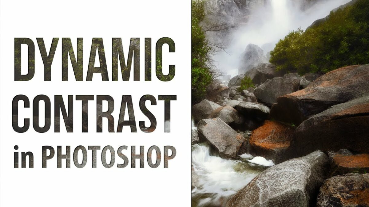
In the vast landscape of digital design, the ability to seamlessly integrate text into images is a skill that elevates visual storytelling and communication. Adobe Photoshop, a powerhouse in the realm of graphic design, provides a myriad of tools and features for crafting captivating compositions. This comprehensive guide will walk you through the intricate process of adding transparent text to an image using Photoshop layer effects. From choosing the right fonts to mastering blending modes, this guide unveils the secrets to creating transparent and visually engaging text that harmoniously integrates with your images.

I. Choosing the Right Image:

1.1 Image Selection:

  • Begin by selecting an image that complements the message or theme you wish to convey with your transparent text.
  • Consider factors such as color tones, composition, and focal points within the image.

1.2 High-Quality Image:

  • Opt for a high-resolution image to ensure clarity and detail in the final result.
  • A high-quality image serves as a solid foundation for adding transparent text that seamlessly merges with the visual elements.

II. Launching Adobe Photoshop and Opening the Image:

2.1 Opening Photoshop:

  • Launch Adobe Photoshop on your computer to initiate the creative process.
  • Create a new document or open an existing one where you want to incorporate transparent text.

2.2 Importing the Image:

  • Import the chosen image into Photoshop as a new layer.
  • Ensure the image layer is positioned at the bottom of the layer stack, serving as the backdrop for the transparent text.

III. Adding Text Layer:

3.1 Creating a Text Layer:

  • Select the Text Tool (T) from the toolbar and click on the image to create a text layer.
  • Type the desired text and choose a font that complements the overall aesthetic of the image.

3.2 Adjusting Font Size and Position:

  • Resize and reposition the text layer as needed to achieve the desired placement within the image.
  • Experiment with font sizes and styles to find the perfect balance between visibility and subtlety.

IV. Applying Layer Effects for Transparency:

4.1 Accessing Layer Styles:

  • With the text layer selected, go to the bottom of the Layers panel and click on the “fx” icon to access Layer Styles.
  • Choose “Blending Options” to explore a variety of effects that can be applied to achieve transparency.

4.2 Adjusting Opacity:

  • Within the Blending Options, locate the “Opacity” slider and adjust it to control the transparency of the text.
  • Lower the opacity to make the text more transparent, allowing the underlying image to show through.

V. Experimenting with Blending Modes:

5.1 Understanding Blending Modes:

  • Explore different blending modes to further enhance the interaction between the text and the image.
  • Experiment with modes such as “Overlay,” “Soft Light,” or “Multiply” to achieve diverse and visually interesting effects.

5.2 Customizing Blend If Options:

  • Within the Blending Options, use the “Blend If” sliders to fine-tune how the text interacts with the underlying image.
  • Adjust the sliders for a seamless integration of the text with specific tonal ranges in the image.

VI. Adding Depth with Drop Shadows:

6.1 Applying Drop Shadow:

  • To add depth and definition to the transparent text, consider applying a subtle drop shadow.
  • Within the Blending Options, check the “Drop Shadow” option and adjust settings like opacity, distance, and size.

6.2 Experimenting with Outer Glow:

  • Enhance the visibility of the text by experimenting with an outer glow effect.
  • Adjust settings such as size, spread, and color to create a soft glow around the transparent text.

VII. Creating Gradient or Gradient Overlay:

7.1 Gradient Overlay Effect:

  • Experiment with adding a gradient overlay to the text for a stylish and dynamic effect.
  • Within the Blending Options, check the “Gradient Overlay” option and customize the gradient colors and blending angles.

7.2 Adjusting Gradient Opacity:

  • Fine-tune the transparency of the gradient overlay by adjusting the opacity slider within the Gradient Overlay options.
  • This step allows for precise control over the visibility of the gradient on the text.

VIII. Masking Techniques for Precision:

8.1 Adding Layer Mask:

  • For precise control over transparency, add a layer mask to the text layer.
  • Use a soft brush on the mask to paint areas where you want the text to be more or less transparent.

8.2 Refining Edges with Vector Masks:

  • If the text has intricate shapes or curves, consider using a vector mask for smoother and more refined edges.
  • Create a vector mask and use the Pen Tool to define the outline of the text.

IX. Experimenting with Color and Saturation:

9.1 Color Overlay for Hue Adjustment:

  • Add a color overlay to the text layer for creative adjustments to the hue.
  • Experiment with different colors to achieve a harmonious blend with the image.

9.2 Saturation Adjustment:

  • Fine-tune the saturation of the text layer to ensure it matches the overall color intensity of the image.
  • Use adjustment layers or the Hue/Saturation option within the Blending Options.

X. Reviewing and Refining:

10.1 Iterative Review: – Step back and review the entire composition, considering the placement, transparency, and overall visual impact of the text. – Make iterative adjustments to layer effects, blending modes, and additional elements for a polished and cohesive result.

10.2 Saving Iterative Versions: – Save iterative versions of your project to preserve different stages of the creative process. – This practice allows for experimentation and easy backtracking if desired.

XI. Exporting the Image with Transparent Text:

11.1 Saving in Appropriate Formats: – Save the final image with transparent text in the desired format, resolution, and color space. – Consider the intended use, whether for digital display, print, or further digital manipulation.

11.2 Sharing and Showcasing: – Share your image with transparent text on social media platforms or within design communities. – Engage with fellow designers, gather feedback, and celebrate the seamless integration of text with your images.

XII. Conclusion:

Adding transparent text to an image in Adobe Photoshop is a journey into the realm of visual finesse, where typography becomes an integral part of the composition. By skillfully applying layer effects, blending modes, and masking techniques, designers can create transparent text that enhances the narrative and aesthetics of their images. As you embark on your journey of typographic integration, let your creativity guide you, experiment with different styles, and witness the transformative power of Photoshop in seamlessly merging text with visual elements to craft compositions that captivate and communicate with elegance.

Categories
How To Guides

Mastering Color Transformations: A Comprehensive Guide to Converting Colors to Different Profiles in CorelDRAW

Introduction: Color transformation is a fundamental aspect of graphic design, allowing designers to adapt their creative vision to different color spaces and output requirements. In the realm of design software, CorelDRAW stands out for its robust set of tools for color management. This extensive guide delves into the intricacies of converting colors to other color profiles in CorelDRAW, providing designers with a comprehensive understanding of the process and its importance in achieving accurate and consistent color representation across various devices and output mediums.

I. The Dynamics of Color Conversion:

A. Defining Color Conversion:

  1. Color conversion involves transforming colors from one color space or profile to another.
  2. CorelDRAW facilitates color conversion to adapt designs to different output requirements, ensuring the fidelity of colors in diverse design contexts.

B. Importance of Color Conversion:

  1. Design projects often involve multiple devices and output mediums, each with its unique color characteristics.
  2. Color conversion enables designers to maintain consistent color representation regardless of the intended output, be it for digital display, print, or other applications.

II. Understanding Color Spaces and Profiles in CorelDRAW:

A. RGB Color Space:

  1. CorelDRAW predominantly uses the RGB (Red, Green, Blue) color space for digital design.
  2. RGB represents colors using light and is suitable for computer monitors and electronic displays.

B. CMYK Color Space:

  1. The CMYK (Cyan, Magenta, Yellow, Black) color space is essential for print projects, representing colors using ink.
  2. CorelDRAW supports CMYK color profiles to ensure accurate color reproduction on printed materials.

C. Additional Color Spaces:

  1. CorelDRAW accommodates various color spaces, including LAB, Grayscale, and Spot colors, each serving specific design requirements.
  2. Understanding the nuances of different color spaces is crucial for effective color conversion.

III. Steps to Convert Colors to Other Profiles in CorelDRAW:

A. Opening the Color Management Dialog:

  1. Access the Color Management dialog in CorelDRAW through “Tools” > “Color Management.”

B. Selecting the Source Profile:

  1. In the Color Management dialog, identify the current color profile of the document or design.

C. Choosing the Target Profile:

  1. Select the desired target color profile to which the colors will be converted.
  2. Choose the appropriate profile based on the output requirements or device specifications.

D. Rendering Intent Selection:

  1. Choose a rendering intent that aligns with the goals of the color conversion process.
  2. Options include Perceptual, Relative Colorimetric, Absolute Colorimetric, and Saturation, each influencing how colors are transformed.

E. Applying Color Conversion:

  1. Once the source and target profiles are selected, apply the color conversion by confirming the changes in the Color Management dialog.
  2. CorelDRAW will adjust the colors in the document based on the selected profiles and rendering intent.

F. Real-Time Color Transformation:

  1. CorelDRAW enables real-time color transformation, allowing designers to observe the impact of the conversion instantly.
  2. Experiment with different profiles and rendering intents to achieve the desired color results.

IV. Best Practices for Color Conversion in CorelDRAW:

A. Understanding Rendering Intents:

  1. Familiarize yourself with the different rendering intents and their effects on color transformation.
  2. Choose the rendering intent that best suits the goals of your design project, whether it’s preserving overall visual harmony or achieving precise color matching.

B. Consistent Rendering Across Projects:

  1. Maintain consistency in rendering intents and color profiles across different design projects.
  2. Create a standardized set of profiles and rendering intents that align with your preferred output mediums for uniform color representation.

C. Soft Proofing Before Conversion:

  1. Utilize CorelDRAW’s soft proofing feature to simulate how colors will appear after conversion.
  2. Soft proofing aids in making informed decisions about color adjustments before finalizing the conversion process.

D. Documenting Color Conversion Settings:

  1. Keep a record of color conversion settings used in each project for future reference.
  2. Documenting color conversion settings ensures that consistent color representation can be maintained, even when revisiting or updating projects.

V. Troubleshooting and Common Issues:

A. Mismatched Profiles:

  1. Be cautious of mismatched profiles when converting colors, as this can result in inaccurate color representation.
  2. Ensure that the source and target profiles are compatible with the intended output.

B. Artifacts and Color Shifts:

  1. If artifacts or color shifts occur during the conversion process, reassess the choice of rendering intent and profiles.
  2. Experiment with different combinations to achieve the desired color outcome without compromising quality.

C. Real-Time Adjustments:

  1. If colors appear differently than intended during real-time color transformation, evaluate and adjust color settings as needed.
  2. Regularly preview and assess the impact of color conversion in real-time to maintain control over the final color results.

VI. Conclusion:

Converting colors to other color profiles in CorelDRAW is a pivotal skill for designers seeking to achieve accurate and consistent color representation in their projects. This comprehensive guide has explored the dynamics of color conversion, the importance of understanding different color spaces, and the practical steps for executing color transformations in CorelDRAW. By mastering the art of color conversion, designers can confidently adapt their creations to diverse output requirements, ensuring that their creative visions are realized with precision and fidelity. CorelDRAW’s commitment to color management empowers designers to navigate the complexities of color transformation with ease, creating designs that captivate and resonate across various devices and mediums. As designers embrace the nuances of color conversion, they unlock the full spectrum of possibilities within CorelDRAW, elevating their designs to new levels of visual excellence.