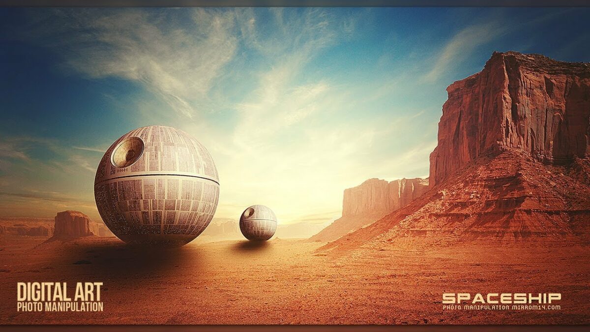
Categories
How To Guides

Mastering Color Management: A Comprehensive Guide to Color Handling in CorelDRAW

Color management in CorelDRAW plays a pivotal role in ensuring the accuracy and consistency of colors across various devices and output mediums. As one of the leading graphic design software packages, CorelDRAW offers a robust set of tools and features to facilitate color management, empowering designers to achieve their desired color results with precision and reliability.

I. Understanding Color Management:

Color management is the process of controlling and maintaining consistent colors throughout the design workflow, from creation to final output. It involves the accurate representation of colors across different devices, such as monitors, printers, and digital displays, to ensure that the intended colors are faithfully reproduced.

A. Color Spaces and Profiles:

  1. RGB Color Space: The RGB (Red, Green, Blue) color space is commonly used for digital design, as it encompasses the range of colors visible on computer monitors and electronic displays. RGB color profiles define the color characteristics of a device or color space, ensuring consistent color reproduction across digital platforms.
  2. CMYK Color Space: The CMYK (Cyan, Magenta, Yellow, Black) color space is used for print production, representing the combination of ink colors used in the printing process. CMYK color profiles are essential for ensuring accurate color output on printed materials, such as brochures, posters, and packaging.
  3. Other Color Spaces: CorelDRAW supports various color spaces and profiles, including LAB, Grayscale, and Spot colors, providing designers with flexibility and control over color management in different design scenarios.

B. Color Management Policies:

  1. Conversion and Rendering Intent: Color management policies dictate how colors are converted and rendered when moving between different color spaces. Rendering intents, such as Perceptual, Relative Colorimetric, Absolute Colorimetric, and Saturation, determine how colors are adjusted to maintain consistency and preserve color accuracy across devices and mediums.
  2. Soft Proofing: Soft proofing allows designers to simulate how colors will appear on different output devices, such as printers or monitors, before finalizing designs. By previewing color adjustments and rendering intents, designers can make informed decisions to ensure the desired color results in the final output.

II. CorelDRAW Color Management Tools:

CorelDRAW provides a comprehensive suite of color management tools and features to facilitate accurate color reproduction and consistency throughout the design process.

A. Color Management Settings:

  1. Color Settings Dialog: The Color Settings dialog in CorelDRAW allows designers to customize color management preferences, including default color profiles, rendering intents, and soft proofing options. By configuring color settings according to specific project requirements, designers can ensure optimal color accuracy and consistency.
  2. Device Link Profiles: Device link profiles provide advanced color management capabilities by preserving color relationships and consistency between different devices and color spaces. CorelDRAW allows designers to apply device link profiles for precise color transformations and accurate color reproduction across various output mediums.

B. Color Proofing and Correction:

  1. Soft Proofing Mode: CorelDRAW’s soft proofing mode enables designers to simulate how colors will appear on different output devices, such as printers or monitors, directly within the application. By previewing color adjustments and rendering intents in real-time, designers can fine-tune colors to achieve the desired results before finalizing designs for output.
  2. Color Correction Tools: CorelDRAW offers a range of color correction tools, including Color Balance, Hue/Saturation/Lightness, and Color Harmonies, to adjust and fine-tune colors within designs. These tools empower designers to achieve precise color adjustments and corrections, ensuring optimal color reproduction and consistency across various design elements.

III. Best Practices for Color Management:

Effective color management requires adherence to best practices and guidelines to ensure consistent and accurate color reproduction across different devices and output mediums.

A. Calibrating Devices:

  1. Monitor Calibration: Calibrating computer monitors ensures accurate color representation and consistency when designing digital artwork. Using calibration tools and software, designers can adjust monitor settings to match industry-standard color profiles and achieve optimal color accuracy.
  2. Printer Calibration: Calibrating printers ensures consistent color output and accuracy when printing designs. By using printer calibration tools and test prints, designers can adjust printer settings to match color profiles and achieve reliable color reproduction on printed materials.

B. Using Standard Color Profiles:

  1. Default Color Profiles: CorelDRAW provides default color profiles for RGB, CMYK, and other color spaces, ensuring consistent color representation across different design projects. Designers should select appropriate color profiles based on project requirements and output mediums to maintain color accuracy and consistency.
  2. Custom Color Profiles: For specialized design projects or specific output requirements, designers can create custom color profiles tailored to individual preferences and project specifications. Custom color profiles allow for precise color management and control, ensuring optimal color reproduction and fidelity in design output.

IV. Conclusion:

Color management is a critical aspect of the design process, ensuring consistent and accurate color reproduction across various devices and output mediums. CorelDRAW offers a comprehensive suite of color management tools and features to facilitate precise color control and consistency throughout the design workflow. By understanding color spaces, profiles, rendering intents, and utilizing color management tools effectively, designers can achieve optimal color accuracy and fidelity in their designs. Adhering to best practices for color management, including device calibration, using standard color profiles, and soft proofing, ensures reliable color reproduction and consistency across different output mediums. With CorelDRAW’s robust color management capabilities, designers can confidently create vibrant, visually compelling designs that accurately reflect their creative vision.

Categories
How To Guides Photoshop

Mastering Artistry: Creating Intricate Photo Borders in Photoshop with Masks and Filters

Introduction:

In the realm of digital design and photography, the framing of an image plays a crucial role in enhancing its visual impact. Creating photo borders in Photoshop is an artful technique that goes beyond traditional framing, allowing for the infusion of creativity and personality into your compositions. This extensive guide will walk you through the step-by-step process of crafting intricate photo borders using masks and filters in Photoshop. From selecting the right image to applying advanced masking techniques, this tutorial aims to empower you with the skills to elevate your photo borders to a level of artistic excellence.

Section 1: Choosing the Right Image

Step 1: Selecting a Compelling Image:

Begin by choosing a photograph that captures attention and aligns with your creative vision for the photo border. Consider images with distinct subjects, vibrant colors, or interesting compositions that can serve as a focal point within the border.

Step 2: Assessing Composition:

Pay close attention to the composition of the selected image. Elements like leading lines, symmetry, or a well-defined subject can enhance the effectiveness of your photo border. A thoughtful composition ensures that the border complements and enhances the overall visual narrative.

Section 2: Importing and Organizing Images

Step 1: Transferring Images to Photoshop:

Transfer the selected image to your computer and organize it in a dedicated folder. This organizational step ensures a smooth workflow and easy access to the image during the photo border creation process.

Step 2: Opening Images in Photoshop:

Launch Adobe Photoshop and open the chosen image within the workspace. Use the “File” menu and select “Open” to load the image, preparing it for the photo border design.

Section 3: Basic Adjustments in Adobe Camera Raw

Step 1: Accessing Adobe Camera Raw:

Before delving into photo border creation, make basic adjustments using Adobe Camera Raw. This step involves refining exposure, contrast, and color balance to achieve an optimal starting point for your photo border.

Step 2: Fine-Tuning Highlights and Shadows:

Use the sliders in Adobe Camera Raw to fine-tune highlights and shadows. Balancing these elements ensures that your photo border will complement the overall tone and mood of the image.

Section 4: Initial Image Masking

Step 1: Creating a Duplicate Layer:

To begin the photo border creation, create a duplicate layer of your image. This duplication allows for non-destructive editing, preserving the original image beneath the adjustments.

Step 2: Applying a Layer Mask:

Add a layer mask to the duplicated layer. This mask will be the foundation for shaping the photo border. Utilize the “Brush” tool to selectively reveal or hide parts of the image, defining the boundaries of your border.

Section 5: Introducing Filter Effects

Step 1: Choosing a Filter:

Experiment with various filters to add a distinct visual effect to your photo border. Filters such as Gaussian Blur, Oil Paint, or Brush Strokes can introduce unique textures and atmospheres to enhance the artistic quality of the border.

Step 2: Adjusting Filter Settings:

Fine-tune the filter settings to achieve the desired effect. Control parameters like intensity, size, or complexity to tailor the filter to complement the theme and mood of your photo border.

Section 6: Layer Styles for Dimension

Step 1: Adding Layer Styles:

Enhance the three-dimensional quality of your photo border by applying layer styles. Use effects like Inner Shadow, Bevel and Emboss, or Stroke to add depth and definition to the border’s edges.

Step 2: Customizing Layer Style Settings:

Customize the settings of layer styles to align with the aesthetics of your photo border. Adjust parameters such as opacity, size, or color to achieve a harmonious integration of layer styles with the overall composition.

Section 7: Advanced Masking Techniques

Step 1: Utilizing Advanced Brushes:

For intricate photo borders, employ advanced brushes to refine the layer mask. Brushes with unique textures or patterns can add intricate details, contributing to the complexity and artistry of the border.

Step 2: Experimenting with Brush Opacity and Flow:

Fine-tune the opacity and flow settings of your brushes for nuanced masking. This step allows for precise control over the gradual reveal or concealment of image elements within the photo border.

Section 8: Incorporating Texture Layers

Step 1: Adding Texture Layers:

Elevate the tactile quality of your photo border by incorporating texture layers. Overlay textures such as paper, fabric, or grunge patterns to infuse additional visual interest and depth.

Step 2: Blending Texture Layers:

Experiment with blending modes and opacity settings to seamlessly integrate texture layers with the photo border. This step ensures that the texture enhances the overall aesthetic without overpowering the image.

Section 9: Creative Overlays for Artistry

Step 1: Introducing Creative Overlays:

Explore the addition of creative overlays to impart a distinct atmosphere to your photo border. Overlays like light leaks, bokeh, or abstract patterns can introduce an artistic flair that enhances the overall impact.

Step 2: Adjusting Overlay Blending Modes:

Fine-tune the blending modes of creative overlays to achieve a harmonious blend with the photo border. Experiment with blending modes such as Screen or Overlay to ensure a seamless integration.

Section 10: Color Grading and Toning

Step 1: Selective Color Adjustments:

Refine the color palette of your photo border through selective color adjustments. Use adjustment layers like Color Balance or Hue/Saturation to tailor the color tones to match the desired mood.

Step 2: Introducing Gradient Maps:

Experiment with gradient maps to add depth and dimension to the color grading. Gradient maps allow for creative control over color transitions within the photo border, contributing to a cohesive visual narrative.

Section 11: Final Touches and Global Adjustments

Step 1: Evaluating Overall Composition:

Step back and assess the overall composition of your photo border. Ensure that the added elements, filters, and adjustments contribute to a unified and visually appealing design.

Step 2: Global Adjustments for Cohesion:

Make any final global adjustments to overall color balance, contrast, or saturation. This step ensures that the photo border integrates seamlessly with the broader color scheme and aesthetics of the image.

Section 12: Saving and Exporting

Step 1: Save Your Artwork:

Once satisfied with your photo border creation, save your work in a high-quality format such as PSD. This preserves layers and allows for future edits or refinements.

Step 2: Exporting for Different Platforms:

When ready to share your photo border masterpiece, export it in suitable formats for various platforms. Consider the intended use, whether for print, web, or social media, to ensure the exported file retains the quality and impact of your artistic creation.

Section 13: Troubleshooting Common Challenges

Challenge 1: Uneven Masking:

Address uneven masking by revisiting the layer mask with advanced brushes. Ensure that the masking is consistent and aligns with the intended design of the photo border.

Challenge 2: Overwhelming Filters:

If filters overpower the image, dial back the intensity or complexity settings. Adjust the filter parameters to achieve a balance where the filter enhances without overshadowing the photo border.

Section 14: Showcasing Inspirational Examples

Example 1: Vintage Elegance Border:

Explore a photo border infused with vintage charm, featuring subtle filters, texture layers, and intricate masking for an elegant and timeless aesthetic.

Example 2: Contemporary Abstract Border:

Witness a modern and abstract photo border created through bold filters, creative overlays, and experimental color grading. This example showcases the versatility of photo border design in contemporary digital art.

Section 15: Advancing Skills in Photo Border Design

Step 1: Experimenting with Styles:

Expand your photo border design skills by experimenting with different styles. Explore minimalistic borders, ornate frames, or thematic designs to diversify your creative repertoire.

Step 2: Pushing the Boundaries of Creativity:

Challenge yourself to push the boundaries of creativity within photo border design. Integrate unconventional elements, experiment with asymmetry, or combine various techniques to create borders that defy traditional norms.

Conclusion:

Creating photo borders in Photoshop with masks and filters is a dynamic fusion of technical skill and artistic intuition. This comprehensive guide has equipped you with the tools and techniques needed to transform your images into visually captivating compositions. As you embark on your journey of photo border design, let your creativity flourish and infuse your personal style into each border you craft. Embrace the artistry of photo borders – let them become a testament to your mastery of design, attention to detail, and the seamless marriage of technology and creativity in the digital canvas of Photoshop.

Categories
How To Guides Photoshop

Mastering Visual Impact: Adding Focus to an Image with Color in Photoshop

Introduction:

In the vast landscape of digital photography and design, the strategic use of color can transform an ordinary image into a captivating visual narrative. Understanding how to add focus to an image with color in Photoshop is a skill that elevates your creative prowess, allowing you to guide the viewer’s attention and convey a nuanced story. This extensive guide will take you through the step-by-step process of harnessing the power of color to enhance focus, create emphasis, and infuse depth into your photographs.

Section 1: The Power of Color Psychology

Step 1: Understanding Color Meanings:

Before diving into Photoshop techniques, grasp the fundamentals of color psychology. Different colors evoke specific emotions and associations, and understanding these nuances will inform your decisions when adding focus to an image.

Step 2: Selecting a Dominant Color:

Identify the dominant color that aligns with the mood or message you want to convey. This color will serve as the focal point, drawing the viewer’s gaze and establishing a visual hierarchy within your image.

Section 2: Importing and Organizing Images

Step 1: Transferring Images to Photoshop:

Begin by transferring your selected images to your computer and organizing them in a dedicated folder. This organization ensures efficiency and ease of access during the editing process.

Step 2: Opening Images in Photoshop:

Launch Adobe Photoshop and open the image you intend to enhance. Utilize the “File” menu and select “Open” to bring the chosen image into the Photoshop workspace.

Section 3: Basic Adjustments in Adobe Camera Raw

Step 1: Accessing Adobe Camera Raw:

Make preliminary adjustments to your image using Adobe Camera Raw. This step includes tweaking exposure, contrast, and white balance to create a balanced starting point for the subsequent focus-enhancing color techniques.

Step 2: Enhancing Color Vibrancy:

Boost the vibrancy of colors in Adobe Camera Raw to ensure that your chosen dominant color stands out. Adjust the Vibrance slider to enhance overall color intensity without oversaturating the image.

Section 4: Isolating the Dominant Color

Step 1: Creating a Duplicate Layer:

Duplicate the original image layer to create a new working layer. This duplication serves as a non-destructive editing approach, allowing you to experiment with enhancing focus without altering the original image.

Step 2: Desaturating the Image:

Desaturate the duplicate layer by navigating to “Image” > “Adjustments” > “Desaturate.” This step converts the duplicate layer to black and white, preparing it for selective color enhancements.

Section 5: Selective Color Adjustments

Step 1: Applying Layer Masks:

Add a layer mask to the desaturated duplicate layer. Layer masks enable you to reveal specific areas of the original color image, allowing you to selectively apply color enhancements.

Step 2: Revealing the Dominant Color:

Using the layer mask, selectively reveal the dominant color in the areas you want to emphasize. This can be achieved by carefully painting over the layer mask with a soft brush, unveiling the vibrant color beneath.

Section 6: Enhancing Color Contrast

Step 1: Duplicating and Blending Layers:

Duplicate the original color image layer and set the blending mode to “Overlay” or “Soft Light.” This technique enhances color contrast, intensifying the presence of the dominant color in the image.

Step 2: Adjusting Opacity:

Fine-tune the impact of the duplicated and blended layer by adjusting its opacity. This step allows you to control the level of color contrast, ensuring a balanced and visually appealing result.

Section 7: Creating Color Gradients

Step 1: Adding Gradient Adjustment Layers:

Introduce gradient adjustment layers to enhance the transition of colors within the image. Use the Gradient Map adjustment layer to create smooth and gradual shifts in color tones.

Step 2: Adjusting Gradient Map Settings:

Experiment with different settings for the Gradient Map adjustment layer. Consider variations in opacity, blend modes, and gradient color combinations to achieve the desired focus-enhancing effect.

Section 8: Color Splash Techniques

Step 1: Selective Colorization:

For a dramatic effect, employ the color splash technique. Start by converting the image to black and white and then selectively restore specific colors to create emphasis. This technique is particularly impactful when applied to key elements within the image.

Step 2: Refining Selective Colorization:

Fine-tune the selective colorization by adjusting the saturation levels and blending modes of the restored colors. This step ensures a seamless integration of color emphasis without compromising the overall cohesiveness of the image.

Section 9: Advanced Techniques for Precision

Step 1: Utilizing Color Range Selections:

For precise control over color selections, use the Color Range tool. This tool allows you to make targeted selections based on specific color ranges within the image, facilitating meticulous focus enhancement.

Step 2: Refining with Adjustment Layers:

Refine your focus-enhancing color adjustments by incorporating adjustment layers such as Hue/Saturation, Color Balance, or Selective Color. These layers provide granular control over individual color channels, allowing you to fine-tune the impact of each hue.

Section 10: Adding Dimension with Shadows and Highlights

Step 1: Enhancing Shadows:

Amplify the impact of your focus-enhancing color by selectively enhancing shadows. Create a new layer, set the blending mode to “Multiply,” and use a soft brush to add subtle shadows, emphasizing the depth and dimension of the image.

Step 2: Illuminating Highlights:

Conversely, illuminate highlights to further enhance focus. Create another new layer, set the blending mode to “Screen,” and apply soft brush strokes to accentuate highlights. This step adds luminosity to key areas, drawing attention to the focal points.

Section 11: Final Touches and Global Adjustments

Step 1: Evaluating Overall Composition:

Step back and evaluate the overall composition of your image. Ensure that the focus-enhancing color adjustments contribute to a harmonious and balanced visual narrative.

Step 2: Global Adjustments for Cohesion:

Make any final global adjustments to overall color balance, contrast, or saturation. This step ensures that your focus-enhancing color enhancements seamlessly integrate with the broader color scheme of the image.

Section 12: Saving and Exporting

Step 1: Save Your Enhanced Image:

Once satisfied with your focus-enhancing color adjustments, save your work in a high-quality format such as PSD. This preserves layers and allows for future edits or refinements.

Step 2: Exporting for Different Platforms:

When ready to share your enhanced image, export it in suitable formats for various platforms. Consider the intended use, whether for print, web, or social media, to ensure the exported file retains the quality and impact of your focus-enhancing color adjustments.

Section 13: Troubleshooting Common Challenges

Challenge 1: Overemphasis or Saturation:

If certain areas are overly emphasized or saturated, revisit the layer masks and opacity settings to achieve a balanced distribution of focus-enhancing color.

Challenge 2: Inconsistent Color Blending:

Address inconsistencies in color blending by adjusting blending modes, opacity, or layer masks. Ensure a seamless transition between the enhanced color areas and the rest of the image.

Section 14: Showcasing Inspirational Examples

Example 1: Vibrant Portraiture:

Explore a portrait enhanced with focus-enhancing color, where the subject’s eyes or a specific element is emphasized to create a striking visual impact.

Example 2: Nature’s Color Symphony:

Witness a landscape photograph where key elements, such as flowers or a vibrant sunset, are accentuated with focus-enhancing color adjustments, enhancing the overall visual narrative.

Section 15: Advancing Skills in Color Enhancement

Step 1: Experimenting with Color Harmonies:

Expand your color enhancement skills by experimenting with different color harmonies. Explore complementary, analogous, or split-complementary color schemes to create diverse visual effects.

Step 2: Pushing the Boundaries of Creativity:

Challenge yourself to push the boundaries of creativity within focus-enhancing color adjustments. Experiment with unconventional color choices or explore the interplay of multiple dominant colors to create unique and impactful compositions.

Conclusion:

Adding focus to an image with color in Photoshop is a nuanced art that combines technical skill with creative intuition. This comprehensive guide has equipped you with the tools and techniques needed to transform your photographs into visually compelling narratives. As you embark on your journey of color-enhanced storytelling, let the strategic use of color become a powerful ally in guiding the viewer’s gaze and conveying the essence of your images. Embrace the artistry of color, embrace the mastery of focus – let your images speak with clarity and impact through the harmonious interplay of colors in the digital canvas of Photoshop.