Resolving Font Substitution and Baseline Shift Errors When Opening Legacy Photoshop Files Across Different Systems
Opening older Adobe Photoshop files on another computer can cause unforeseen typography problems that impact the look and precision of an established design. What was formerly perfectly aligned may suddenly look like a new set of letters with spacing changed, line breaks uneven, or baseline alterations evident. This happens often when the source document contains fonts that are not available, have been renamed or are obsolete or installed in a different way on the system receiving the document. Differences in Photoshop versions, operating systems, font types, and the way text is rendered might potentially provide surprising effects. These challenges are particularly difficult when working with archival advertising assets, newspaper layouts, branding assets and collaborative design projects that need to maintain their original look and feel. Adobe Photoshop can recognize missing fonts and even recommend replacements, but selecting a replacement without taking into account the typography in the document can affect the entire composition. Knowing how Photoshop treats text layers, font dependencies, baseline alignment, and legacy document compatibility helps designers to recover the desired appearance without the need to redo the original artwork unnecessarily.
Understanding Font Substitution in Old Photoshop Documents
Font substitution happens when Photoshop is unable to access the font specified in a text layer and either substitutes another font or requests a replacement. A PSD file will typically have editable text data , including the characters , font references , formatting , paragraph settings , and so on . However , a PSD file does not typically include all the font files needed to render the text . If the document is opened on a system that doesn’t have the original typeface, Photoshop may realize that the font is missing and display a warning. Even if the replacement has a similar overall design, it may differ in character width, letter proportions, stroke weight and spacing. These changes can impact line wrapping, text alignment and the overall balance of a composition. A title that once fit in a single line may now spill over to two lines, and a well-aligned caption may run past its original text box. Verify are missing fonts prior to altering the document, and establish whether the original fonts can be correctly installed or activated. The most sure way to fix this is usually to go back to the intended font, which preserves the designer’s typographic decisions and reduces the need for other layout fixes.
Finding missing fonts and checking system compatibility
Troubleshooting typographic problems starts with evaluating whether the problem is a missing typeface or a more general compatibility issue. If you open a project containing fonts that are not available, Photoshop may notify you of missing fonts or identify the text layers that are affected in the UI. Select the text layers you want in the Layers panel and examine the character settings. Whenever available, record the original font family, style, weight, and other key qualities. Then check whether the appropriate font is installed or enabled on the machine. A font may be available in another application but not available to Photoshop due to activation delays, installation issues, or application-specific font caching. Font arrangement and naming conventions may also differ between Windows and macOS. Older publications may refer to old font families, font styles that are now renamed or no longer available. Verify that the version of Photoshop installed and the current operating system and application support the original font format. Knowing the exact reason of this means you do not have to make unnecessary changes throughout the page and you can figure out if replacing the font or bringing back the font is the best solution.
Restore Original Fonts Before Editing Text Layers
When it is important for a document to maintain its original design, recreating the original typefaces is often preferable to substituting fonts. If the missing font is available from a valid vendor, permitted font library, or the organization’s existing license agreement, install or activate the correct family and style. Make sure you have the weight you need, as a regular font may not look like a missing semibold, condensed, italic or black version. Once the typeface is activated, enable the font manager or operating system to complete the font installation. If Photoshop is open, you might try restarting the application to have it identify the newly accessible fonts. If necessary, reopen the document or refresh the affected text layers, then check the typography to see if spacing and alignment have been restored. Do not install multiple conflicting versions of the same font family. Duplicate or obsolete files can lead to inconsistent font menu and rendering behavior. If the original typeface is unavailable, look in the project archive for documentation that names a substitute that is approved for use. Note any substitute, so that future editors will know why the typeface differs from the original. Changing the text formatting back to the original typefaces decreases the chances of creating more layout difficulties.
Baseline shift correction and vertical misalignment errors
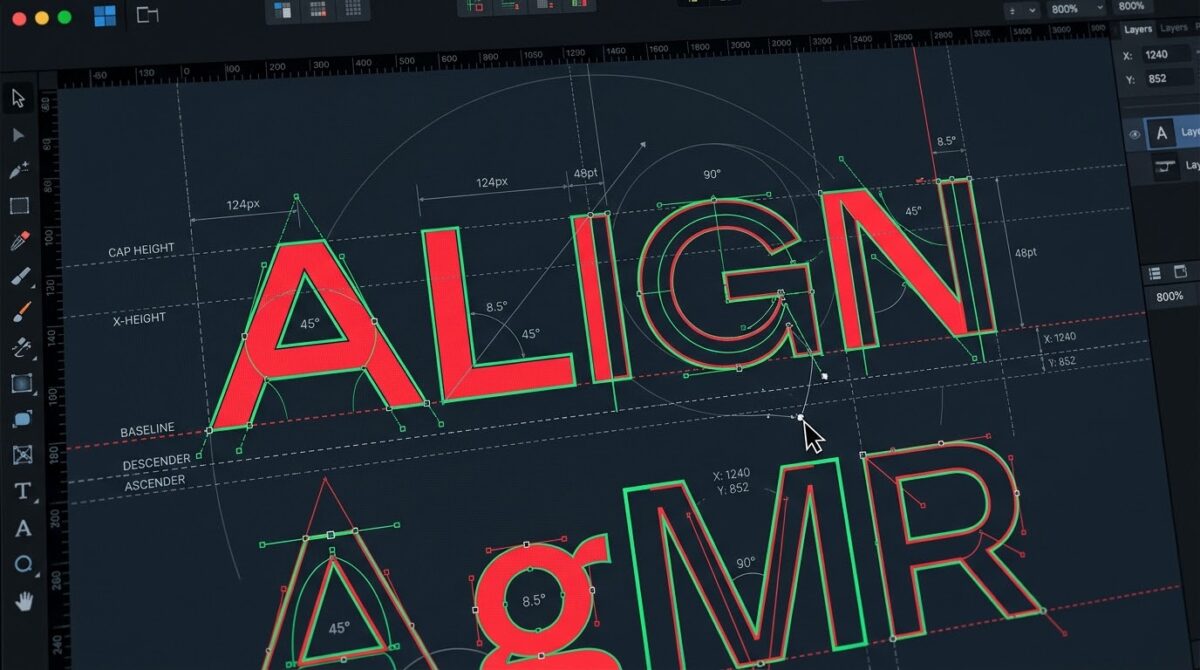
Baseline shift moves the selected characters above or below the regular baseline of the text. This is a feature in Photoshop that is in the Character panel and is typically used for superscripts, subscripts, math notation, or intentional typographic alterations. If you open a legacy document and find the text vertically misaligned, confirm the character settings of the affected text layer before relocating the entire layer manually. Select the specific characters or text range that looks to be out of place . Check to see whether a baseline shift value has been used that is other than zero . If you do not want the shift, change it to the right value for the selected text. However not all problems of vertical alignment are caused by baseline shift. Font substitution can modify the relative proportions of glyphs, ascender heights, and descender depths, and the perceived alignments, even if the baseline setting does not change. Lines can look uneven if fonts are mixed, leading isn’t uniform or paragraph settings are changed. Compare the afflicted text against a known good version or a reference image to determine which property requires correction. Changing baseline shift indiscriminately would correct one char but break other planned formatting. Targeted tweaks preserve the original typographic structure while fixing noticeable alignment issues.
Correcting Character Spacing, Kerning, and Leading Discrepancies
Font substitution can effect more than one typographic measurement at a time, so when restoring a heritage design, it’s crucial to check spacing settings. Kerning controls the space between specific pairs of characters. Tracking manages the space over a range of characters. Leading is the space between lines of text, vertically. The new glyph shapes and widths are different . Photoshop may no longer be able to achieve the visual balance based on the existing kerning relationships when a replacement typeface is used . The automatic kerning may also look different when fonts or application versions are changed. Open the Character panel and check the tracking, kerning, leading, horizontal scale and vertical scale properties of the affected text. If line wrapping, alignment or indentation has altered, check the Paragraph panel, too. If possible, return to the original font before making these adjustments, because spacing corrections made with a temporary substitute font may become inaccurate when the correct typeface is used. If you need to use a replacement font, make slight tweaks and compare to the original layout. In this case the two words are part of the same word in the sense that one is a prefix and the other is the base word. Moving the individual characters without knowing the reason gives less consistent effects than fixing the underlying font and spacing settings.
Dealing with Text Rendering Differences Between Operating Systems
The way text appears in Photoshop may vary slightly across different systems due to changes in font availability, font versions, application builds, and rendering settings. Even if you have installed the font family, various versions of the same font family may have updated glyph outlines , spacing metrics , or language-specific features . Another difference in operating systems is the way fonts are installed, activated and made available to applications. Such changes can affect line breaks, character spacing, and perceived sharpness, especially in older manuscripts with tightly limited text boxes. To troubleshoot, verify both computers are using the same font files and styles, when licensing allowed. Check the Photoshop version and document settings. Determine if the difference is only in editable text or in the overall visual arrangement. whether the text is valid but appears differently at various zoom levels, check the document at 100 percent magnification and see whether display scaling is affecting the preview. Not every visual variation means the document data is corrupted. If you want to operate across systems, standardize your typeface library and document workflow where possible. Consistent application versions, font activation procedures and reference exports help decrease superfluous variances and make it easier to find real typography mistakes.
Preserve Editable Text and Eliminate Future Font Issues
Editable text layers are gold because they allow designers to edit headlines, captions, product information and other content without rebuilding the typeface. The display, however, depends on the availability of the appropriate typefaces. Before archiving or sharing a legacy PSD, take note of the font families and styles used throughout the design. If the font license permits, distribute the necessary fonts through an allowed channel or allow collaborators to activate the fonts via a shared font service. Don’t presume a PSD contains all fonts or that a recipient has the legal right to extract and install them from someone else’s machine. For especially significant deliverables, you might want to keep both an editable master and a separate presentation-ready version where the text has been transformed to shapes or rasterized. When you convert text to shapes, the outlines of the supported characters are preserved, but you can no longer alter the text as normal text. When you rasterize text, only the displayed pixels are preserved. Neither technique should be a substitute to the editable master Make a copy of the text before changing it, and mark the unchanged one explicitly. This two-file approach allows teams to keep an editable source and secure the visual presentation of an approved design if the original font environment cannot be assured.
Debugging Older PSD Files with Complex Typography
Some older Photoshop documents feature mixed font families, nested text styles, custom transformations, unique text boxes, or formatting that is difficult to recreate after a system change. In these circumstances, instead of replacing all lost fonts at once, try to troubleshoot one text layer at a time. Begin by saving a copy of the PSD and writing down how the impacted items look now. Look for missing fonts , and if you can restore original fonts , do so . Check baseline shift , tracking , kerning , leading , and paragraph settings . Verify whether the text box size has been altered or whether the substituted font is resulting in atypical line breaks. Check the settings for distorted text, altered layers or other special effects separately as they can make the restoration of the alignment more difficult. Rasterized or embedded artwork within Smart Objects could not react to font replacement the same way that editable text layers do. If a text layer cannot be safely restored, compare it with an archived export or with an older version of the file. Don’t flatten the entire manuscript as a troubleshooting shortcut because you lose important editing flexibility. The controlled layer-by-layer repair technique preserves complicated designs and makes it easy to know which change fixes which problem.
Creating a Consistent Cross-System Typography Workflow
To avoid font replacement and baseline shift mistakes, a consistent approach to document preparation, font management, and preservation practice is needed. Before sharing a Photoshop project, make sure all text layers are using permitted fonts, and the needed font styles are available to the team receiving the file. Keep a list of font dependencies for key branding, publishing and advertising documents. Keep editable master files distinct from presentation-ready outputs at all times, and keep original copies before changing fonts, changing text formatting, or converting text to shapes. If you are opening legacy files, fix missing font warnings before changing spacing or vertical alignment. When you replace the correct typefaces, review character formatting, paragraph settings and any altered text elements to ensure that the layout is consistent. Standardize on Photoshop versions and font activation techniques where possible for collaborative projects. Use reference exports to find unintentional differences. Periodically test archived documents on a representative workstation so that compatibility issues are found before an urgent revision is necessary. Combined with precise spacing changes, selective baseline corrections and systematic document preservation, accurate font reconstruction enables designers to preserve typography more consistently across multiple systems, while allowing legacy Photoshop files to remain editable and professionally consistent.