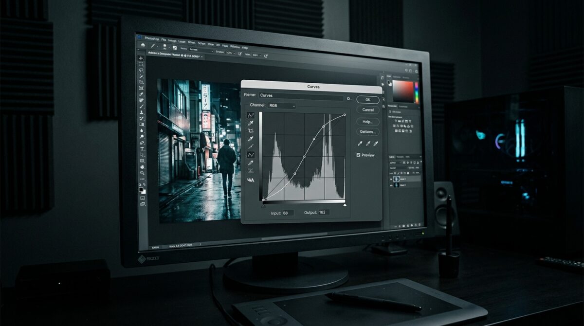
The Math Behind the Curves Tool: How to Match Black and White Points for Seamless Compositing
The Curves tool in Photoshop is one of the most exact methods to produce seamless compositing, which is a technique that depends significantly on matching tonal ranges across multiple photos. Unrealistic composites are often produced as a consequence of mismatched black and white points, which occur when pieces from several sources are combined. These composites give the impression that the subjects are separated from their context. Direct control over tonal mapping is provided via the Curves tool, which enables designers to modify the manner in which the brightness values that are entered are converted into the values that are produced. The mathematical correlations that make up contrast and dynamic range are the foundation of this process. Designers are able to construct a cohesive tonal framework that increases realism by coordinating black and white points across several levels. A better understanding of the mathematics that lies underneath curves permits modifications that are both more precise and more predictable. Compositing, color grading, and picture manipulation are all areas that make extensive use of this method in the professional world. When you master curves, it goes from being a straightforward adjustment tool to a powerful instrument that allows you to achieve tonal perfection.
With an understanding of the dynamic range and the tonal range
“Dynamic range” refers to the range of tones that are present in every digital picture, which may vary from completely black to completely white. The numerical representation of this range generally extends from 0 to 255 in an 8-bit picture. It is the distribution of these values that defines the overall contrast and brightness of the picture. In the process of compositing, it is common for separate photographs to have distinct tonal distributions due to the presence of diverse lighting circumstances. It is easy to see a mismatch between two images when one has bold blacks and whites and the other looks to be flat. The alignment of these ranges is necessary in order to provide visual uniformity. The Curves tool gives designers the ability to remap these values, which may effectively bring the tonal range closer together or bring it farther apart. By gaining an understanding of the distribution of tonal values, one may more easily determine the areas that need modifications. In order to do exact compositing work, this understanding serves as the foundation.
What the Curves Tool Does to Map Input Values to Output Values
In its most basic form, the Curves tool is a graphical depiction of a mathematical function that determines the output values based on the brightness values that are input. When compared to the vertical axis, the horizontal axis represents the original input tones, while the vertical axis shows the modified output tones. A one-to-one mapping, in which no modifications are made, is represented by a diagonal line that is absolutely straight. Designers are able to tweak certain tonal areas by creating control points and modifying the curve. As an example, increasing the curve in the shadows will result in a greater brightness in darker places, but decreasing the highlights will result in a decrease in brightness in brighter regions. Through the use of this mapping procedure, extremely focused modifications are possible. In contrast to the more fundamental settings for brightness or contrast, Curves provides granular accuracy. For the purpose of making controlled and deliberate adjustments, it is essential to have a solid understanding of this connection.
y is equal to f(x).
When it comes to consistency, matching black points
There is a significant significance that black points play in producing depth and contrast in a picture. Black points identify the darkest portions of the image. It is possible for items to seem either overly washed out or abnormally dark while compositing if the black points do not line up properly. Adjusting the bottom end of the curve is one way for designers to anchor the black point while they are working with the Curves tool. This guarantees that the deepest tones in each layer align in a consistent manner. Using the eyedropper tool to take samples from shadow regions is an effective way to determine the proper values. When making adjustments, it is important to be careful so as not to crush features in the shadows. It is vital to keep the texture going while simultaneously obtaining a constant blackness. In order to provide a strong basis for the composite, it is necessary to match the black points carefully. Taking this step enhances the visual cohesion between the pieces greatly.
Coordinating White Points in Order to Achieve Balanced Highlights
White spots are the parts of a picture that are the brightest, and they have an effect on how highlights interpret the image. The presence of inconsistencies in white points might result in some elements seeming overexposed or dull in comparison to other elements. Design professionals have the ability to alter the top end of the curve using the Curves tool in order to align highlight values. In order to guarantee that modifications are based on precise reference locations, it is necessary to sample bright regions. A careful approach is required to prevent clipping, which leads to a reduction in the amount of information in highlights. Adjustments made gradually contribute to the maintenance of smooth transitions and tones. In order to guarantee that all items have the same level of illumination intensity, matching white points is necessary. This adds to the creation of a composite that is coherent and lifelike. Enhancing the overall visual harmony of the picture is the use of highlights that are balanced.
With the Help of Midtones, We Can Bridge the Tonal Gap
The black and white points of the picture are responsible for establishing the extremes, while the midtones are in charge of maintaining the general balance and detail to the image. By adjusting the midtones, you may assist bridge the gap between the shadows and the highlights, which provides a seamless transition between the two tones. A modification to the middle region of the curve is what is required to do this using the Curves tool. Changes that are not immediately noticeable may have a major influence on how bright and contrasting something appears. In order to guarantee that textures and details seem constant, it is important to match the midtones across layers. It is especially crucial to keep this in mind when dealing with skin tones, surfaces, and environmental factors. In order to make alterations to the midtone, careful monitoring and gradual adjustments are often required. It is possible to get a more natural appearance in the composite by achieving equilibrium in this range. This guarantees that there is no element of the picture that seems to be out of place.
Making Contrast Through the Use of S-Curves
An S-curve is a frequent method that simultaneously deepens shadows and brightens highlights in order to get the desired effect of increasing contrast. It is possible to do this by including two control points into the curve and changing them in different directions. The final form has a greater degree of differentiation between the dark and light tones. It is possible to utilize this method in order to get the contrast levels of the various photos in a composite to line up. However, cautious application is required in order to prevent dramatization. Overuse may result in outcomes that are not natural and can cause a loss of detail. S-curves, when applied appropriately, give the picture a sense of deeper depth and dimension. Across all of the elements, they contribute to the unification of the tonal framework. It is common practice for professional color grading and compositing procedures to make advantage of this method.
“math_block_widget_always_prefetch_v2”: “content”: “y = ax^3 + bx^2 + cx + d” is the expression that is used in the equation.
Avoiding Clipping While Maintaining Attention to Detail
When making adjustments to Curves, one of the most significant concerns is clipping, which occurs when the tonal values are pushed beyond the 츨΄ range, resulting in the loss of information. Whenever shadows turn completely black or highlights become completely white without keeping their texture, this is an example of clipping. Through the monitoring of the histogram, it becomes possible to detect potential modifications for clipping. Keeping modifications within safe limits guarantees that the precision of the detail will be maintained. When it comes to control, using repeated modest modifications rather than abrupt alterations is more effective. Techniques of non-destructive editing make it possible to easily improve, in the event that problems develop. Maintaining a sense of realism in composites requires careful attention to detail preservation. The prevention of artifacts and the preservation of picture quality are both achieved via the careful management of tonal changes. This stage guarantees that the final outcome will continue to be visually appealing and aesthetically pleasing.
The Application of Compositing Techniques in Professional Settings
As a basic technique in professional compositing operations, matching black and white points using the Curves tool is an essential step. It allows for the incorporation of individuals into new surroundings, the balancing of exposures over several photographs, and the creation of visual tales that are comprehensive. The use of this strategy is essential for photographers and designers who want to produce consistent tonal relationships. The fields of advertising, cinema, and digital art, all of which place a premium on realism, are especially reliant on this quality. Different tools are unable to compete with the accuracy that Curves provides, which enables alterations to be fine-tuned. When designers have a better knowledge of the mathematical concepts that underlie tonal mapping, they are able to make judgments that are more informed. This results in processes that are not just quicker but also of greater quality. The mastery of this method guarantees that composites will have a smooth, natural, and professionally constructed appearance.