Introduction:
In the realm of digital photography, photo retouching has become a transformative process, offering photographers the ability to enhance and refine their images to meet professional standards. Whether you’re a seasoned photographer or a beginner seeking to elevate your skills, this comprehensive guide provides seven invaluable tips to upscale your photography through effective photo retouching. From basic adjustments to advanced techniques, these tips will empower you to bring out the best in your images and create visually stunning photographs.
Section 1: Start with a Solid Foundation
Subsection 1.1: Understanding the Importance of RAW Files
Begin your retouching journey by working with RAW files whenever possible. RAW files contain more data and provide greater flexibility during post-processing. Unlike compressed formats like JPEG, RAW files retain more details in highlights and shadows, allowing for extensive adjustments without compromising image quality.
Subsection 1.2: Utilizing Non-Destructive Editing
Embrace non-destructive editing practices to maintain flexibility in your workflow. Use adjustment layers, Smart Objects, and duplicate layers to make edits without altering the original image. Non-destructive editing ensures that you can revisit and refine adjustments at any point in the retouching process.
Section 2: Mastering Basic Adjustments
Subsection 2.1: Perfecting Exposure and Contrast
Start your retouching process by optimizing exposure and contrast. Use tools like Levels and Curves to adjust the overall tonal range of your image. Ensure that highlights are not blown out, shadows have detail, and the midtones provide a balanced exposure.
Subsection 2.2: Color Correction and White Balance
Achieve accurate and pleasing colors by correcting white balance. Utilize the Temperature and Tint sliders or use the Eyedropper tool to neutralize color casts. Fine-tune color balance with the Vibrance and Saturation adjustments for a vibrant and natural look.
Section 3: Refining Composition and Cropping
Subsection 3.1: Rule of Thirds and Composition Guidelines
Enhance the visual impact of your photos by adhering to composition guidelines like the Rule of Thirds. Consider the placement of key elements within the frame to create balanced and engaging compositions. Crop images if necessary to improve the overall visual flow.
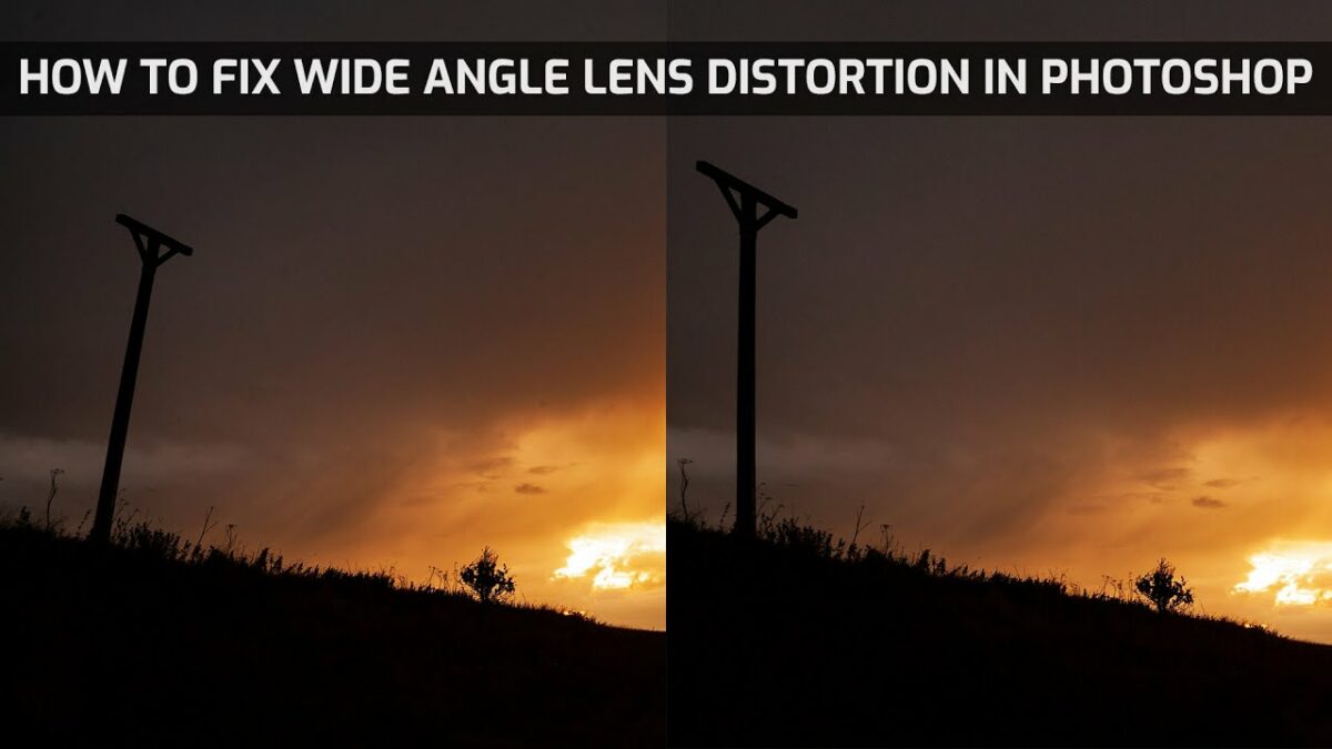
Subsection 3.2: Correcting Distortions and Perspective
Address distortions and perspective issues to ensure geometric accuracy in your photos. Use tools like the Lens Correction filter or the Perspective Crop tool to straighten lines and correct any unwanted distortions introduced during shooting.
Section 4: Advanced Retouching Techniques
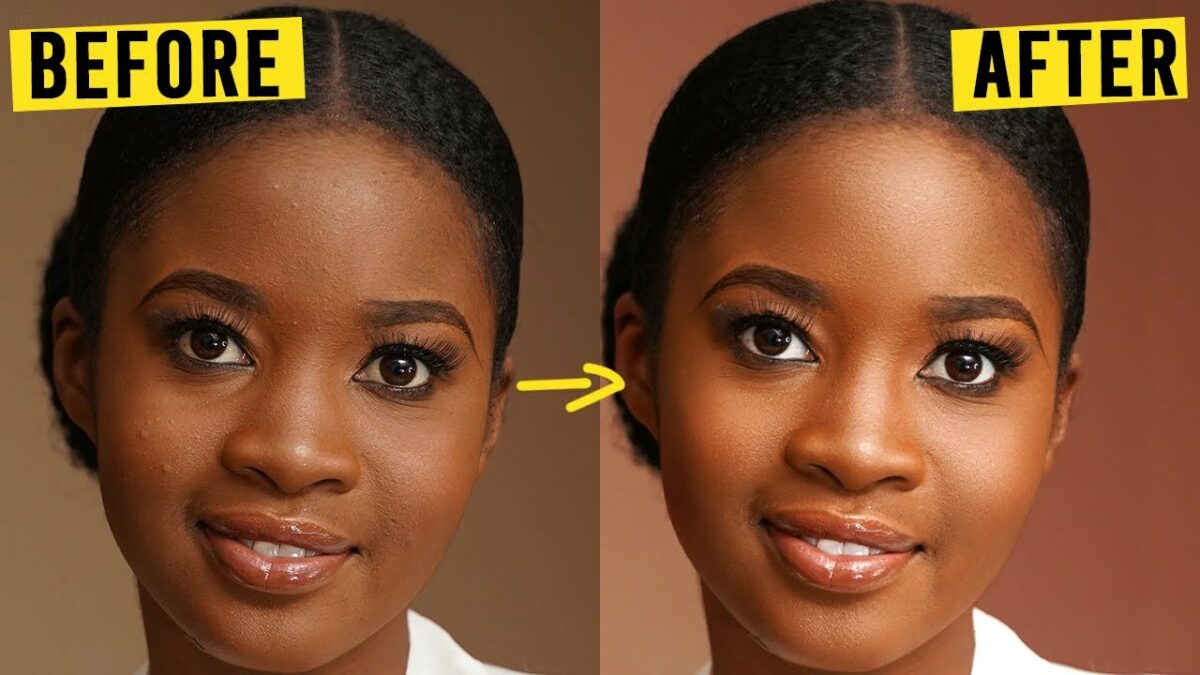
Subsection 4.1: Frequency Separation for Skin Retouching
Take your portrait retouching to the next level with Frequency Separation. This advanced technique allows separate adjustments for color and texture, enabling you to airbrush skin while maintaining natural details. Mastering Frequency Separation enhances your ability to create flawless and professional-looking portraits.
Subsection 4.2: Dodging and Burning for Dimension
Bring dimensionality to your images by mastering the art of dodging and burning. Use these techniques to selectively lighten (dodge) and darken (burn) specific areas, emphasizing highlights and shadows for enhanced depth and three-dimensionality.
Section 5: Sharpening and Detail Enhancement
Subsection 5.1: Smart Sharpening Techniques
Apply sharpening judiciously to enhance image details. Use the Smart Sharpen filter in Photoshop or other advanced sharpening tools. Be mindful of the appropriate amount, radius, and threshold settings to avoid oversharpening artifacts.
Subsection 5.2: Detail Enhancement with Clarity
Explore the Clarity adjustment to enhance midtone contrast and add crispness to your images. Use this tool selectively to avoid introducing unwanted artifacts. Clarity is particularly effective for landscapes and images with intricate details.
Section 6: Creative Color Grading
Subsection 6.1: Using Color Lookup Tables (LUTs)
Experiment with color grading using Color Lookup Tables (LUTs) to impart specific looks and moods to your images. LUTs offer a quick and effective way to apply cinematic or vintage color grading, elevating the visual impact of your photographs.
Subsection 6.2: Split Toning for Artistic Effects
Explore the creative possibilities of split toning to add artistic effects to your photos. This technique involves applying different colors to the highlights and shadows, allowing you to achieve unique and visually striking results.
Section 7: Maintaining a Consistent Style
Subsection 7.1: Developing a Signature Style
Consider developing a signature style that defines your photographic work. Consistency in your editing style not only creates a cohesive body of work but also establishes a recognizable brand. Experiment with color schemes, tonal preferences, and creative treatments to discover your unique style.
Subsection 7.2: Using Presets and Templates
Streamline your workflow and maintain a consistent look by creating and utilizing presets and templates. Develop presets for common adjustments and apply them across your images. Templates can be handy for maintaining a cohesive aesthetic, especially when working on a series or project.
Conclusion:
Photo retouching is an art form that empowers photographers to enhance their images and convey their creative vision. By incorporating the seven invaluable tips outlined in this guide, you can upscale your photography skills and create visually stunning photographs. From mastering basic adjustments to exploring advanced retouching techniques, each tip contributes to a holistic approach to photo retouching. May your retouched images captivate viewers and reflect the true essence of your artistic expression.