Introduction:
Excel is not just a tool for organizing data; it’s a powerful platform for visualizing information and uncovering insights. Advanced Excel charts enable users to present complex data sets in a visually appealing and comprehensible manner, making it easier to analyze trends, patterns, and relationships. In this extensive guide, we delve into the realm of advanced Excel charts, exploring techniques, best practices, and creative strategies to unlock the full potential of data visualization.
Understanding the Significance of Advanced Excel Charts:
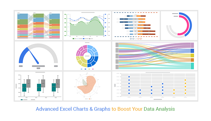
Advanced Excel charts offer a sophisticated way to represent data beyond the standard bar, line, and pie charts. These charts allow users to visualize multidimensional data, compare multiple data series, and highlight outliers and exceptions. By leveraging advanced Excel charts, users can gain deeper insights into their data, communicate findings effectively, and drive informed decision-making.
Key Concepts of Advanced Excel Charts:
Before delving into specific chart types and techniques, let’s explore some key concepts:
- Data Preparation:
- Before creating advanced Excel charts, it’s essential to prepare and structure the data properly.
- Ensure that data is organized in a tabular format with clear headings and consistent formatting.
- Chart Types:
- Advanced Excel charts encompass a wide range of types, including scatter plots, bubble charts, radar charts, waterfall charts, heatmaps, and more.
- Each chart type has unique characteristics and is suitable for visualizing different types of data and relationships.
- Customization Options:
- Excel provides extensive customization options for advanced charts, including formatting, labeling, axis scaling, trendlines, annotations, and more.
- Users can tailor charts to suit their specific needs and preferences, ensuring clarity and effectiveness in data presentation.
Exploring Advanced Excel Chart Techniques:
Now, let’s explore some techniques for creating and enhancing advanced Excel charts:
- Scatter Plots:
- Scatter plots are ideal for visualizing relationships between two continuous variables.
- Customize scatter plots with markers, labels, trendlines, and data point colors to highlight patterns and correlations.
- Bubble Charts:
- Bubble charts extend scatter plots by adding a third variable represented by the size of the bubbles.
- Use bubble charts to compare data points across three dimensions, such as sales revenue, profit margin, and market share.
- Waterfall Charts:
- Waterfall charts are effective for illustrating the cumulative effect of sequential positive and negative values.
- Create waterfall charts to visualize financial data, budget analysis, and performance metrics with clarity and precision.
- Radar Charts:
- Radar charts, also known as spider or star charts, display multivariate data in a radial format.
- Utilize radar charts to compare performance across multiple categories or attributes, such as product features, employee skills, or survey responses.
- Heatmaps:
- Heatmaps represent data values as colors on a two-dimensional grid, providing a visual summary of patterns and trends.
- Generate heatmaps to analyze data density, identify outliers, and detect correlations in large datasets.
Advanced Tips and Best Practices:
In addition to specific chart techniques, consider the following tips and best practices for creating advanced Excel charts:
- Simplify and Streamline:
- Avoid cluttering charts with unnecessary elements or excessive detail.
- Keep charts clean and uncluttered to enhance readability and comprehension.
- Use Consistent Formatting:
- Maintain consistency in chart formatting, including colors, fonts, and labels.
- Use a cohesive color scheme and font style to ensure visual harmony and coherence.
- Provide Context and Insight:
- Include informative titles, axis labels, and data labels to provide context and insight into the data.
- Use annotations and callouts to highlight key findings or observations.
Conclusion:
Advanced Excel charts are invaluable tools for visualizing complex data sets and communicating insights effectively. By understanding the key concepts, exploring advanced techniques, and following best practices outlined in this guide, users can unlock the full potential of data visualization in Excel. Whether you’re analyzing financial data, tracking project progress, or presenting research findings, advanced Excel charts empower you to convey information with clarity, impact, and sophistication. So, dive in, experiment with different chart types and techniques, and elevate your data visualization game with advanced Excel charts.