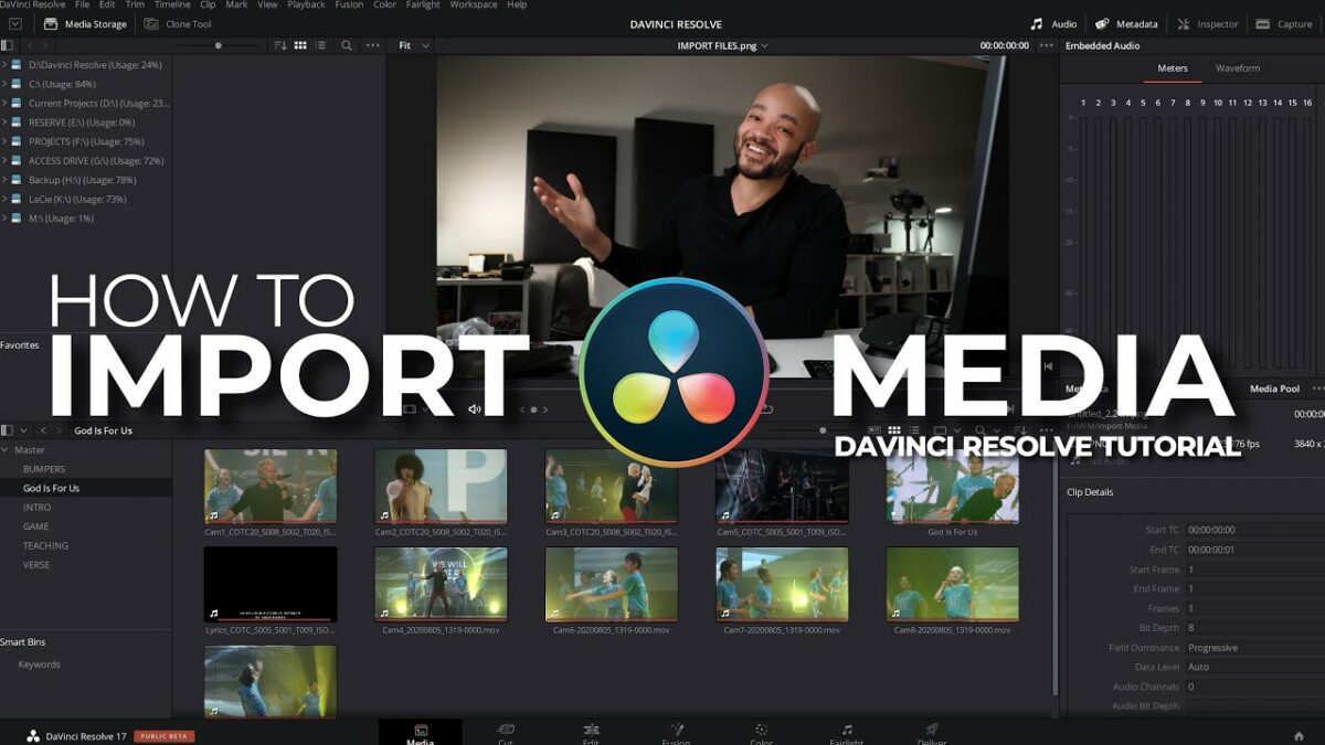
Introduction:
Audio levels play a crucial role in video production, influencing the clarity, balance, and overall impact of your project’s sound. In DaVinci Resolve, adjusting audio levels is a fundamental aspect of the post-production process, allowing users to fine-tune the volume, dynamics, and balance of audio tracks to create a polished and professional-sounding final product. In this extensive guide, we’ll delve into the art of adjusting audio levels in DaVinci Resolve, providing you with the knowledge and techniques to achieve optimal sound balance and quality in your video projects.
Understanding Audio Levels in DaVinci Resolve:
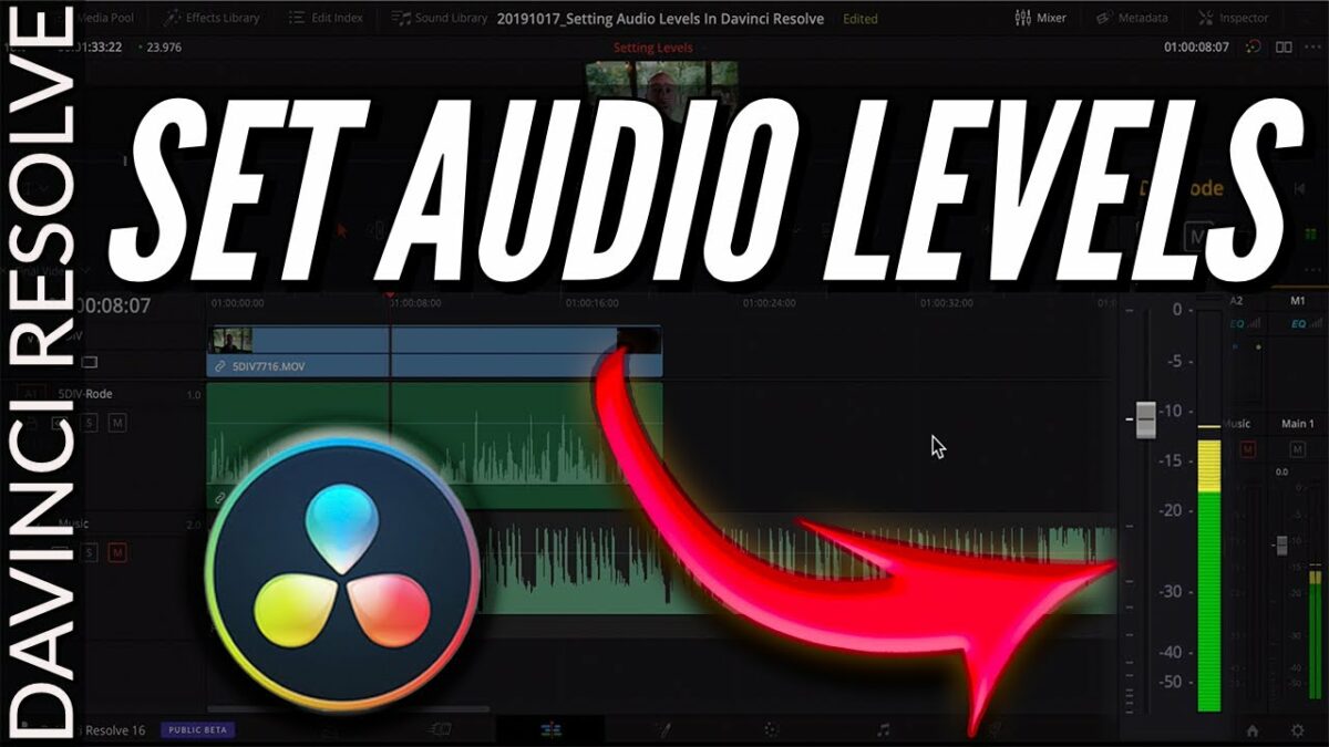
Before diving into the specifics of adjusting audio levels, it’s essential to understand the basics of audio levels and how they are represented within the DaVinci Resolve interface. Audio levels are measured in decibels (dB) and represent the intensity or volume of sound. In DaVinci Resolve, audio levels are displayed visually using waveform meters, which provide real-time feedback on the amplitude of audio signals.
Adjusting Audio Levels in DaVinci Resolve:
Let’s explore the step-by-step process of adjusting audio levels in DaVinci Resolve:
- Access the Fairlight Page:
- Launch DaVinci Resolve and open your project. Navigate to the Fairlight page by clicking on the Fairlight tab at the bottom of the interface. The Fairlight page provides a dedicated workspace for audio editing and mixing, where you can adjust audio levels, apply effects, and fine-tune the sound of your project.
- View Audio Waveform Meters:
- Once in the Fairlight page, locate the audio waveform meters, which display the amplitude of audio signals in real-time. The waveform meters are located in the meters panel and provide visual feedback on the volume levels of audio tracks in your project. Each audio track in the timeline has its waveform meter, allowing you to monitor and adjust levels independently.
- Adjust Clip Gain:
- Adjust the clip gain of individual audio clips to control their volume levels relative to each other. Click on an audio clip in the timeline to select it, then navigate to the inspector panel to access the clip gain controls. Use the clip gain slider to increase or decrease the volume of the selected clip, adjusting its overall amplitude without affecting other clips.
- Apply Volume Automation:
- Apply volume automation to adjust the volume levels of audio clips dynamically over time. Click on an audio clip in the timeline to select it, then navigate to the inspector panel to access the volume automation controls. Use the volume automation curve to create keyframes at specific points in the timeline and adjust the volume levels between keyframes to create smooth transitions and fades.
- Use Track Mixer:
- Utilize the track mixer to adjust the volume levels of entire audio tracks or groups of tracks. Click on the mixer icon in the toolbar to open the track mixer panel, where you can see a visual representation of all audio tracks in your project. Use the faders in the track mixer to adjust the volume levels of individual tracks, groups of tracks, or the master output.
- Apply Audio Effects:
- Apply audio effects such as EQ, compression, and limiting to shape the tone and dynamics of your audio tracks. Navigate to the effects library in the Fairlight page to access a wide range of audio effects, then drag and drop them onto individual audio clips or tracks in the timeline. Adjust the parameters of the effects to achieve the desired sound and balance.
- Monitor Audio Levels:
- Monitor audio levels throughout the editing process to ensure that they remain within an optimal range and avoid clipping or distortion. Keep an eye on the waveform meters in the meters panel to track the amplitude of audio signals in real-time, and make adjustments as needed to maintain balanced and clear audio levels.
- Preview and Playback:
- Preview your project in the Fairlight page to assess the overall sound balance and quality. Playback the timeline to hear how the audio tracks blend together and synchronize with the accompanying video. Use the playback controls to scrub through the timeline and review your project’s audio levels and dynamics.
- Export Your Project:
- Once you’re satisfied with the audio levels and sound balance of your project, export it to create the final video with audio included. Navigate to the Deliver page, configure the export settings, and click “Add to Render Queue” to queue the project for rendering. Then, click “Start Render” to export the video with audio to your desired format and specifications.
Best Practices for Adjusting Audio Levels:
To achieve optimal sound balance and quality in your project in DaVinci Resolve, consider the following best practices:
- Use Reference Material:
- Use reference material such as professionally produced videos, music tracks, or sound effects to guide your decisions when adjusting audio levels. Compare the audio levels and sound quality of your project with reference material to ensure that they meet industry standards and sound natural and balanced.
- Start with Basic Adjustments:
- Start by making basic adjustments to the overall volume levels of your audio tracks using clip gain or track faders. Aim to achieve a balanced mix where all audio elements are audible and blend harmoniously with each other.
- Use Automation Sparingly:
- Use volume automation to adjust volume levels dynamically over time, but use it sparingly to avoid excessive changes that may sound unnatural or distracting. Focus on creating smooth transitions and fades between audio segments to maintain a cohesive and immersive listening experience.
- Monitor Peaks and RMS Levels:
- Monitor both peak and RMS levels of audio tracks to ensure that they remain within acceptable limits and avoid clipping or distortion. Keep peak levels below 0dBFS to prevent clipping, and aim for RMS levels between -12dB and -6dB for optimal balance and clarity.
- Listen on Different Playback Systems:
- Listen to your project on different playback systems, such as speakers, headphones, and monitors, to ensure that it sounds balanced and cohesive across various devices and environments. Make adjustments as needed to optimize the sound for different playback scenarios and ensure a consistent listening experience for your audience.
- Take Breaks and Listen with Fresh Ears:
- Take regular breaks during the editing process and listen to your project with fresh ears to gain perspective and identify any potential issues or imbalances. Use tools such as spectrum analyzers and audio meters to analyze the frequency response and dynamics of your audio tracks objectively.
Conclusion:
Adjusting audio levels in DaVinci Resolve is an essential skill that allows you to achieve optimal sound balance and quality in your video projects. By understanding the basics of audio levels, using the built-in tools and controls in DaVinci Resolve, and following best practices for audio editing and mixing, you can create professional-quality soundscapes that enhance the overall viewing experience and captivate your audience. Experiment with different techniques, explore creative possibilities, and let your ears be your guide as you master the art of adjusting audio levels in DaVinci Resolve.